Thursday 30 September 2010

Alphabet soup...my final series.


DIVIDE: TO SEPARATE INTO PARTS, SECTIONS, GROUPS, OR BRANCHES.

After suffering a few numb brain cells earlier in the week, and many design ideas and drafts that didn't seem "quite right", I finally brainstormed and developed a series of typography cards to represent the word "division" (of which I have chosen to specialise in the field of science and mathematics).

From some of my initial ideas i wrote down, such as "nuclear fission" and "the conception of twins", I believed that I could create both a really innovative, yet subtle series of letters, which would be clevery crafted and styalised, without being too "obvious".

From my initial sketches and notes on my nuclear fission designs (see previous blog entry) I decided that for this series I would really like to work with the letter 'H', for two reasons:

1. I was very drawn to the uniformity and symmetry of the letter 'H', and believe that I had a lot of variations available- as the letter 'H' can be visually presented in several ways.
2. In relation to science, I was drawn to using the letter 'H', as it is the first symbol on Dmitri Mendleev's periodic table, standing for the colourless gas, 'hydrogen, and baring the atomic number '1'- I have always been fond of creating subtle significance within my work.


I used the bold serif 'H' above as a basis template for my letters, but then decided to create a more "industrious" and uniformed look, sqauring the edges and adding extra boldness to the design.

After realising the basis for my letters, I went onto research particular subject areas which I could communicate visually, both in connection to science, and the aformentioned chosen word/theme, 'divide'.

Although I have a keen interest in science, I am undoubtedly not an expert (as my GCSE results paper would tell you), so I went on to research elements of nature and chemistry in which division, or seperation, of some kind occurs- referencing books within the university library, as well as sponging my Dad for advice (he used to be a practicing science practioner, luckily for my research!).

After researching for several hours, I concluded to work on these ten particular areas:

1. Nuclear Fission- the nuclear reaction in which a massive nucleus splits into smaller nuclei with the simultaneous release of energy.
2. The Combining reaction of Chemicals- Linking on from the topic above- visually presenting the wonder of chemicals- how single elements combined make something lager, exciting, new.
3. Muscle structure- Each tendon working both singularly and in harmony with others to move the human body and add a structural wall between our skin and vital internal organs (along, of course, with the skeleton).
4. The Tongue- Each section of the tongue recieving different sensory messages- sweet, salty, sour, bitter. Even on such a small surface area, each taste bud has an individual job and receptor.


(map diagram found from online sources to showcase the sensory taste buds upon the tongue)

5. The rib cage- Protecting vital major organs- incasing both lungs and heart. Each with seperate functions, but one could not survive without the other.
6. Blood- Incredibly vital in our lives- offer blood transfusions to those in needs- chemotherapy patients, medically trying labours etc. We all have blood within our bodies- but we each have our own specific blood group- cannot be mixed through transfusions, and must be clarified in these circumstances.
7. Veins and artries- Heart pumps blood through the arteries. They branch out into microscopic capillaries, then rejoining to form veins, carrying blood back to the heart.
Only the arteries from the left side of the heart reach down to the fingers and toes, the right side arteries are dedicated to the flow of blood to the lungs.
Again, I was very interested in the seperate functions of the same product within the body- a fascinating network of bizarre and complex system mapping occuring within our bodies each and every day.
8. The Conception of twins- 1/90 pregancies result in the conception of twins, 2/3 of these are non-identical. identical twins develop from the same fertilized egg in the womb, and always share the same gender- along with sharing the same placenta, amniotic membrance, and, when born, genes.
This idea particularly interested me, as the idea seemed so clear- one egg, divided to make two lives- though incredibly similar, both unique and their own self.
9.The Skull- made up on several plates, perhaps like a jigsaw- but  must be formed in order to "perform" it's function efficiently.
10. The Nervous System- essentially, the system which allows receptors to be carried to our brain to perform movement in the 30, 000 miles of nerves within the human body.
The nervous system consists of two main controls: sensory nerves (messages to the brain from eyes, ears, skin, and other sense organs), and motor nerves (other parts of the body, e.g, limbs, which allow us to move).


(l-r from top: muscles, tongue, ribcage, blood, nuclear fission, veins and arteries, chemical elements, the conception of twins, the skull, and the nervous system).

In these images, I have carefully thought over and planned why each is aesthetically presented in such a way:

1. muscles- the red strips demonstrate the directional positioning of the muscles and tendons on the pectorials and chest area on a human.
2. tongue- quite a playful one! I liked the idea of the H "sticking it's tongue out". Each coloured section on the tongue represents the correct postioning of the taste buds:
- dark pink: bitter
-yellow: sour
-blue: salty
-purple: sweet
3. ribcage- an incredibly simplified version of the ribcage. I wanted to create a childlike look about this design, and the set in general. Unfortunately, science is becoming decreasingly popular throughout the education system, and therefore, I believe, needs to be resolves in perhaps a more managable and fun way.
4. blood- a simple, bright red blood splatter upon the hard contrast of the black background.
5. nuclear fission- black and white to represent the colourless element of Hydrogen, with two black dots- symbolising the atomic structure of hydrogen (a central proton, outter electron).
6. veins and arteries- an abstract presentation of blood flow.
7. chemical elements- the split 'H' showing the division of chemicals, with smaller 'H''s stemming from them, showing the development of chemical reactions.
8. the conception of twins- double shadow of the letter 'H'- colours representing the cross section of the womb with two small foetuses intertwinned.
9. the skull- simplified cream jigsaw- representative of the human skull.
10. the nervous system- blue directional lines cut on cream background- to show the direction and purpose of the nervous system in a styalised manner.

Of course, if I had the option, I would really have liked to have produced more design work to back up this project, but from particular circumstances, and the week deadline, I think that I have done reasonably well to have completed this project in a style which I can optimistically say that I am rather pleased with.

Although my outcomes may not seem entirely obvious, as aforementioned, they each represent a simplified response to each of these matters.
What I liked most about my particular subject is that they were all very much so seperate functions and controls, but without the aid of others, they would simply cease to be.

You can't divide without multiplication waiting right around the corner.
alphabet soup: design development and final collection.


Throughout the past week, I have been busy attempting to complete the project brief set before us at the start of the week.
Although I have faced some issues which may have hindered my progress- balancing my part-time job with college work, as well as induring minor illness, but I can now safely say that I have created a set of 10 A6 typographic designs that I believe that I can be proud of, and will feel no shame to present to others in the crit later today.

Admittedly, at the beginning of this week, I was finding the prospect of completing this week-long project somewhat daunting and challenging- starting off feeling incredibly uninspired and lacking in the way of original and aesthetically creative ideas.

However, I had a flash of inspiration, developing from inital idea mind mapping (see picture above), on Thursday morning (talk about last minute pressure!). Although I had referenced many different areas of division, such as "cuts", "tears", "seperations", etc, they all seemed rather cliched and stereotypical.

I don't quite know where it emerged from, but the idea of division through scientific means (the division of particles- nuclear fission) kept on popping into my mind, developed from my initial reaction to the word "division", i instantly thought of maths and science.
Therefore, I decided to go with my gut instinct, and create my typographic alphabet soup series based on the wonders of science!...

Monday 27 September 2010

Alphabet soup- a visual thinking breif.


'Didn't someone say, "Wait for inspitation and all you'll get is an overdraft"', was the starter for the project brief this Monday morning from tutor Fred.
How, how true.

After we had our aforementioned typographic induction we went on to randomly pick a word from the 'BA (Hons) Graphic Design Randomizer' box, in which words were printed onto paper, with words such as 'vanish', 'flatten', 'freeze', etc.

After i picked out 'divide', it was explained to us that we would have to typographically demonstrate this motion in unique fonts and designs based upon this theme.

The project brief paper reads:

The Brief:
Produce a set, series or sequence of ten letterforms that explore and communicate your interpretation of the word that you have selected from the randomisers.

Using your newfound appreciation of the anatomy of typographic forms and the wealth of research that you have already gathered, focus on the manipulation of existing letterforms in order to solve this problem.

Considerations:
THINK VISUALLY. Consider what the visual essence of your subject matter is and how best to communicate this. What are the obvious responses? How can you go beyond these? How subtle can you be? Do your ideas operate as a set, series or sequence?

The following terms may prove useful: trace, erase, layer, combine, outline, silhouette, and surface.

Practical Considerations:
Consider the most effective and controlled use of media appropraite to your subject matter. EXPERIMENT with a range of possible line qualities, marks, colour and paper types. How will colour help with the communication? What paper stocks can you work with? Do you need to draw, photocopy, photograph, collage, trace or combine all of these processes?

Background:
The alpha-numeric forms within typefaces and fonts are vast. Each has been designed in response to a specific problem, set to requirements or design needs. Clairty, legibility, ease of (re)-production, usability and functionality are always considerations but the mood, personality, tone of voice of these forms is just as important to a designer.
Investigating these relationships can open up a wealth of visual and conceptual possibilities.

Mandatory requirements:
Each image should contain only one letterform but the set should demonstrate a range of possible solutions.
Each resolved letterform should be supported by a broad range of visual investigation in the form of design sheets and notebooks.

Deliverables:
10x A6 resolutions each representing a well crafted and clearly presented typographic form.

Therefore, I intend to start design and scribbling down lots of graphic ideas to represent the word 'divide', and choose a letter of the alphabet in which i believe i can best represent this.

The anatomy of typography.


Today, for the first time, I had a lesson in the principles of typography and typographic design. Though quite a shock to the system, from this afternoon, I really feel that I have learnt so much in a short space of time.

Until today I, admittedly, really hadn't realised how much there was to typography- to how great an extent you can disect in, break it down, and examine every little factor.

After an initial brief induction in the morning, we were then sorted into our blog groups to work on categorising typographic fonts we had gathered for our task two summer project.
We pooled together all of our examples of each letter (twenty times each member of the group for each of the twenty-six letters for the alphabet!) and then decided to focus on one of the letters- of which the numbers of examples appeared to be the greatest.


organising letters into piles (picture taken by Sarah Roberts)


organising our selection of 'E' letters (picture taken by Sarah Roberts)


upper and lowercase 'e' organisation (picture taken by Sarah Roberts)

We then discussed typographic categories these could be organised into, and concluded upon areas such as:


  • serif (with flicks and angles at the end of letterforms- most commonly used in handwriting to start the form of a letter, orginating from Roman stone type)

  • sans serif- ('sans' from the French word 'without', "without serif")

  • italic

  • bold

  • hand-rendered

  • digitally-rendered

  • contemporary

  • traditional

  • point size/scale

  • decorative
the ten that we were then told were most important categories or factors to consider were:

  • light (the thickness of the letterform)
  • regular
  • bold
  • italic
  • font
  • scale/point size
  • serif
  • sans serif
  • uppercase
  • lowercase
- the factors in which all typographic fonts should be considered and sorted into.

We then returned to a briefing with our tutor, Fred who explained many other factors of the true anatomy, principles and structure of typography (which have further details in the photogaphs i have shown, taken from worksheets...), along with a glossary of terms, for all the slightly bemused and confused amateurs to typography like me!...


We then went onto the initial step to our next week-long project, to be continued...

Friday 24 September 2010

printing our final outcome tote bag designs...


Yesterday, we went onto the exciting step of printing our graphic solution designs onto the cotton canvas tote bags.
On Wednesday, I went to purchase five canvas tote bags from a local craft store (one for each of our designs) and iron-on transfer paper. For the time remaining in this project, this seemed like the most effective solution.
Our group agreed, that under different circumstances, screenprinting would probably have been the most aesthetically effective technique, however, this is very time consuming and costly, and therefore would not fit with our economic ethos.
Both Will and I had used the iron-on transfers with heat transferring methods before, and with enough practice shared between us both, we agreed that despite the often differing results, we would still be able to achieve tote bags that looked professional and fashionable.

Here are our designs post-print:


Stephanie Lawson's design- inspired by the idea that a routine of cleanliness will benefit both your time management and state of mind!

I really liked this design in monochrome, as the fine details have been picked up really well (and think that these details may have been lost among colouring). I am also really impressed by Steph's typography, and think that this variation works wonderfully not only together, but in harmony with the illustrative design to the left.


Simon Cherry's design- inspired by the warming goodness and company that "putting the kettle on" can bring- promoting heartfelt conversation and new friendships.

I love the splashes of colour that Simon added to this- and the overlapping of the yellowish-brown colour in the tea cup, giving it a really original and graphic edge.


Will Cotterill's design- Will's design reflected the high life of a night out on the tiles! Will's idea came from a slight different viewpoint- with a sense of real optimism, with a message which says "it's all good and well missing home, surrounding yourself in home comforts, but the world is your oyster, so eat it all up!"

Again, much like Steph's design, I think that Will's typography really makes this design and adds real character. I think that the solid green colour also works really well here- with a bold design linking back to the traditional bottle colouring aswell.


and, of course, this is my design. I am really pleased with how the design printed out onto the tote bag as the colours looked really vibrant and true to my orignial thoughts and designs.

I went for the white scroll design as oppossed to the brown, as this was not only the majority favourite among other group members, but I think that the brown design took away from the scripture writing, which, of course, is one of the main features of the design.

Unfortunately, I have not yet managed to photograph Yafet's bag design, as it was unavailable at the time, however, I plan to do this early next week, and will, of course, blog it then.


Our tote bag "In the Bag" collection (Yafet's design featured in top, left-hand corner).


Aside from contributing to the planning of our presentation, the image above was my last task towards the products.
From the design inspiration of tutor, Amber Smith, I decided to create "slogan cake cases" to contribute to the contents of our "In the Bag" student survival kits.
These examples show the prototype for cake cases: when the cake is eaten, a lovely little message awaits you at the bottom!
I decided to create a range of sayings from the heartfelt "with love" to the humourous "omnomnom" to suit every mood and personality.
I really liked the idea of these cake cases being used as bonds between new friends, housemates, etc. Not only would it give them a chance to bond by baking with one another, but also to leave charming messages behind to make you smile after your tasty treat!

I genuinely feel very proud of our group and what we have achieved with such little time, and facing some difficult cirumstances along the way. Although often finding ourselves stressed through the week, I can safely say that I know that we all share a real feeling of satisfaction in reviewing the work we have created, and feel that we have certainly made a step in the right direction.

For a self-evaluation to the outcome of our presentation to the rest of the group, click here:


further design ideas.


Today, within our groups, we finalised design ideas for this week-long project, and organised our presentations for our one o' clock deadline.

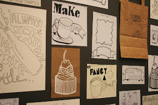
The image above shows our presentation board, with a collection of our illustrative drafts and designs from our initial stages of design development.

I feel really lucky to have been part of a group where our graphic and illustrative style and preferences really have very little difference, and people actually commented how surprised they were to find out that the designs on the presentation board were actually a collection from various people! I think this really reflects our strengths as a team, and how well we communicated with one another to make a consistency within our designs.


The design above was created by group member, Will Cotterill, along with our approval.
We decided to make a brand for our bag collection to add to the consistency and proffessionalism of the project as we pitched our graphic solution to the group and course tutors.
"In the Bag" seemed like the obvious solution- in both a literal and metaphorical sense. "In the Bag" in the sense that the products that we aim to produce are presented "in the bag", and "in the bag" also, metaphorically means "success", "completition", "well done". We encorporated the telephone illustration and telephone wire typography to represent communication (between students and their "lives back home"), and therefore, we wanted this logo, and our brand to stand for "successful communications", and we really hope that that is what we have achieved.

Thursday 23 September 2010

add a splash of colour...


Early this morning I came into college in attempts to achieve a quick head-start on the project for the day. Though initially unsure as to whether or not the group had decided to opt for the colour or monochrome palette, I decide to produce some quick colour samples in photoshop to demonstrate what they may look like with this enhancement, and to provide more demonstrations of our sampling this work in our group crit later this afternoon.

I took my completed monochrome illustration (as shown in my previous blog) and added pastel-tone colours for a soft and gentle enhancement to my illustration. I decided in this example to leave the typographic scroll uncoloured, as I thought this would work well with both the fine liner outline and the white "icing" sections I have left uncoloured (see above).


I then went on to colour the scroll in a light cream brown, with darker shadow brown where necessary, giving it a more "classically aged" scroll appearance, whilst still keeping the illustration clean and crisp. I like the subtle shadowing on this sample, though I think that the first sample illustration perhaps looks a bit fresher and cleaner with the large sections of white.

I am still undecided as to which sample I will use in the final design, however, it is, of course, not just my decision within the group, and I will look for the opinions and thoughts of my other team members to make a joint decision as to which would be most appropriate for our design collection.

Wednesday 22 September 2010

if i knew you were comin'...


Throughout today I have been kept very busy indeed!
Along with the usual, mundane chores of the day, I went into the city centre today to pick up the vital ingredients towards the final outcome solution for our project- five cotton tote bags (one each to showcase our individual designs on) and five iron-on sheets to transfer our images onto the cotton fabric.


This afternoon I went onto create a design for my bag, developed from the original "design scribbles" i have prevuiously blogged.

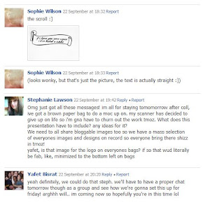
From writing constant messages to fellow group members, my original ideas for my design have completely changed. I originally wanted to create something perhaps a little "OTT" and full of illustrative design- though, from the opinion of others, I have been lead to believe that simplicity really will work best from both an aesthetic and economic viewpoint (as, when we pitch these products, one of the real, notable points is that if they were to be distributed to new students, they would be an affordable and easily-made gift!)

However, i still believe that there remain to be many of my original ideas, and, perhaps, just a slightly different execution in the terms of the layout, and am very pleased with the results I have achieved in the short space of time...


I am really looking forward to seeing the feedback from my group in our session tomorrow, and am anticipating the decisions in terms of colour editing and enhancement to create the final piece before transferring onto our tote bags!

How To...


I feel really pleased and progress that our group has made so far, and along with Simon posting a short survey on the LCA portal to benefit the research side of this project. I feel confident that by the deadline on friday afternoon we will be able to produce a strong design solution.

Tuesday 21 September 2010

Developments in "How To..."


Now, to you, this may be one small step for scribbles, but for me, this is one huge step for "design-kind".

I have a habit of "perfection-ism" (yes, that's probably a word) so although these scrribles aren't at all aesthetically impressive, or showcase a great amount of skill, i'm pleased with my outcomes.

This A4 piece of paper shows my sketch development for ideas towards the designs of the tote bag i aim to have designed and also to have created for the design solution for the previously mentioned "homesickness" problem in which our group are setting out to resolve.

I originally thought of desiging the illustrative tote with various foodstuffs scattered around among a bold food-relative font, however, the idea of cupcakes and sweet treats kept creeping back into my mind, so I feel sure that I can create something I'm really passionate and enthusiastic about.

Tomorrow, throughout my unscheduled timetable, I hope to both source tote bags and iron-on transfer paper for the five designs we are creating within our group and to personally create a final design for the tote i shall be designing, complete to print for thursday evening!

best get scribbling!

Monday 20 September 2010

design principles.


Today, we launched off on our first level 04 project, entitled "How To" in which we were assigned groups to create graphic resolution to a particular problem that we as students face.

In a group with Yafet Bisrat, Simon Cherry, Will Cotterill, and Stephanie Lawson, we were chosen the "problem" of "missing home" to solve through the aforementioned fashion.

After brainstorming several resolutions and potential outcomes, we were asked to select three and record these on sheets of paper, as shown below:


(hmm, really should start taking more care of my sheets...)


Our fate was then placed in another group within our year base, and I was delighted when they chose the first option (tote bag design) as the graphic resolution we should create.

Within our group, we intend to create the previously mentioned solution to homesickness, and therefore, we have decided to each design a tote bag within a certain theme to either give a nostalgic, wistful and warming memory of home, or the optimistic and high-sprited oppurtunity for a fresh start, and new beginnings, such as a new found independence and experiences.

I am very pleased to be designed a tote bag in the theme of home-baking, (my speciality!) reflecting the home comfort that so many of us have been privaleged to experience.

I hope to encorporate text and hand-rendered illustration for my designs, which I shall go on to create both tonight and throughout tomorrow, and which I hope to present on my blog shortly.

ABC all about me.


This is me.
(I wouldn't necessarily look like this if you saw me in the street).

This illustrative mount board collection shows my LCA summer project task 1, creating an alphabetic collection that reflects my personality, interests, etc.

A: le fabuleux destin d' amelie poulain
B: beekeeper
C: crafts
D: dreams
E: embrace
F: france
G: genteel
H: hands/cross-hatching
I: icarus
J: J.M Barie
K: kiwi (an allergy most foul)
L: lighthouse
M: Morrissey
N: Nureyev
O: octopus
P: penguin
Q: quotations
R: rose tint
S: seaside
T: (mixed) tapes
U: the unbearable lightness of being
W: Willy Wonka
X: xenomania
Y: yummy goods
Z: zoology

I had a lovely response from my blog group, and they had a lot of positive comments. They seemed to like how personal the piece was, and how it reflected myself entirely.