Wednesday 29 February 2012

Design Practice II//YCN//Concept feedback presentation.


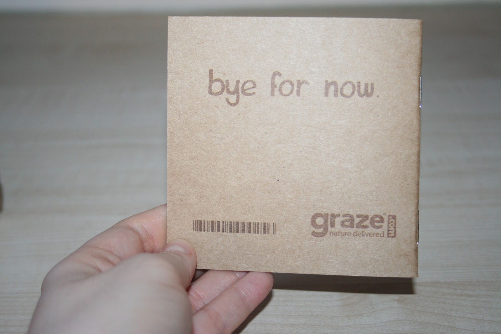
In preparation for the feedback crit for the Graze brief with our peers, I decided to gather a little bit of research to back up some of our reasonings and decision making (which I will go on to progress with over the next couple of days also). 


Deciding to stick to an office environment for our main target audience and design focus (as specified in the brief) though changing our age range to the slightly more youthful 18-30, to fit in with the "young professional" target audience, who we believe would have the most disposable income, I went onto research how realistic this was. From the (very useful) link, as sourced above we found two facts:

"...Big bosses and chief executives saw 15% increase in their salaries in 2011, earning an average of £112,157"

and...

6/10 of the highest paid professions in 2011 were employees who work in an office environment

although these high paying jobs would ordinarily be in quite senior positions (and potentially that would be evident in the average age of the employees of these professions) this is also an advantage as we could use these leading professions to act as a promotional tool for the working environment- to target at the bosses and "those with power" to buy the Graze boxes in bulk for business meeting, employee benefits etc to encourage wellbeing, job satisfaction, health and over all job satisfaction (with the added benefit of reduced costs for bulk-buying boxes).

We then presented our ideas to the two other groups (Luis and Sarah and Chloe and Claudia) and discussed our ideas. They went down well, and received some good ideas and feedback- as well as generating our own new ideas as we went through the process which was really helpful and useful. As a result, we went on to fill out the given feedback forms and action plan in response to this. 

For next Tuesday's session, we have also been asked to produce x5 presentation boards to present once more about our design process, concept development and idea generation.

Charlie and I have decided to create/focus on these 5 subjects for our boards:


CONCEPT
MARKET RESEARCH
GRAZE SPECIFIC RESEARCH
DESIGN DIRECTION (CONTEXTUAL RESEARCH)
INITIAL DESIGN (WHAT IT IS...WHAT IT COULD BE)


We will go on to complete all of our research and process work for Monday (as specified on the action plan) so we can get them completed, printed and ready for Tuesday's workshop session with tutors Fred and John.

Design Practice II//YCN Brief//Collaborative concept workshop.


Today, Charlie and I worked collaboratively in a workshop to look further into the Graze/YCN brief as a continuation of what we unpicked from the brief yesterday.
Today we were looking at the finer details in preparation for pitching our ideas to two other groups to generate feedback and opinions which are, of course, always helpful.


These are the notes that Charlie and I took down pre-presentation:


MISSION STATEMENT


"We aim to regenerate the Graze brand for a new, contemporary audience- visually communicating the wholesome, environmental ethos of the company along with the interaction of digital media to reflect their online ordering service."


TARGET AUDIENCE


- Young professionals
- 18-30
- Gender neutral (allowing to open up to a larger market share)


WE AIM TO BE...


- Fun
- Wholesome
- Contemporary
- Modern


COMPETITORS/SIMILAR MARKET


- Innocent
- Feel Good Drinks
- Gu (In terms of the premium product/price)
- Fish in a box
- Fruit in a box (Leeds based- might be worth organising a meeting to discuss their marketing/promotional media?- Target audience is largely office based too)


PROBLEMS (WE NEED TO SOLVE)


- Boring visual communication
- Inconsistent
- Not very well advertised
- Trying to appeal to everyone- a confused target market
- Convincing Graze that a rebrand is necessary if they want to generate a wider target audience and market share


WHY REDESIGN IS APPROPRIATE


- Engage new generation of Grazers
- Advertise and promote the company for greater awareness
- Consistent designs


DESIGN OUTCOMES/VISUAL OUTCOMES/PROCESSES


- Hand rendered type
- Icons and pictograms (infographic? visually communicative information)
- Screenprinting
- Using recyclable materials


SPECIFIC OUTCOMES WE AIM TO PRODUCE


- Logo
- Box packaging
- Serviette
- Additional booklets
- Mailshot deliverables
- Digital promotion
- Print promotion
- Tagline
- Interactive media
- Food cartons


DESIGN OUTCOMES (IN DETAIL)


LOGO


- Modern
- Contemporary
- Strong identity
- Work through both print and digital media
- Needs to work as both 'Graze' and 'Graze.com'
- Needs to communicate the ethos and production of the brand


BOX PACKAGING


- Range of "specialist" boxes
- Set menu- "quick pick"- quick, easy
- Restricted by the structure and die of the box
- Recyclable material
- Lightweight (to keep costs low for the company in terms of postage)
- Durable (through postal delivery)
- Modern, minimal
- Balance of formality and informality
- Hand-rendered, though formal, structured layout


SERVIETTE


- Recyclable
- Consistently branded
- Minimal
- Only 1 per box?
- Not just an after thought


ADDITIONAL BOOKLETS


- Retain the information- but snappier, more visual
- Consistently styled and branded- less messy
- Scale works well- pocket size?


MAILSHOT DELIVERABLES


- Interactive
- Engaging
- Work through consistent branding in both print and digital design
- Hand rendered, illustrative icons and typography


DIGITAL PROMOTION


- Propose a series which works throughout both print and digital media
- Fun, light hearted (think INNOCENT brand)


PRINT PROMOTION


* See digital promotion


TAGLINE


- More snappy, modern, contemporary.


FOOD CARTONS


- Consistently branded, minimal packaging (environmental and cost factors)


INTERACTIVE MEDIA


- QR codes on printed media- leads directly to online ordering
- More interactivity on website- to be fun and engaging

Design Practice II//YCN Brief//Graze- Vector icons.


After yesterday's brainstorming and concept development session with Charlie yesterday, I spent a few minutes this morning generating some really simple vector logo designs as potential ideas and developments for the illustrative iconography that we want to push and experiment with in the branding and redesign of the Graze packaging- here, looking at different "specialist" boxes- themes written below that we have brainstormed for selective specialist boxes for a fast selection process.

In terms of final generation, the style we are going for will be a lot more hand rendered and screenprinted, but it was good to try out a few ideas nonetheless- I need a big drawing/doodling session as soon as possible!

Tuesday 28 February 2012

Design Practice II//YCN//Concept development for the Graze brief.


Written notes for concept development for the design development for the collaborative YCN brief that I am currently working on for the Design Practice II with Charlie.


Really, just starting to make designs about the design processes and visual outcomes that we set out to achieve- as well as additional deliverables that we could produce to expand the potential of the brief, and generating a wider portfolio of designs to send off to Graze as a result.


Tomorrow morning, before the start of the workshop sessions, I will work on generating the hand rendered and vector based icon designs that were assigned to myself for the action plan- already got a couple backed up, and hopefully waking up after a full nights sleep will help me whilst working on them pre-presentation tomorrow for more creative and innovative designs.

Design Practice II//YCN//Re-writing the brief.


After each individually working on the workshop 'disecting of the brief' in our respective sessions today, Charlie and I joined together late afternoon to review what we had each written in order to re-write the Graze brief, concept statement and action plan for the next couple of days.


I was really pleased to see that Charlie too had extensive research and analysis of the brief, though he had looked more into the existing business strategies and ethos (etc) whereas I had looked more at the target audience and market for the product- which allowed us to combine our research.


The PDF document above shows our finalised decisions for the practical side of the brief- chiefly working to rebrand the packaging and company for young professionals with a more visually engaging and consistent aesthetic outcome- working with hand rendered imagery, iconography and type to ensure that the designs are kept fun, yet still formal in terms of their layout and overall communicated visual outcomes.


The action plan is set before tomorrow's workshop session in which Charlie and I will work together to make a presentation about our proposed ideas and which direction we will be following for the continuation of the brief.

Design Practice II//YCN Brief//Idea generation workshop.


In this morning's session, working individually (conveniently my partner, Charlie, was in a presentation, so no risks of working together!), we went to work on pulling apart our YCN brief to evaluate specific factors and details within the document such as content, media, audience and product deliverables in order to research enough information to re-write the brief and concept statement with Charlie later this evening and to generate enough research material to be able to come in tomorrow to work on putting a presentation together about our intentions for design outcomes and contextual research).


Writing down on several A2 sheets, these are the collective notes that I took:


//PAGE 1


GRAZE BRIEF 
Charlie Crosby & Sophie Wilson


WHAT WE ARE BEING ASKED TO/HAVE TO DO: 


Regenerate Graze packaging and company- make them more appealing and interesting to a wider audience and consumer market.


PROBLEMS


- Confused target audience in terms of visuals.
- Reluctant to change (box, structure, logo, etc).
- Limited target audience appeal.
- Confused visual outcomes- not formal or informal.


WE NEED TO DO


PERSUADE
EDUCATE people about Graze and their ethos through engaging, visual design.


FRIENDLY & FUN


Engage with our target audience and the consumers that would regularly buy natural, "wholesome" products.


//PAGE 2


OUR AVERAGE AUDIENCE


AUDIENCE


- Female
- Office worker
- Mid 20's
- Health conscious
- Time conscious
- Buying into the "healthy lifestyle"


WHAT THEY MAKE LIKE/INTERESTS


- Environment and social change
- Health and exercise
- Cafe culture
- Socialising
- Friends and family
- Shopping and leisure
- Cooking and nutrition


//PAGE 3


CONTENT AND SUBJECT


- Define what is given
- Define what we need to provide


- Re branding and re design to re generate the Graze brand for contemporary audiences. As a premium cost product, the visual outcome has to denote quality and to be able to visually communicate the character and ethos of the company to consumers.


- Look at existing visual designs (that Graze are reluctant to change) and how we can utilise existing styles as a vasis of research and design progression.


- Work with hand-rendered type in a bold, structured layout- able to denote the natural ethos of a company with the formality of the online, interactive aspect of the company.


//PAGE 4


MEDIA AND DISTRIBUTION


- What is specified, and how we can take it further, eg...


* Photoshop logo and design rebrand onto an image of their webpage to show the design in an online context.
* Redesign the information guides that are sent within the box, 'hello' booklet.
* Redesign other printed media and methods of distribution (that are more exciting than just a mailshot...)
* Design an online/print campaign to help promote the company to a wider audience and target market- not just for the premium "Trustafarian" client(s).


//PAGE 5


AUDIENCE AND CONTEXT


Consider their personality, product, brand consumption and what they look for in a product themselves.


PERSONALITY


- Sophisticated
- Fun
- Playful
- Strong willed
- Independent
- Hard-working
- Driven (office workers)
- Ethically/environmentally driven
- Sense of humour
- Friendly
- Passionate (about environment and health)


PRODUCTS/BRANDS
That they purchase/consume


- Similar health promotion/loyalties
- Similar ethics and ethos, environmental/natural
- Sourcing of products, manufacturing and distribution
- Premium products
- Food and drinks industry


BRANDS/COMPANIES


- Innocent (drinks)
- Feel good drinks company
- GU
- This...water
- Co-op
- Jordan's (cereal)
- Holland & Barrett


RESEARCH BRAND DESIGN, MARKET SHARE AND TARGET AUDIENCE


//PAGE 6


PRODUCTS AND DELIVERABLES


Are we being asked to produce or to propose?


LOOK at what products and methods of production are most effective for the brief outcome, and not just our interests.


WHAT IS BEING ASKED FROM THE BRIEF


- Re design logo.
- Re design box.
- Create mailshot design (print) to promote the Graze company.


WHAT WE AIM TO PRODUCE/GENERATING IDEAS AND PRODUCT OUTCOMES


- Re design logo/look at ways in which it can be improved upon.
- Branding and identity developments-visually communicate the ethics and ethos of the brand.
- Packaging redesign- effective methods of print and production, environment, low cost (veg inks, recyclable paper/card, etc).
- Promotional campaign- both online and print to promote Graze to a contemporary audience.
- Create proposed web design with new interactivity and branding considerations.
- Pin point the target market and distinguish a visual outcome which is most appropriate to the personality and interests of the product consumers.


DESIGN IDEAS


- Hand rendered type (fun, informal and illustrative- showcases the character and personality of the brand as wel las that of the consumer).
- Structured layout (fitting to a formality of office/working place environment [distribution] whilst still looking engaging and exciting- not too dry or too bland).
- Play on words- Work with the product/company aims to promote with hand-rendered, typographic work. Eg, serviette- 'wipe, clean, smear, dry...Graze'. Combined typefaces/illustrative details- not too flamboyant- one/two colours plus stock, otherwise would look too informal/not visually representative of their online services.


ALSO RESEARCH


Freshbox (fruit and veg)
Fishbox


- Food deliverable services
- The practically of this- company/market


ONLINE SALES


- Way of life
- Office environment


SAINSBURYS
TESCO
ASDA
WAITROSE


Look at delivery process and how effective this is for the companies- costs, delivery times, etc.


TO DO TONIGHT


- Re write brief and concept statement with Charlie and blog.
- Gather all company research, market analysis.
- Research existing design.
- Generate some of our own simple designs.
- Generate all images and visual contextual references to support the presentation that Charlie and I will start putting together tomorrow.

Saturday 25 February 2012

Design Practice II//Analysis YCN Briefs.


Finally getting round to scanning in my sheets from Wednesday's workshop with tutors Fred and Lorraine, in which Charlie and I (my new OUGD203//Design Practice II design partner) re-grouped after Tuesday's "recruitment" workshop with our favourite YCN briefs to work on deciding which we would go on to complete, looking at the pros and the cons of each of the briefs through a series of short tasks.


From the briefs we distinguished our two favourites, and our least favourite, 5 reasons for each as to why, looking more closely at the 'openness' of the the brief, and then distinguishing 5 things we are being asked to do in our final selected brief- more information posted beneath each of the PDF Issuu documents below.


GRAZE BRIEF ****/*****


FIVE REASONS WHY WE LIKE THE BRIEF


1. Sustainable and ethical brand and methods of production.
2. Lots of creative freedom within the potential design outcomes.
3. Clear direction and structure in terms of the design outcomes that can be produced.
4. Familiar with the brand already- market analysis and research will be natural and ethically sourced.
5. Various design outcomes/practices available to work with (eg branding & identity, packaging...)


THE OPENNESS OF THE BRIEF (Selecting words to define the "openness" of the brief)


CONTENT/SUBJECT: Graze/Nature Delivered/Nutritious/Wholesome/Health
MEDIA/DISTRIBUTION: Logo/Box/Direct Mail/Marketing/Internet
AUDIENCE/CONTEXT: Female (average grazer)/Office/Work/Homes/Male
PRODUCT/DELIVERABLES: Graze Box/Serviette/Environment/Logo/Digital


5 THINGS WE ARE BEING ASKED TO DO


1. Re design logo "we'd love it to be more distinctive and unique".
2. "Refresh our Graze box".
3. Consider environmental factors and methods of production.
4. Visual and informative communication in a direct mail marketing campaign (creative concepts).
5. Consider digital media within the design and how this can work in harmony with their natural ethos and message.


5 PROBLEMS WE ARE BEING ASKED TO SOLVE


1. Be careful not to exclude anyone "design for a wide market and not just the average 25-45 office worker female "average grazer".
2. Create a balance between formality and informality of the graze box to suit both work and home environments.
3. Direct mail marketing- we're looking for a creative solution that will stand out from "junk mail".
4. The logo must be versatile.
5. Durable design- "every graze box goes on a journey through the post, so when it arrives it shouldn't look dirty or unappealing".


FEEL GOOD DRINKS ***/*****


FIVE REASONS WHY WE LIKE THE BRIEF


1. Ethical company.
2. PMA!- Promote fun and their "feel good" ethos.
3. Illustrative and colourful design outcome potential.
4. New historicists view on drinks companies- strong interest.
5. Young company, able to reach out to a contemporary audience.


TRIUMPH


* Disregarded, my/our third favourite choice (Charlie and I picked the same briefs, and in the same order!)


BLYK **/*****


FIVE REASONS WHY WE DISLIKE THE BRIEF


1. Not interested in the method of communication (we don't engage with it).
2. Lack of/no opportunity to print, which we are particularly interested in.
3. Vague and ambiguous.
4. Against our own ethical views.
5. Weak brief in terms of our own personal interest- very type orientated.


WRITTEN NOTES


YCN BRIEF PRINTED SHEETS


TASK//


- Re write brief.
- Write concept statement.
- What problems are we being asked to solve?
- Why has the brief been set?
- Interpretation of problems with the brief
- What we have to do
- Problems and how to solve them


RESEARCH//


- Market competitors
- More Graze info
- Audience
- Ethos
- History of company
- Initial ideas

Friday 24 February 2012

Design Practice II//YCN Brief//Free Graze box!


My free Graze box arrived today, horray! A great opportunity to have a closer look at the elements and design aspects that were required to be redesigned for the YCN brief that Charlie and I have decided to take on, as well as trying out a few of their snacks to become more familiar with their products.
As previously mentioned, I was familiar with the company before ordering as my parents used to receive Graze boxes, however, that was around five years ago now, so I'm sure (though my memory lets me down) that many design features may have been changed or altered since this time.


A simple brown recyclable card box, much the same as my previous experiences- with die cut sections to fit in the individual snack pot compartments- however, a few new items that I couldn't remember from previous years- information guides, napkins, and, in this case, an olive skewer- all handy, useful, and informative tools and design extras.
After Wednesday's print session, Charlie and I had discussed the apparent confusion in terms of the design style of the company- not really seeming very consistent- the photography mixed with the crisp vector type, combined with a few more hand-rendered elements. Although each on their own work well, we felt that together it was perhaps a little overpowering, and this was evidenced in my box delivery.


Charlie and I really loved the hand-rendered type, and feel that this could be pushed a lot further in the design- considered and structured to look friendly and fun, yet still formal enough for an office environment, to which Graze boxes are often sent.


Great additional touch with the information book- again, could be more considered and formatted- styles, again, a little inconsistent. Although this hasn't been specified in the brief as something to redesign, it's certainly something to bare in mind and potentially redesigning to sit more with out future redesign(s).

Wednesday 22 February 2012

Image//Book Works//Yellow by Culture.


Finalising my research for my 'colour by cultures' content- looking at individual conuntries around the world and how yellow is represented/signified in that country. Possible considerations for design outcomes (what I'm currently thinking) include map vectors/logos and icons to represent the countries- I'll start designing as 
soon as possible! Also could consider the language element that I had previously researched for additional information (the translation of 'yellow' is written below each country name).


AMERICA
YELLOW/YELLOW


- Cowardice
- Energy
- Fun
- Happiness
- Peace


NATIVE AMERICAN
YELLOW/ZEE (Lakota translation, commonly spoken by native tribes in North & South Dakota)


- Danger
- Fun
- God
- Insight
- Love
- Unconditional Love


JAPAN
YELLOW/黄色


- Courage
- Cowardice
- Deceit
- Illness
- Religion
- Joy
- Nobility


CHINA
YELLOW/黄色


- Honour
- Happiness
- Respect
- Loyalty


EGYPT
YELLOW/أصفر (ARABIC)


- Mourning


GERMANY
YELLOW/GELB


- Envy


ITALY
YELLOW/GIALLO


- Summer


UKRAINE
YELLOW/жовтий


- Hospitality
- Benevolence


INDIA
YELLOW/पीला (HINDI)


- Commerce


MEXICO
YELLOW/AMARILLO (SPANISH)


- Mourning


ETHIOPIA
YELLOW/BOORA (OROMO, MOST COMMONLY SPOKEN DIALECT)


- Mourning


SAUDI ARABIA
YELLOW/ أصفر (ARABIC)


- Strength
- Reliability