Written response and self evaluation for the YCN/Graze collaborative brief, undertaken with design partner Charlie Crosby.
Thursday 29 March 2012
Design Practice II//YCN/Graze//End of project evaluation.
Written response and self evaluation for the YCN/Graze collaborative brief, undertaken with design partner Charlie Crosby.
Design Practice II//YCN/Graze//Submission.


Ready, set, submit! Finally sent off our submission for YCN today, and it felt like a religious experience (in the best of ways, naturally). It's been a long, difficult four weeks and I'm so relieved to have it done and sent off. Still a great deal, given more time, I would like to change, but I think that's naturally with every project.
Evaluation coming soon!
Design Practice II//Pre-Easter briefing with Fred.
Notes from today's pre-Easter briefing with Fred.
A summary of our academic year so far, things to look forward to, and tasks to complete over Easter.
NEXT BRIEF (See moodle)
- Design Practice II, Pt. II
- Look at online live briefs (just past) to work on, and develop from- ISTD, D&AD, YCN, etc. Will write my own personal adaptions of these briefs to create my own project brief and outcome(s) until the end of the academic year (May 25th).
- Start thinking about my own practice and what I want to do- common disciplines and practices within the industry.
- What I am interested in developing and how can I write a brief to adhere to this?
Categories to work on include:
* Publishing & Editorial
* Information & Wayfinding
* Branding & Identity
* Product & Packaging
* Retail & Promotion
- How do I combine these categories? Focus on ONE as a starting point, to then go on to cover a wide range of areas.
OVER EASTER
- RESEARCH these areas of work and make decisions and direction as to the design path I want to follow.
- Select a range of briefs, ONE FROM: D&AD, YCN, ISTD PLUS ONE OTHER BRIEF (ONLINE-PENGUIN??)
Design Practice II//YCN/Graze//Final boards.
Our final board submissions, with the necessary amendments and edits from last night and this morning. Still a great deal more that I would have liked to have refined and edited for a bit crisper, tidier layout and editorial design, but, admittedly it's not a strength, and was happy with the feedback I received nevertheless. I still feel that there's far too much repetition in terms of the images, but unfortunately Charlie couldn't finish his designs due to work commitments, and I didn't have time to finish them last night in balance with the rest of my work.
Compressed, zipped down, and ready for submission!
Design Practice II//YCN/Graze//Final design amendments.
The final edits and amendments made in terms of mocking up images and designs for the final YCN submission boards- home straight before submission now! From the feedback received in the crit session, I worked on all the small board details, as well as creating some new visual designs- working on a single iMac (the two were unnecessary), as well as experimenting with attempting to create an app icon for the Apple iPad, to give a little more variation to our visual outcomes. Despite working with overlaying white 20% opacity gradient, and using the Apple standard Myriad typeface, I couldn't get it to look quite right (Apple novice...) and it looked far too flat. Unfortunately, not something I could spend too much time working on, but something to try and perfect in
the future.
The last edit for the day was creating a vector silhouette of a woman in terms of generating some sort of visual representation of use and scale, but found it a little unnecessary in the end, and cluttering the design boards a little more than we wanted to. Charlie also helped me out this morning by changing the perspective of the vendor stall so that the vanishing points/perspectives were perpendicular to one another.
Time to finish the boards!


Tuesday 27 March 2012
Design Practice II//YCN/Graze//Presentation boards & feedback.
The final submission crit boards which I designed and laid out with the addition of the design elements that Charlie and I have worked on for the concept and design development of the Graze Working Lunch promotion.
Even whilst tutors John and Jane were talking to us both in the introductory briefing, we realised quite a few errors on our A2 print out sheets, which were missed due to a lack of sleep! Misalignments, hairlines going missing... repetitive typing... spell check needed... lots of little errors, but hopefully they should be very quick and easy to amend.
In terms of design, we gathered, once again, in three groups (with the two group members each) to assess one another's work, as well as receiving written feedback from the entire Graphic Design group.
The feedback we received was as follows:
PROS
- Choice of colour, consistency, neutral relates to natural.
- Logo and strap line simple and effective.
- Changed resolution to how the website works- effective, simple layout, works well.
- Good typeface, 'Quicksand' fits the overall feel of the project.
- The lids have a strong visual identity, the white space works well.
- It is very open and clean which is good for the style and fits the context.
CONS
- Use iPhone 4 for mock up- it's more current.
- Consolidate iPhone mock ups into one board for visual consistency.
- Condense text- smaller point size.
- Crammed visuals, create more negative space.
- Some of the visuals aren't necessary- kraft board stock, looks out of place.
- Mock up the same perspective in terms of drawing the vending machine and stall.
- Don't use the imac and the macbook- not necessary.
- Consider how you want the industry to perceive you through layout- be a little more formal, less fun.
* Overall, really happy with the comments given. Nothing really negative, but all constructive, without a doubt. Charlie and I have written a strict action plan for the next day or two, so hopefully we will have submitted by Thursday morning!
Monday 26 March 2012
Design Practice II//YCN/Graze//Preparation for design boards.

Today Charlie and I were really focused on getting all of the design features and elements ready for our design boards to print for the final submission crit tomorrow morning. I was mainly working on creating a few more vector-based designs as proposals for the boards (such as the vending machine and the 'Graze Working Lunch: On the go!" stall, which would have otherwise have been difficult to create in Photoshop), working on cloning and editing the box photographs that Charlie had taken in an earlier session, as well as creating the online/digital newsletter, as mocked up on an iPhone smartphone device. A pretty busy day, just hoping to get as much done as possible before combining all that I've worked on so far, along with what Charlie sends over during the day to create the design boards for the final submission crit session, to then go on to be sent to YCN for our final submission, with edits, if necessary.


Sunday 25 March 2012
Design Practice II//YCN/Graze//Mock ups.

Drawing some quick proposal mock up images to print on our YCN/Graze design boards. Not an ideal way of communicating our presentation designs, but at least it will remain consistent. Although Charlie has created a few mock up designs, unfortunately he hasn't got round to designing the vending machine frontage, etc. Hopefully, by creating a few quick designs it will help to cover our backs and visually communicate the whole range of products. Again, not ideal but hopefully a good compromise.
Saturday 24 March 2012
Design Practice II//YCN/Graze//Facebook cover photo.

After doing a quick bit of online research, and discovering that the set dimensions for a Facebook cover page are 850px x 315px, I made a quick cover photo header for the Graze Working Lunch Facebook page, again, hopefully something that we can mock up and Photoshop for our design boards to present on Tuesday for our final submission and for the hand in to YCN- expanding the online networks and presence of the campaign, and the Graze company on the whole.


Friday 23 March 2012
Design Practice II//YCN/Graze//Printing.
After a disappointing morning traipsing round Leeds looking for materials for printing our YCN/Graze designs on Monday I couldn't' find ANYTHING. Not even remotely close to what we're looking for. No bamboo cutlery, kraft board (or similar) or cellophane-like wrappers for our pot lids. Really disappointing.
As we want to achieve the most closely associated stock visuals as possible, we are now in the position where we will have to mock everything up on Photoshop on the existing Graze boxes and hope that the designs turn out as good as possible, as sourcing materials as this late notice will be highly unlikely.
Really would have liked to print, but unfortunately now this won't be the case.
Wednesday 21 March 2012
Design Practice II//YCN/Graze//Final Crit Feedback.
Final Crit Feedback and information from today's session. Working in groups of three (with the two members of each group- Charlie and I, Simon and Will, Oli and James), we each went around viewing the final design boards that we had created to present, writing on the feedback sheets about our initial thoughts and opinions before then openly discussing our design intentions and plans for the future of the project before Tuesday's final submission.
Before the crits began, Charlie and I wrote a list of five specific questions that we felt would be important to address in the crit and get feedback from:
1/ Is our colour scheme appropriate for the brand and/or product?
2/ Is the branding suitable for our target audience?
3/ What do you think about the idea of a miniature box for mailshot deliverables?
4/ Aesthetically and physically, is there enough balance between print and digital design outcomes?
5/ Is the box and branding eye catching and engaging enough?
The crit, as ever, was really useful, and I can speak for both Charlie and myself when I say it was really useful to get the opinions of our peers, and maybe to realise that we were doing okay for the moment (and not to be too worried about getting it finished on time!).
One particular topic that was bought up by James and Oli was the notion that the knife and fork logo wasn't very appropriate because of the "nibble" nature of Graze. This is something that I had worried about when creating the design, but without being overly conceptual (and therefore not very visually communicative) I found it quite difficult to come up with any other ideas that were contemporary and suited our campaign.
After discussing the integration of the spork/spoons to the Graze box to suit the more formal working environment, as a group, we came to a mutual agreement that, although not ideal in terms of visual communication, we would keep the logo (for now at very least) as it is- a good lesson in branding for me!
Image//Getting my priorities sorted.

Spent my afternoon listening to The Smiths and baking cupcakes for the final Image session tomorrow afternoon- just the break from work I needed! (And something tasty to look forward to to top it off!) Eager to get on with my research for the self initiated brief (as well as my presentation) for tomorrow now- all systems go!
Design Practice II//YCN/Graze//Final crit design boards.
Reasonably happy with our boards (considering all that we have left to do)- we will propose that the items will be printed and photographed for the submission boards to YCN, and in time for the final submission crit next Tuesday. Layout generally works (landscape orientation suited for both print and digital- unsure as to which YCN will choose to judge it)- need to add more text detail about our concept, propositions, etc.
Tuesday 20 March 2012
Design Practice II//YCN/Graze//Twitter background.

https://twitter.com/#!/grazeworklunch
Another task on the YCN/Graze to do list for today was to upload our background onto the Twitter page, again, for another example of networking and promotion for the brand, as well as to maintain the strong, consistent identity across the range of media.
Charlie worked on putting some design together, and I then went on to edit the AI backgrounds slightly to make them Twitter-ready.
I've never gone through this process before, but was pleased to find it was really easy- having looked up the correct pixel dimensions required (see screenshot above)- too a little bit of "jigging around" to get the simple background we wanted, and correctly composed but got there relatively quickly (horray). Glad that I got to learn something new today (need to apply my own personalised background to my Twitter page asap!).


Design Practice II//YCN/Graze//Box/Net design.

Starting to make more progress with the net of the box design, after discussing potential layouts and colour palettes with Charlie earlier in the day. We have decided to stick to the natural mid brown without our colour palette range as this works well with the base stock colour, as well as looking formal, and fitting to the office environment of which we will be utilising for our promotion of the 'Working Lunch' box. Still a lot more to do- filling in the content inside of the box remains still untouched, but happy with the exterior so far- looking at the existing Graze design, any information we feel needs to be carried over (such as the environmental, recyclable packaging- health/allergy warnings, etc). On the original Graze box, they use the triangular icon for the recyclable material imagery, which I attempted to work with, but decided to use the rounded recycling logo for the finalised design as this was not only more suited to the sticker seal (that will be placed on the box once folded and packaged), but also ties in with the existing logo on the serviette design (see images below).
Lots more to crack on with!


Design Practice II//YCN/Graze//Network Icons.

Twitter and Facebook icons (the networking site which we propose to use for the Graze Working Lunch promotion) traced and ready to use on our printed media- in our varying colour palette of white, orange, yellows and browns.
Design Practice II//YCN/Graze/Cutlery.

Another small detail, and part of the Graze box that Charlie and I wanted to provide was bamboo cutlery. In the first Graze box that I received, there was a bamboo pick for the olives (one of the four snack pots), though we felt, due to the working environment that the product would be eaten in, that a spork and a spoon would be most appropriate, to ensure that hands are kept clean in a working office (if necessary). We wanted to keep the design really simple, and, again, appropriately branded with the rest of the Graze printed media we are working on and towards.
I tried experimenting with applying logo designs to the orange paint-dipped handle bamboo cutlery, but felt the orange alone was enough and ensured that the design wasn't too cluttered or busy- yet still appropriately tied in with the brand colour palette.
* Hopefully by next week I'll have been able to source some bamboo cutlery which we can then go on to appropriately colour match and paint for photographing for the final outcome/deliverable boards for submission to YCN.


Design Practice II//YCN/Graze//Mock up/Test box.

Whilst working on the vectored version of the Graze net (that I originally traced), I started to get worried about the accuracy of the net as I started to make the design a little more semetrical and aligned from my original trace. As a quick test, and to measure the accuracey of the net, I did a quick test print on printed paper (and in black and white... no expense spared!) on A4 to see whether the net still fit and connected properly...and was very pleased it did!
Amazing how, not even half finished, and in black and white, the design looks like it's really starting to come together now it's visible in print- encouraging stuff!

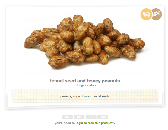
Design Practice II//YCN/Graze//Nutritional Information & Proposed box products.
Due to a lack of nutritional information found for the Graze products online, I have had to source products from the two Graze boxes which I have ordered, which contain nutritional information booklets, in order to be able to source this necessary information. Therefore, a new "set menu" that will be printed inside the lid of our mock up box design will be as follows:


INGREDIENTS// wholemeal and white wheat flour, sundried cherry tomatoes (cherry tomatoes, sunflower oil, salt, basil, garlic, chilli pepper, oregano, citric acid, ascorbic acid) water, rapeseed oil, sunblush tomato pesto (sunflower oil, basil paste [basil, sunflower oil, salt], water, sunblush tomatoes, sundried tomatoes, tomato paste, Italian style cheese [milk, salt, vegetarian rennet], water, garlic), basil, cracked wheat, soft improver (wheat flour, sugar, salt, ascorbic acid), sunflower seeds, yeast, sourdough (water, fermented wheat flour), salt, mono- and diglycerides of fatty acids (suitable for vegetarians)
NUTRITIONAL INFORMATION (PER PUNNET)//
- Energy (kcal) 141 kcal
- Energy (kJ) 591 kJ
- Carbs 13g
- Carbs (sugars) 0.6g
- Protein 2.7g
- Fats 8.8g
- Fats (saturates) 0.7g
- Fibre 1.8g
- Sodium 215 mg
NUTRITIONAL INFORMATION (PER 100G)//
- Energy (kcal) 349 kcal
- Energy (kJ) 1460 kJ
- Carbs 32.1g
- Carbs (sugars) 1.6g
- Protein 6.7g
- Fats 21.6g
- Fats (saturates) 1.8g
- Fibre 4.4g
- Sodium 530 mg


ENERGY// Honeycomb Flapjack
INGREDIENTS// rolled oats, margarine [vegetable oil, water, salt], demerara sugar, golden syrup, honeycomb, milk chocolate [sugar, cocoa butter, whole milk, cocoa mass, soya lecithin, vanilla] (contains gluten)
NUTRITIONAL INFORMATION (PER PUNNET)//
- Energy (kcal) 239 kcal
- Energy (kJ) 998 kJ
- Carbs 30.1g
- Carbs (sugars) 15.7g
- Protein 2,6g
- Fats 12.1g
- Fats (saturates) 3.9g
- Fibre 2.1g
- Sodium 126 mg
NUTRITIONAL INFORMATION (PER 100G)//
- Energy (kcal) 442 kcal
- Energy (kJ) 1850 kJ
- Carbs 55.g
- Carbs (sugars) 29g
- Protein 4.8g
- Fats 22.4g
- Fats (saturates) 7.3g
- Fibre 3.9g
- Sodium 234 mg


HEALTHY HEART// Bollywood blend (nutrient rich, nuts)
INGREDIENTS// gram flour, vegetable oil, salt, chilli powder, natural lemon flavouring, rusk [contains wheat], lemon juice powder [maltodextrin from maize and lemon juice], yeast extract, natural flavouring [contains soya], garlic, onion, yeast, citric acid, paprika, caraway seed, peanuts, salt, citric acid, green raisins, goji berries.
NUTRITIONAL INFORMATION (PER PUNNET)//
- Energy (kcal) 135 kcal
- Energy (kJ) 566 kJ
- Carbs 13.1g
- Carbs (sugars) 5.7g
- Protein 4.4g
- Fats 7.6g
- Fats (saturates) 0.9g
- Fibre 1.7g
- Sodium 152 mg
NUTRITIONAL INFORMATION (PER 100G)//
- Energy (kcal) 455 kcal
- Energy (kJ) 1910 kJ
- Carbs 44g
- Carbs (sugars) 19.2g
- Protein 14,8g
- Fats 25.6g
- Fats (saturates) 3.2g
- Fibre 5.6g
- Sodium 511 mg


WELLBEING// Tropical daiquiri
INGREDIENTS// pineapple pieces, sultanas, natural flavouring, green mango, Sugar.
NUTRITIONAL INFORMATION (PER PUNNET)//
- Energy (kcal) 103kcal
- Energy (kJ) 433 kJ
- Carbs 24.4g
- Carbs (sugars) 22.8g
- Protein 0.8g
- Fats 0.3g
- Fats (saturates) trace g
- Fibre 1g
- Sodium 4.3mg
NUTRITIONAL INFORMATION (PER 100G)//
- Energy (kcal) 309 kcal
- Energy (kJ) 1300 kJ
- Carbs 73.4g
- Carbs (sugars) 68.5g
- Protein 2.3g
- Fats 0.9g
- Fats (saturates) trace g
- Fibre 3.1g
- Sodium 12.9 mg
Design Practice II//YCN/Graze//Hypothetical set menus.
Generating initial ideas and information for hypothetical set menus, to use as nutritional information/ingredient information within our mock up Graze box design.
For the 'Working Lunch' campaign, we are prompting the Graze box for workers, and the working environment- proposing that four key, balanced, nutritional benefits are key to a good working day, and, for employers, harder-working, healthier employees, which, to them results in less sick days!
Below, I have used my research previously gathered on my Design Context blog (see link for more information) to create a couple of menu ideas for the boxes which feature the four key nutritional benefits of (within the workplace) :
APPETITE
ENERGY
HEALTHY HEART
WELLBEING


BOX IDEA I//PRODUCT LIST.
APPETITE// Smoked paprika, garlic & thyme, rustic marble bread.
ENERGY// Orange & Cinnamon flapjack.
HEALTHY HEART// Fennel seeds & honey peanuts.
WELLBEING// Sun dance.


APPETITE// Tomato, herb & provolone cheese rustic marble bread.
ENERGY// Fruit & seed flapjack.
HEALTHY HEART// Born in the USA.
WELLBEING// Bounty hunter.


BOX IDEA III//PRODUCT LIST.
APPETITE// West country cheddar, red onion & chutney foccacia.
ENERGY// Orange & ginger flapjack.
HEALTHY HEART// Bakewell tart.
WELLBEING// Pina colada.


BOX IDEA IV//PRODUCT LIST.
APPETITE// Cherry tomato, basil & puglian pesto foccacia.
ENERGY// Honeycomb flapjack.
HEALTHY HEART// Himalayas & beyond.
WELLBEING// Beach bum.
* I attempted to make the ingredients/products within the box as harmonious as possible... but Graze really don't make it easy...
Subscribe to:
Posts (Atom)