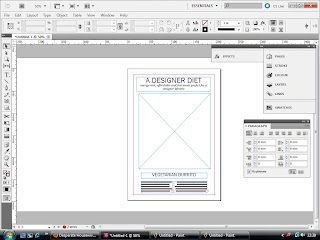
Starting to experiement with various layouts and experiments with type and composition for my designs. At this early stage, it is hard to invisage the layout without the necessary photographed final outcome (to be produced on Wednesday, as I have booked out the entire day in the photography studio!)- looking at combinations of type and layouts which may suit. As I'm looking to print onto tea towels for my major final piece, I have started to design onto A4 formats- relative to the tea towel dimensions.
With no grid structure at the moment (will be developed along with the photography and the natural eye of composition and arranging my paper items) I am designing for a very basic and simple layout- not to overpower the main image in the centre (which will be my "exploded diagram" images of the recipes and ingredients).
Using Bebas Neue typeface- a little too harsh and bold for the papercraft, handmade style...
Franklin Gothic appears to work well, particularly with the Jutus italic I have experimented here for the sub-header, and recipe details. The perfect balance between light and heavy weight, the typeface packs a punch and is aesthetically powerful without being over baring.
Mixing the content on the item- here changing around the recipe with the series header 'a designer diet'- I think this layout is a little confusing and doesn't read as well- dividing up the recipe header and the method. The 'Designer Diet' is definately more suited to being above the main image.
This layout was a little too bottom heavy...too much text at the bottom...needs more balance in the design.
Again, a little confused with the mixed-up content. The title and sub-heading balances out the other items of content when situated at the top of the page.
After playing around with the justification and alignment of type, I actually think the central-alignment works best. Simple, balanced and focusing all of the attention to the centre of the page- where the photographed images will be.


No comments:
Post a Comment