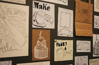
Yesterday, we went onto the exciting step of printing our graphic solution designs onto the cotton canvas tote bags.
On Wednesday, I went to purchase five canvas tote bags from a local craft store (one for each of our designs) and iron-on transfer paper. For the time remaining in this project, this seemed like the most effective solution.
Our group agreed, that under different circumstances, screenprinting would probably have been the most aesthetically effective technique, however, this is very time consuming and costly, and therefore would not fit with our economic ethos.
Both Will and I had used the iron-on transfers with heat transferring methods before, and with enough practice shared between us both, we agreed that despite the often differing results, we would still be able to achieve tote bags that looked professional and fashionable.
Here are our designs post-print:
Stephanie Lawson's design- inspired by the idea that a routine of cleanliness will benefit both your time management and state of mind!
I really liked this design in monochrome, as the fine details have been picked up really well (and think that these details may have been lost among colouring). I am also really impressed by Steph's typography, and think that this variation works wonderfully not only together, but in harmony with the illustrative design to the left.
Simon Cherry's design- inspired by the warming goodness and company that "putting the kettle on" can bring- promoting heartfelt conversation and new friendships.
I love the splashes of colour that Simon added to this- and the overlapping of the yellowish-brown colour in the tea cup, giving it a really original and graphic edge.
Will Cotterill's design- Will's design reflected the high life of a night out on the tiles! Will's idea came from a slight different viewpoint- with a sense of real optimism, with a message which says "it's all good and well missing home, surrounding yourself in home comforts, but the world is your oyster, so eat it all up!"
Again, much like Steph's design, I think that Will's typography really makes this design and adds real character. I think that the solid green colour also works really well here- with a bold design linking back to the traditional bottle colouring aswell.
and, of course, this is my design. I am really pleased with how the design printed out onto the tote bag as the colours looked really vibrant and true to my orignial thoughts and designs.
I went for the white scroll design as oppossed to the brown, as this was not only the majority favourite among other group members, but I think that the brown design took away from the scripture writing, which, of course, is one of the main features of the design.
Unfortunately, I have not yet managed to photograph Yafet's bag design, as it was unavailable at the time, however, I plan to do this early next week, and will, of course, blog it then.
Our tote bag "In the Bag" collection (Yafet's design featured in top, left-hand corner).
Aside from contributing to the planning of our presentation, the image above was my last task towards the products.
From the design inspiration of tutor, Amber Smith, I decided to create "slogan cake cases" to contribute to the contents of our "In the Bag" student survival kits.
These examples show the prototype for cake cases: when the cake is eaten, a lovely little message awaits you at the bottom!
I decided to create a range of sayings from the heartfelt "with love" to the humourous "omnomnom" to suit every mood and personality.
I really liked the idea of these cake cases being used as bonds between new friends, housemates, etc. Not only would it give them a chance to bond by baking with one another, but also to leave charming messages behind to make you smile after your tasty treat!
I genuinely feel very proud of our group and what we have achieved with such little time, and facing some difficult cirumstances along the way. Although often finding ourselves stressed through the week, I can safely say that I know that we all share a real feeling of satisfaction in reviewing the work we have created, and feel that we have certainly made a step in the right direction.
For a self-evaluation to the outcome of our presentation to the rest of the group, click here:


No comments:
Post a Comment