With one week until our final critical analysis presentation, I had to really begin to think about the style and format my typeface was going to be represented by.
From my previous posts, you can see that I quite liked the flow in which the design plan was taking, but not necessarily the finished outcome.
Though I liked the ideas behind my last 'F O N T' design idea sketch-up, it didn't take a mid-project briefing analysis for me to know that it wasn't quite right- the lines too heavy, perhaps too bold, and lacking in any particular continuity through that design idea stage.
However, after a frantic sketching session in desperation to find a new source of inspiration, I found that I already had the basis of my typeface all along, it just needed a few little adjustments.
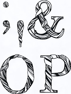
The letter 'P' above comes from my final design idea- very similar to the 'F O N T' letters, but this time, far more subtle- taking greater care over the weight of line, the elegance and flow of the line, and the balance of negative space with shading and colouring.
I was really pleased with the outcome when I tested the technique on various letters and glyphs, as it proved really easy (though a little time-consuming!) to create a different aesthetic, direction of line, etc, for each one, whilst still maintaining the look of a series as was required.
I am really pleased with the subtle difference I made as opposed to having a complete overhaul in the direction in which my typography was taking. I still believe that it reflects many aspects of Chloe's personality traits and interests:
-the bold, classic serif font (based upon 'century schoolbook')
- the series style, consistency and continuity
-monochrome/neutral tones and colouring
-nature-like texture: relating to her rural upbringing, favourite book 'wild swan'
I will now go on to trace my twenty-six letter alphabet and six-glyph series onto a sheet of A1 trace paper and create a name badge measuring 4.5x9cm with Chloe's name.


No comments:
Post a Comment