
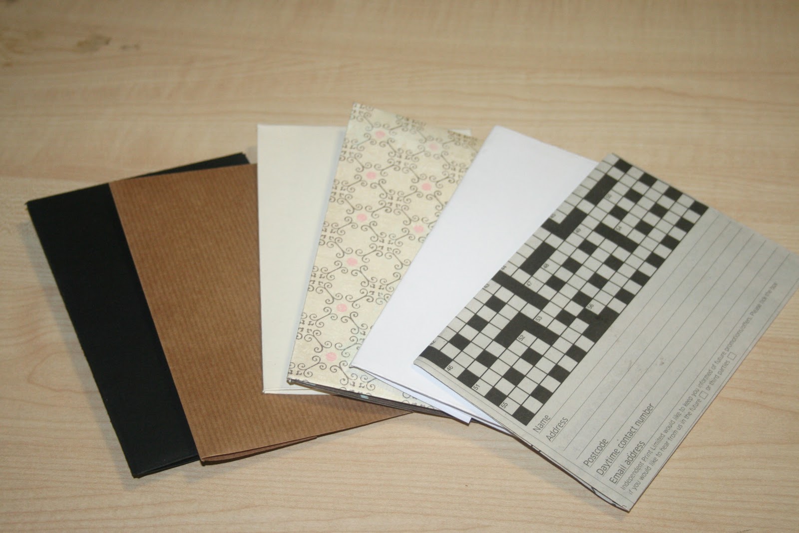
Before I even started to make my design plans, handrawn and through Illustrator, I wanted to get an idea of how my mail shot would be presented- I had an idea of the sort of colours I would use- natural, earthy tones of cream, green and brown, but wasn't certain at this stage.
Therefore, I thought that envelopes would be a good place to start- experimenting with colour, folds, and design. This selection of six are all made in the same fashion, with simple structure, but very different papers- even though they were all relatively simple, it was really interesting to see just how different they looked when in a group.
The ornate pattern, the cream, and brown parcel paper envelopes were my favourites- and now am sure that I would like to work in natural tones- I want to communicate an ecological and enviromental message, and these designs certainly are most appropraite to my theme.
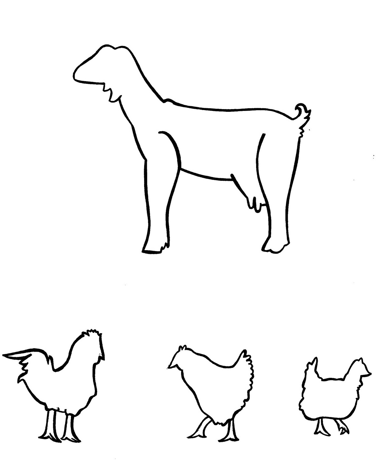
Now certain of the aesthetic that I want to achieve, I went onto draw very basic, crude designs to be developed and digitally rendered in Illustrator- these are some of the "products of purchase" available through the oxfam unwrapped site- goats and chickens...

...medical care, fresh water, and irrigation systems...

...and seeds and plants to benefit the eco-system of the country and families in particular.

Throughout my research process, I had considered many options and directions in which my mail shots could take. One thing I noticed throughout all the beneficary gift schemes that I researched is that many had a "snappy" catchphrase or tag line- such as world vision's "must have gifts" or oxfam's "oxfam unwrapped"- a really clear, bold name which would prove very memorable.
Ideally, I would like my mail shot to have the same effect. I started to think up tag lines, such as "a drop of water for a daughter", "a spoonful of love helps the medicine go down", etc... but the one which I particularly liked, and kept coming back to in my brainstorming was "spare a groat for a goat"- a simple, playful rhyme which gets directly to the point- "donate some money for a goat" !
I thought about aesthetic concepts, and knew that I wanted to keep it reasonably bold and simple- like a great deal of Oxfam design already is, and, of course, considering the scale of the mail shot- it could easily be crowded with over-the-top, fussy design. Therefore, I knew minamalism was the way forward.
After a lot of learning (Illustrator is trickier than it looks!) I traced over my original tree illustration in a deep brown...

...I then started to add green '£' signs in the font 'cooper black' (oxfam's font of choice!) as leaves on the trees- symbolising the catchphrase "money doesn't grow on trees" (apart from this case, of course)...

...and around three hours later, a finished design, complete with oxfam logo, vectored goat, and "spare a groat for a goat" "engraving" in the tree...
...or so i thought.
As usual, through every process, I came to do a print test of the image above (to check that it works not only on screen, but, most importantly, when printed in CMYK) and found that the brown was far too dark for the printer to distinguish, and came up as a very high contrast, jet black.
With the help of a printer technician, we created a swatch test of suitable browns in decreasing tone percentages, until I found the tint that would be most suitable for my design.

The final design, re-coloured in an orange-y, milk chocolate shade, and, after printing, this is far more suitable, printing in a dark chocolate colour I originally expected from the original example of this image.

With one stage of my design complete, I went on to create a net template, (with goat nibble marks included!) the image above a vectored scan of a paper cut fold-up, of which I will have four sides front and back- perhaps with a fold-out poster in the centre?

Here, my original vector design in situe in the scanned template.

Rotated to edit the back fold of the mail shot- a directional link to the 'oxfam unwrapped' website.

Only after seeing the image in situe did I realise how it would work in harmony with the other elements of design around it, and, again how minimalism would work best throughout this design. Therefore, I decided the "nibble marks" on the corners of the mail shot fold page were probably a bit over-the-top and cluttering the image- when I believe that it doesn't need that amount of design detail.
After removing the detail, I think it makes a big difference, and looks a great deal more professional for it.

After a brief, but, of course, helpfull feedback session with tutor Amber and a few of my classmates, we agreed that my mailshot would look best printed onto a cream, or "antique white" coloured paper, with "eco appeal"- therefore, newsprint paper seemed like a good idea- lightweight, recyclable and very affordable.
I scanned a swatch in so, until I print, I could edit the background colour to the same pantone of the newsprint to see what effect the addition of this stock colour would make.

My newly lightened brown colouring completed mail shot, before the newsprint background was added...

...and after.

With all the information correctly lined up and angled on my mail shot sheet, I removed my "guidelines", so they would not be visable in print- creating a much clean, and crisper aesthetic.
With my informative mail shot complete, I will now go on to create my fold-out poster (the reversable side to this mail shot), envelope and mailing list, which will be complimentary to this current design.
No comments:
Post a Comment