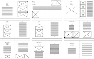
The vector versions of my original hand-drawn InDesign layouts. Before I apply the layout practices into the actual InDesign software, I would like to take the portraiture photograph(s) of Beth (planned for Tuesday lunchtime) and to hopefully have created a hand-quilled typographic header for the DPS.
The five A4 sheets developed from my original DPS illustration design sheets. I feel quite pleased with the basic designs- having good variation and appropriate to Beth's tastes and my perception of her style (which I hope to reflect in the design)- clean cut, crisp and with a bit of quirky charm and character.
My favourite designs were on the last sheet (x9)- which I believe give the best balance between type and image, as inspired by some of the magazine layouts I researched on my design content blog (www.s-wilson1013-dc.blogpsot.com). I will now go on to source the rest of the content for the DPS (portrait of Beth, the final selection of her work I will present, and, hopefully, a handmade quilled header) and then test out these nine final layouts, and others in the InDesign software programme.


No comments:
Post a Comment