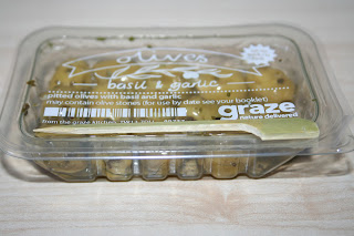
My free Graze box arrived today, horray! A great opportunity to have a closer look at the elements and design aspects that were required to be redesigned for the YCN brief that Charlie and I have decided to take on, as well as trying out a few of their snacks to become more familiar with their products.
As previously mentioned, I was familiar with the company before ordering as my parents used to receive Graze boxes, however, that was around five years ago now, so I'm sure (though my memory lets me down) that many design features may have been changed or altered since this time.
A simple brown recyclable card box, much the same as my previous experiences- with die cut sections to fit in the individual snack pot compartments- however, a few new items that I couldn't remember from previous years- information guides, napkins, and, in this case, an olive skewer- all handy, useful, and informative tools and design extras.
After Wednesday's print session, Charlie and I had discussed the apparent confusion in terms of the design style of the company- not really seeming very consistent- the photography mixed with the crisp vector type, combined with a few more hand-rendered elements. Although each on their own work well, we felt that together it was perhaps a little overpowering, and this was evidenced in my box delivery.
Charlie and I really loved the hand-rendered type, and feel that this could be pushed a lot further in the design- considered and structured to look friendly and fun, yet still formal enough for an office environment, to which Graze boxes are often sent.
Great additional touch with the information book- again, could be more considered and formatted- styles, again, a little inconsistent. Although this hasn't been specified in the brief as something to redesign, it's certainly something to bare in mind and potentially redesigning to sit more with out future redesign(s).


No comments:
Post a Comment