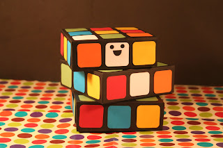
After laser cutting my paper pieces (and then going on to cut the black box nets by hand due to slightly off dimensions and measures...) I went on to put together the photograph to complete the 2D/3D/2D aspect of the project to bring in for the project deadline and feedback from my BAGD peers.
Working simply with two desk lamps, I began experimenting with various camera ISO and lighting settings, as well as composition, angles, and perspective to see what outcomes I could achieve- and how my 3D paper Rubik's Cube would be most effectively captured. Originally, I began photographing with two sheets of black paper to ensure that the bold colours of the Rubik's Cube would stand out in the image. However, this was pretty dull and didn't really adhere to my original plan for a disco setting scenario- the "happy" and "twisted" criteria for the Rubik's Cube were fulfilled, but not the environment in which it was due to be placed.
To try and create more of a disco environment and aesthetic, I used some wrapping paper I had (left over from Christmas)- to reflect a 1970's multi-coloured neon disco floor. However, the clashing colour scheme and the circles/squares felt a little too much in terms of visual assets, and I wanted to go for a slightly more subtle, stylised approach.
After ringing my parents in Thursday's image session, I was kindly sent, on request, some Christmas decorations (!)- in the form of a strand of silver disco ball beads, which I felt would sit well within my proposed disco environment. To reflect the metallic colour palette introduced from these decorations, I went on to spray my black paper silver with spray paint, which, when the light was directed onto it, created a wonderfully reflective, shiny surface which enhanced the colours on the Rubik's Cube brilliantly.
Ideally, I didn't want to have anything other than paper craft assets in my design, which, of course, the plastic disco balls go against, so, perhaps, if I were to return to this project (time permitting) I would work on spray painting polystyrene balls/paper balls or covering with the small mirrored tiles that you would ordinarily find on disco balls.
My final selected image- as chosen below. Pretty happy with how this turned out- the light caught a great metallic shine reflection of the bottom coloured squares- the primary colours really standing out boldly, with the environment of the disco subtly suggested with the "floor" and the disco balls hanging in the background. Of course, plenty more could be done with this project in terms of experimentation- trying to enhance the environment, in particular, to try and give it more of a disco feel. However, reasonably happy for now, and I look forward to receiving feedback in tomorrow's session once I have printed out my final A3 design.


No comments:
Post a Comment