Using the existing measurements of my mailshot presentation box (the net crafted and posted on my Design Practice blog a couple of days ago) I went on to create the slip wallet- long enough to be wrapped around the box, but leaving a sizeable width gap so it can be easily communicated that the slip cover is purely functional, and the box lid can be seen clearly.
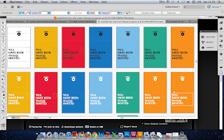
Here, starting in monochrome to get a sense of the design and layout- with the stamped logo at the bottom of the box to add interest, and "you have been cordially invited" on the top- a standard invite message, and also the text found on a wedding invitation in Wes' film 'The Royal Tenenbaums'- geeky links.
Combining Futura Bold and Wisdom Script Al typefaces, again, for visually consistency and style.
Having created my map design (completing this morning) I was actually really fond of the minimal colours- and had a great deal of compliments and feedback saying that this was effective. Originally, I intended to create a mailshot design for each of the six films, however, not only is not time an important factor, but also I feel that doing this would not actively promote the entirety of the festival- potential audience members could miss out on a film/films because of this- and how would I select which film mailshot would go to whom? I think I got too distracted by the idea of the assigned colour palette. Therefore, I decided to make one design for all- playing around with colours. I considered the design (see Adidas logo) where I would create a repeat pattern representing the films on the side panels (yes, at the minute it DOES look like an Adidas logo... but there would be more variation...) though I felt with the variety of visual logo, pictogram and visually representations this could get a little messy.
Using the UK image from my map, I felt this was a simple addition which added interest- and gives a quick and easy representation of where the recipient is being invited to- adding the logo for instant recognition too.
I also added my original 'Address to' panel on the back, of course, now necessary that this will be the mailshot box cover.
Using the two colours (plus stock) worked together quite well- not too much going on, but enough to be eye-catching- and also incorporating some more of the colour palette whilst still being consistent with other existing designs. For now, this will be my final design- enlarged the logo for a larger text point size (more readable) and added the cut out sections in the side, both for practicality and link to tickets. This could look quite good in a satin stock (ice white) but then, of course, I would need to change my Pantone colours from uncoated to coated- need to look into this asap and make a decision (both green and blue here are 60% tints from my original colour palette).


No comments:
Post a Comment