Creating further designs in order to meet the brief criteria for the 'Design is about Doing' Opposites Brief.
I experimented with the plant, cress, to represent life and death- my chosen opposites.
After growing my cress, I decided to lay my paper cut stencil on top to see what sort of effect it created.
I put it into photoshop to edit any damp patches where the leaves had soaked the paper, but I still wasn't happy with the shadows that were created by the stencil overlay.
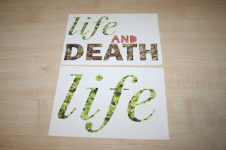
I put my three stages into Illustrator and drew around the type to create a white background on the original photograph- 'life' with the vibrant green, healthy cress...death with the dark brown cress that hadn't been watered for a week, and the 'and' bringing them together for the third image in the other stage of "cress' life"...as seeds.
I quite like the effect that this created, and was quite unusual with the photograph method, and an interesting way to represent stages of life.
However, when I printed the designs, I wasn't overly happy with them- the cartridge paper I had printed them onto just didn't make enough of an impact and show the photographs off to the best of their ability.
When I printed onto glossy paper, the results were much better. Unfortunately, due to stock shortage I couldn't print all of the images- and the ones that I could were only in an A5 format.
(The one A4 version I managed to print- the photographic quality looked rather good this size!)
Given more time, I would have liked to printed onto an A4 scale, which I believe would have been the most appropriate scale for both the poster and book deliverables that the designs would could have been printed in, had I of had time to enter the competition brief with these designs, as oppossed to my original ones.
Whereas the designs aren't as successful as I originally imagined, it was fun to experiment with new methods. Note to self- use a less pungent material next time. Cress stinks.


No comments:
Post a Comment