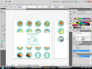
Following through one of my original design ideas- making a recipe swatchbook with meals for breakfast lunch and tea with ingredients from the "top ten" energy-rich foods from my list.
I used several artboards to create front-cover designs (inspired by the belly bands I had already created for previous items, to keep a visual consistency), which allowed me to see all the designs quickly and easily, comparing which was most effective.
In the end, I decided upon using the last design (that I have posted here, bottom image) as it didn't affect the images, with cropping or overlays and gave as much information as possible- as well as keeping the style consistency, appearing to have a belly band around the middle of the book.
Now, I will go on to create the rest of the book in a similar visual concistency, and aim to produce as much as possible before the final crit tomorrow.


No comments:
Post a Comment