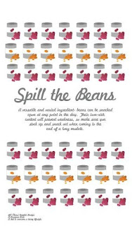
Started to experiment with repeated pattern designs- taking influence from surface pattern in a repeat print. Looks okay, but having something a little more random, and more spotaneous-looking would work better I think.
Trying an alternate repeat, here with kidney beans and baked beans- already, the variation adds a lot more interest, yet the colours remain consistent which works well. Not too sure about the type now though- the more I look at it, the less I like it- looking a little to 1950's Americana.
My finished vector designs- given more time, I probably would have made them more intricate and embellished- though maybe the restrictions will be a blessing! I think that they work well enough- of course, not what I originally had in mind for the project, but I am happy enough with the comprimise I have made at this late stage. I think that the images are all reasonably clear and distinugishable to their origin also.
And again, but this time on the aqua PANTONE colour I had refrenced in my previous blog post- I think the colour works quite well with the pastel tones of the products- and despite the fact that there are a lot of colours "going on" (which would normally bother me, to be honest)- these seem to work okay. The style of the illustrations, as well as what will be consistency of the typeface should work well as a series in creating my designs...more to come very soon!


No comments:
Post a Comment