

Today, for the first time, I had a lesson in the principles of typography and typographic design. Though quite a shock to the system, from this afternoon, I really feel that I have learnt so much in a short space of time.
Until today I, admittedly, really hadn't realised how much there was to typography- to how great an extent you can disect in, break it down, and examine every little factor.
After an initial brief induction in the morning, we were then sorted into our blog groups to work on categorising typographic fonts we had gathered for our task two summer project.
We pooled together all of our examples of each letter (twenty times each member of the group for each of the twenty-six letters for the alphabet!) and then decided to focus on one of the letters- of which the numbers of examples appeared to be the greatest.

organising letters into piles (picture taken by Sarah Roberts)
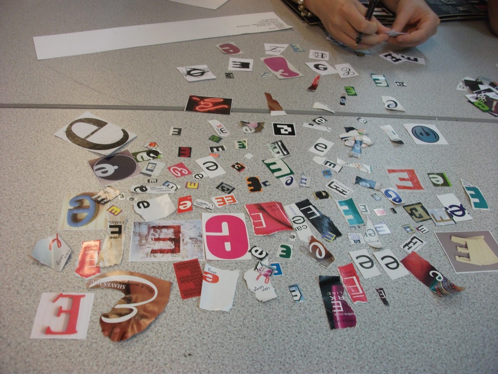
organising our selection of 'E' letters (picture taken by Sarah Roberts)

upper and lowercase 'e' organisation (picture taken by Sarah Roberts)
We then discussed typographic categories these could be organised into, and concluded upon areas such as:
serif (with flicks and angles at the end of letterforms- most commonly used in handwriting to start the form of a letter, orginating from Roman stone type)
sans serif- ('sans' from the French word 'without', "without serif")
italic
bold
hand-rendered
digitally-rendered
contemporary
traditional
point size/scale
decorative
the ten that we were then told were most important categories or factors to consider were:
- light (the thickness of the letterform)
- regular
- bold
- italic
- font
- scale/point size
- serif
- sans serif
- uppercase
- lowercase
- the factors in which all typographic fonts should be considered and sorted into.
We then returned to a briefing with our tutor, Fred who explained many other factors of the true anatomy, principles and structure of typography (which have further details in the photogaphs i have shown, taken from worksheets...), along with a glossary of terms, for all the slightly bemused and confused amateurs to typography like me!...


We then went onto the initial step to our next week-long project, to be continued...
No comments:
Post a Comment