Monday 28 February 2011

Design Ideas: Life.


Initial Ideas and Experimentations into the concept and aesthetic representation of life through design...


Butterflies, symbolic of "re-birth" and grace, freedom and spirituality.
A simple design, but I think effective in conveying my theme, however, I'm not sure how I would integrate it into a poster design?
Potential for further development. 


Experimenting with gradients- as the 'life' gets brighter (an increased number on the opacity scale) it represents the emergence into life- it gets brighter, better and you become the best version of yourself with each new year of learning, experience and wisdom.


The same gradient experiment as before, but this time introducing motion to my type by overlapping- I quite like this design- subtle but clear- life travels quickly- and then stops abrubtly.

Another vartiation on the "development of life"- a swoop down, increasing kerning the lower down the list. Again, I like the idea, but the excercution is not half as good as it could be- it feels a little too self-aware- I think that the kerning would need to be decreased and a little less obvious- the transition of condense to widley-kerned is too great in this design.


...A little more subtle, and far more suitable spacing, however, it doesn't feel "quite right" yet- a little too bland and safe.


...Such a simple edit, yet I much prefer this design to the previous two; combining methods in previous experimentations.


...Experimenting with the application of colour- increasing the percentage of the opacity as the 'life' list travel through the colours of the spectrum- intensifying in the depth of colour as the kerning increases- fitting to the concept that "as life, and you, grow- life gets more colourful."

Again, I feel that the concept was far stronger than the execution- feeling that this style looked a little too simplistic and child-like.
If I were to pursue this design idea, I think that the typeface would be far more effective in sans serif- looking less confused and far more bold and modern.


...Another simple edit, on this occasion using the bloat tool to manipulate the shape of my O's in 'BLOOM'. I originally edited the entirety of the design, but it looked far too over-done and processed. I think that this simplistic style was far more suitable- but could certainly benefit from a few more flourishes.


Although I feel that I have a slight insight into the development of my 'life' designs, I know that I will need to develop my ideas a great deal more before I can cement a final design outcome.
To resolve this confusion, I will now go on to draw further thumbnail designs (to go toward my thirty thumbnail designs- a mandatory requirement for this project) to generate more ideas.

Design Ideas: Death.


Initial experiments with design ideas based upon the "opposites" theme of death, using Adobe Illustrator software to create vector-based poster designs.
One of my initial ideas, representing death in a reincarted-esque way, the butterfly symbolic of a new beauty and freedom. I like the concept, however, I'm not sure how appropraitely this would visually communicate and convey death to a mass audience- perhaps a little too expressionate and spirtuality-based?

  
Again, more simple designs- representing the fade into death with decreased opacities and gradients. I liked the image on the right (which was developed from the image on the left)- perhaps I could reflect the word 'life' as opposed to duplicating 'death'?- reflective of how, despite opposite, the two are very naturally found together- almost unable to "be" without the other.


Here, I began to look at motion in type- conveying the sharp slum into death, when it drops with a "sudden thud." Quite a simple, yet I think effective idea. Again- it's really about being able to effectively communicate this message, as I'm not sure that this would automatically be the association with the design. Perhaps try to manipulate the angle or choose a more suited, gothic text to aesthetically represent death and the "fall into death"...


...Again, a very similar idea- this time manipulating the text a little more- creating the concept that "death is like a dripping tap"- the effects ripple out, just as a droplet would upon calm waters.
I preferred the concept but really dislike the design- I think it looks particularly cheap and almost child-like in design. Using this typeface as a standard for this experimentation phase, it's clear from both this, and several other designs, that it wouldn't be suitable in this design context.


Death- Falling off your perch. Another similar idea, this time an angular fall with a gradient decrease down the page. Again, I prefer this design- not too fussy, but the slight angle of the type makes it a little more interesting.


Another initial idea... I really liked the concept, emulating the shape and lines of a heart rate monitor, with the straight line finalising the image, symbolising death, but despite this just being a very quick sample, I wasn't very happy with the results. I think that the image was too sparse to be representative of my context, and would work far better if seperate words, and not sentances were angled.

Enjoying the development and experimentation with quoatations and famous sayings, I decided to narrow down my information to a more simplistic form- on this occasion, using the famous 'nevermore' from Edgar Alan Poe's 'The Raven'- using raven vectors around the type, as if lurking around, waiting for the death or 'nevermore'. 
Despite being a fan of the striking contrast of black and white, I felt like the image looked a little plain...

 
...A slight alteration, this time adding a textured antique paper-esque layer. I think that for this style, I should have made the black detaling brown as the mixture of tones is quite muddy-looking, quite unattractive with seemingly little style or direction.

..Another variation of the 'nevermore' images- I have really enjoyed experimenting with textures and layers- definately something I will consider when creating my final poster designs- it's inspiring how such little effort and editing can completely transform a design.

Opposites: Choosing my theme.


At three o' clock, after an afternoon brainstorming ideas, we were asked to re-group so we could make a final decision as to the theme of our week-long 'Opposites' project.
Some of the ideas I had for visual interpretation were...

-Sweet and Sour (Creating a series of posters inspired by foodstuffs- using type as image to create interesting food-like imagery).
 -Half Full/Half Empty (a visual representation of optimsm and pessimism).
-Life and Death (a great deal of potential- perhaps looking at how closely the two are infact linked- the optimsm of death, reincarnation, or perhaps medical? data referencing, type as image, etc.)


I decided upon (despite perhaps seeming a little morbid!) the theme of...

'LIFE AND DEATH'

inspired by the depth of visual possibilities available.
Also, I cannot think of anything which is MORE opposite than the earthly state of being to...nothingness. I really hope this tests my range of design outcomes.

methods and approaches I will consider...

-Digital typography
-Text heavy, quotes? data?
-Texture, image
-Medical, religious, expressionate, thought-provoking?

Opposites: Visual Experimentation.


Obviously just some really quick examples exploring the idea of basic typography with the theme of 'opposites'- looking at magnetism (opposites attract- the classic colours of red and blue poles of magnets), contrasting colours, quotes- "the ink is black, the page is white" (opposite of black and white), up and down (motion opposites), and pessimism and optimism (cup half full, cup half empty).

Whilst these examples were very, very quick, 1-minute mock ups it has definately helped, along with my word brainstomring developments to generate a stronger, more defined idea of the work that I would like to produce- working with bold and minimal colour, perhaps using text and image?
I am, as I believe I have shown throughout many of my past projects, hugely interested and appreciative of language- semantic, wordplay, poetry, prose, quotes- i would definately like to encorporate this into my design- perhaps creating something informative aswell as aesthetic? 

Written Examples of 'Opposites': Brainstorming.


*Chalk and Cheese
*Opposites Attract
*Sweet and Sour
*Glass half full and Glass half empty
*Sweet and Salty
*Sweet and Bitter
*Spicy and Bland
*Sun and Moon
*Dead and Alive
*Attack and Defense
*Bad and Good
*Beautiful and Ugly
*Best and Worst
*Blunt and Sharp
*Bright and Dull
*Thick and Thin
*Dusk and Dawn
*Export and Import
*Fail and Succeed
*Lost and Found
*Happy and Sad
*Laugh and Cry
*Land and Sea
*Long and Short
*Narrow and Wide
*Me and You
*Poetry and Prose
*Rough and Smooth
*Tame and Wild
*Vice and Virtue
*Shout and Whisper
*Breath in and Breath Out


With so many possibilities- I will now go on to 'visually brainstorm'- perhaps creating a firmer idea as to my potential limits and boundaries within my own capabillities of design and software, how far I can push those limits, and create a successful outcome with the one-week deadline.

Book Works: Final Outcome.


With my visual language live brief design for 'Book Works' complete after around two weeks crafting, I am really pleased with the results I have achieved- perhaps for one of the first times, my design exactly how I had originally imagined, and intended.
The images below show my progression through the print stages...


A quick CMYK inkjet print test in A4 on my home computer. Because of the subsitution of the text (Gill Sans to Gill Sans > Gill Sans MT) everything was un-aligned due to the wider kerning. 
A quick tester (largely to see how the colours in print as oppossed to screen)- no real use, but a worthwhile experiment- good to see that what I originally thought about A4 scale (that it would be too small) was correct. 


Concerned that I mightn't have time to print onto the stock of my choice (cartridge paper) due to restricted digital print room opening hours in time for the final crit in tomorrow's session, I decided to print onto A3 printer paper in the mac suites. However, when I went to double-side print my A3 sheets from the Illustrator programme, unusually, it was cropping 1/3 off from the sheets on one side. 
With help from a technincian (who assured me that this was an ongoing problem they were facing when double-sided printing), I saved my file as a PostScript, and then opened it in Preview, whereupon I would be able to double-sided print without this flaw..

...However, once I had printed, I discovered that saving the file and opening in Preview did not group my ammendments to the image on that day (for example, above, the Mandarin script symbol was still in 0.75pt, as I originally drew, as oppossed to 0.35, as it should have been.).
 

Fortunately, there was an oppurtunity available to print my designs in the digital print room- after a test run of one of the booklets, I noticed a flaw with the positioning of one of my Bengali script symbols- after staring at the monitor for hours on end, this was easily missed, definately a lesson in checking, checking, and checking again(!) when it comes to typo's- I'm very glad I printed a test before my final batch of ten!


...A double-sided print booklet, sliced and folded into the hot dog format. 


And the final product, complete with belly binds, as designed by tutor, Amber.

I have really enjoyed this live brief visual language project, and feel like my software skills have developed considerably as a result of it. The excitement and anticipation for the "live" factor of this brief has certainly spurned me on, and driven me to meet the deadline, and, hopefully, exceed it.
I've recieved really great feedback, and I really hope that it is well met at both the final crit tomorrow, and the internation book crafter's fayre next week at Leeds University!

A Designer's Voice: Module Briefing.


Context

Graphic design represents a constant dialogue between the client lead brief and the individual voice of the designer. Design problems, content, audience, and context are often given, however, resolutions often stem from your own interests, passions, obsessions and opinions. It is a recognition of and investigation into these personal concerns that help you to develop an individual voice within the creative industries. 

This module offers you the chance to focus on the content on your own choosing and will allow you to explore a range of practical workshops in digital and print based media. The development of your ideas will be supported by crits and tutorials. You will be expected to demonstrate an increasingly individual and independent use of appropraite workshops, working methods and time management.

Brief

You will produce a body of work in response to two overarching briefs:
BRIEF 1: 'Design for Communication'- A series of short studio briefs that focus on the generation and resolution of graphic responses to specified design problems (66.66%)

BRIEF 2: 'Speaking from Experience'- A set brief that focuses on a personal response to an audience centred brief (33.33%)

MODULE BLOG: The practical development of your work will need to be supported through appropriate contextual research, reference and on going evaluation evidence through notebooks and your blog. You can either set up a new blog and link it to your existing one or tag relevant enteries on your exsisting blog with 'OUGD103'. If you need advise on this element of the brief, please speak to a member of staff.
PROJECT FILE: You will be expected to document and evidence your project management skills through the use of personal timetables, statements of intent, and other appropriate methods of time management. Comprehensive records of your own organisation and reflections shoudl be thoroughly documented on your Design Practice Blog and labeled with the OUGD103 module code.

Preperation/Research Suggestions
-See additional handouts-

Briefing Date: Monday 28th February
Interim Crits: See Noticeboard
Studio Deadlines: See Noticeboard
Submission Deadline: Thursday 26th May 2011- 1pm

Design is about Doing: Letter, Word, Sentence, Paragraph.


The Brief

Go to: 
A new typography book being published by HOW books is now accepting submissions. Selected work will be featured in Letter, Word, Sentence, Paragraph due for release in early 2012.
Letter, Word, Sentence, Paragraph will down down the study of type into a systematic progression of typographic relationships using content, examples, interviews, and real life inspiration.

You are required to submit a series of three TYPOGRAPHIC posters that focus on the word "OPPOSITES".
Tone of Voice
The tone of voice should be appropriate to your message, the context in which it is intended to be read and the audience to whom your work will be delievered.

Background

You need people to see your work and the essence of graphic design is communication. There is no value producing work for it to be placed in a draw. Often the best work or best ideas are the ones that people have seen. You must get use to distributing your work at any available oppurtunity.

Remember design is about doing

This is an oppurtunity to visually and conceptually exploit every possible angle of your ideas. We are expecting a visual feast of ideas before you even consider resolving the problem.

Deliverables

A visual investigation into "opposites"

A mimimum of thirtty "thumbnail" possible typographic poster design treatments and supporting design development work.

The three posters you intend to submit.

Sunday 27 February 2011

Logo Design.


A playful new logo design for my blog- a quick re-vamp to express my style and character, and design more- playful, fun and bold.

Saturday 26 February 2011

Creating my Hot Dog Fold Booklet.


After all my intial research and design preperation, I have now come to the final stages of my design- ready to create my page layouts ready for print in the adobe illustrator programme.


The image above shows my final design layout for my hot dog fold book- complete with correct alphabetical order, the name of the language, the written translation, phonetic translation, the countries in which the languages are spoken, and the place where the image of the native country will be- exactly how they will be printed.


I began on the inside sections of my book (naturally, they would take less time- and would give me good practice in using the pen and trace method for my large pull-out map poster). I re-traced the eight countries I was focusing on, and went onto re-produce them as vectors.


For my colour palette, I was inspired by the vintage map hearts that I had previously cut out- I really like the slightly faded, yet traditional colours that I felt would help to achieve a timeless look- suited for all age groups and genders.


Although I had originally wanted to use only the colours from my papercut vintage map hearts, I found that a few looked a little dull besides the bright white background (which, when printed, will be off-white cartridge paper)- therefore, I went into the swatches and chose a deep blue colour from the 'Earthtone' section- perfect for my natural and organic colour palette.


I then went on to fill in all other necessary information on the page:
-the country name
-the written translation of "i love you"
-the phonetic translation of the writing
-the countries in which you would say this phrase
-the vectored image (country of origin)


I then completed the page with the folio (page number) in the bottom right-hand corner, the same blue for consistency and within speech marks- of course, being the main theme and focus of the booklet.


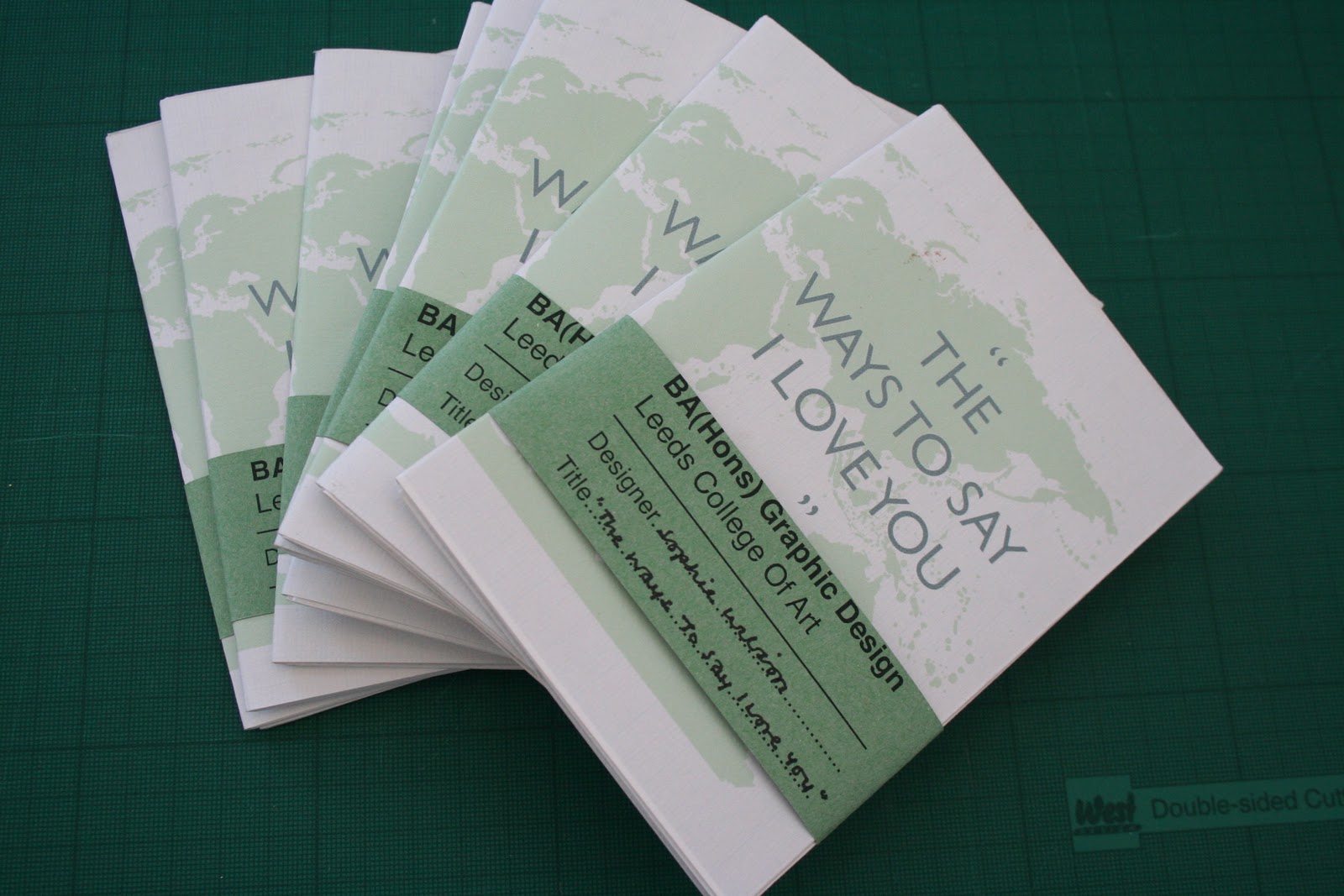
My first three countries completed. I liked the consistency of the pages- through colouring, alignment etc, though the content density would always be slightly different- dependant on the amount of the countries that spoke the particular language, a factor I really liked about the designs. There is certainly a consistency and flow throughout the book, but with each page still looking new, and, hopefully, maintaing interest throughout.


Despite the fact that the majority of my designs were quick and easy to produce, a few posed small difficulties- mostly, the Bengali and Mandarin page. As oppossed to "copy and paste" or typing many of the written translations, the adobe programme didn't recognise some of the Bengali or Mandarin characters, therefore, I had to reproduce them for myself- importing them into photoshop, to then print screen and paste back into illustrator, and use the live trace tool to re-create them. I was very pleasantly surprised by the results- the stroke size being not too difficult to emulate, and with a steady hand on the live trace tool, I hope that the symbols look naturalistic and blend well into the text around them.


Although all of my other scans were easy to use and create vectors from, I was finding my A0+ world map illustration (which I had scanned in parts onto an A2 scanner- the largest I had accesibility to!) very hard to align. Therefore, I looked for various stock images I could trace from to create my world map poster in the inside of my hot dog booklet. I found several, and attempted to trace these, but I found there wasn't half as much detail on them as I would have liked.
Therefore, I finally concluded to use the image above- with a lot of detail, and I liked the circular vectors, used to represent small clusters of islands- creating a bit more of a contemporary feel than minute detail- a style which I hope to use in my own design.


Around mid-way through my trace, it suddenly dawned on me that, for some reason, the map I was tracing from had no Antartica illustrated- therefore, I finished my trace of this image, and then found an image of the Antartic to trace, and scaled and placed this appropraitely into my design.


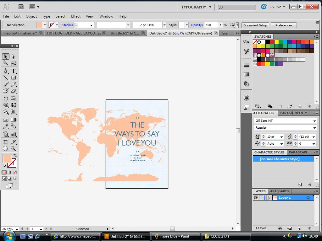
After completing my world map and colouring it the same mint green as my inside land vector images, I added the typographic title (I chose Gill Sans- see design context blog for further reasoning!) in the same blue colouring I had used within my booklet. For the title, I added a white outline to ensure it stood boldly from the vectored map image, and drew in a heirarchical focus.

I liked the design, but felt it looked a little plan, and could benefit from a little more interest, thus, I decided to experiment with different backgrounds...


After trying out all of the different textures as both backgrounds and overlays, I found the last scan, blue grid paper, definately looked the best- working with my colour scheme and the vintage- like style I had found and admired in my research.


Lowering the opacity of the grid paper background to 45% certainly helped- a lot less "in your face" now- much more of an enhancement as oppossed to detracting attention from the content.


After a comment from my partner "that green is a bit geography teacher" (despite his father being a one-time geography teacher, this didn't sound like a positive), I felt it a good insentive to play around with colours a little.
I liked this slightly brighter green, after comparing I felt that this looked far fresher and eye-catching, whilst still having a "classic" look.


...but you can get too much of a good thing! A little too bright in my experience- not a great colour with the blue writing (which I was admant to keep).


...I quite liked this colour, though felt it was inappropriate for the content. Perhaps (stereotypically) looked a little male-orientated, and people would normally associate blue on maps and throughout cartography with the ocean- so not a natural choice that people could automatically relate to.
As this product is part of a live brief, being made with the intention (and hope!) of sale, I certainly don't want to alienate my potential customers, and, as we all know, more often that not, people DO "judge a book by it's cover".


...again, another flawed experiment. Perhaps a little too feminine this time.


With all of the elements for the "language" side of my hot-dog fold booklet complete, I created a red border around all of the images, and placed them onto an A3 spread to arrange them as they would be printed (in these screenshots, some of the text is out of line, but that is because on my home computer, the font I intend to use is unavailable- and has chosen another variation of Gill Sans which has slightly wider kerning- of course, this will be altered and captured pre-print).

During this stage I had to calculate the correct pages sizes and proportions (particularly in the centre pages where my designs are half scaled to fit two per page)...
-Total dimension of hot dog fold booklet when unfolded: 420x297mm
-Dimensions of hot dog fold booklet when folded in half (horizontally): 420x(approx)150mm
-Dimensions of each leaf: 105x150mm
-Dimensions of each leaf divided by two (for centre spread): 105x75mm


I then removed the red-box lines, though some of the images were ever-so slightly unbalanced- with headers, titles, folios, etc, which needed aligning...


...the finished product (with home computer font settings).


With the languages side of the hot dog fold booklet compelte, I went on to finalise the world map poster design. Firstly, by adding the grid background (again, I felt the light green colour looked a little lost against the bright white background)...


...to map the eight countries I would be focusing upon, I decided to once again use colours from the 'Earthtone' swatches- all similar tones which would work in harmony together, yet in very different colours to be easily distinguished on the map.


...Left-aligned with their specific countries, acting as a key for the map.


...the final product!
I'm quite pleased with my final design, and after many hours staring into a computer, and a twinge of RSI, it feels good to know that my ambitions for the project have, I believe, been fufilled. The design is quite different to my usual illustrative style, but I have really enjoyed experimenting and researching this info-graphics style, and have certainly kept my interest maintained with a love of cartography and geography.
I print these double-sided A3 designs on Monday, ready for project hand-in on Tuesday, and just hope that the book-buying public like them too!