Saturday 30 April 2011

Speaking from Experience: Yahoo Answers Research.


In attempts to gauge further responses as to people's intial thoughts about what foods and drinks help restore energy and avoid tiredness, I asked the following question, which prouduced these answers...


I will now combine the various sources of feedback and opinions I have recieved with nutritional and factual based sources to find which foods and drink really are most suitable to restore energy, developing my project to inform the first year Graphic Design students about which diets will really help them in the first year when tackling long working days, and even longer working nights!

InDesign Type and Grid Session: Magazine Preperations.


Sourcing my two magazines for Tuesday's Type and Grid session with Lorenzo- a high end magazine with a feature on recipes, and a more low-end, cheaper magazine with a feature on recipes...

 A feature from home, living and the arts magazine, 'Oh Comely' issue five, March/April 2011. 
A reasonably new and refreshing London-based publication, 'Oh Comely' has a youthful and independent feel- consistently generating witty and light-hearted articles with a wholesome and homely feel. 
This article based on porridge recipes around the world is laid out in a very crisp and clean-cut style, with lots of minimal space and set grid structure ensuring that the magazine looks chic and stylish- also very well composed photographs, with a good source of light- ensuring that the magazine looks of very high quality.


This recipe for cauliflower cheese and bacon "the comeback of comfort food" is from "celebrity & style" magazine 'Now', the issue from 14th March 2011- when not sold as a multipack (as this issue was) the magazine costs £1.40- £2.60 cheaper than the magazine 'Oh Comely' (as featured above), meaning that the low-cost that the magazine prodives needs to be subsidised by advertisements- as shown above. Although this is not one of the most extreme "low end" magazines, this shows the aesthetic differences caused by lower costs- cramming the magazine with information and detail- not clean and crisp like 'Oh Comely'- therefore producing something that is a lot less inviting to read, as your eye manically darts across the page, with the only direction of focus being hierarchical text, pt sizes, colours, etc.

InDesign layouts: Vectored.


The vector versions of my original hand-drawn InDesign layouts. Before I apply the layout practices into the actual InDesign software, I would like to take the portraiture photograph(s) of Beth (planned for Tuesday lunchtime) and to hopefully have created a hand-quilled typographic header for the DPS. 


The five A4 sheets developed from my original DPS illustration design sheets. I feel quite pleased with the basic designs- having good variation and appropriate to Beth's tastes and my perception of her style (which I hope to reflect in the design)- clean cut, crisp and with a bit of quirky charm and character.

My favourite designs were on the last sheet (x9)- which I believe give the best balance between type and image, as inspired by some of the magazine layouts I researched on my design content blog (www.s-wilson1013-dc.blogpsot.com). I will now go on to source the rest of the content for the DPS (portrait of Beth, the final selection of her work I will present, and, hopefully, a handmade quilled header) and then test out these nine final layouts, and others in the InDesign software programme.

Type and Grid Image: Cakes and Recipes.


Collecting source images for the type and grid sessions on the next two Tuesday's in my afternoon workshop lessons with tutor, Lorenzo.


A collection of twenty-five photographs I will bring to the Tuesday type and grid session with Lorenzo- with a selection of delicious-looking recipes that would be well-suited to a high-end magazine article. To me, it was most important to collect really well-photographed images, with clear and crisp focus.

Friday 29 April 2011

Speaking from experience: Primary Research.


Asking friends and classmates what food and drinks perk them up and boost their energy...these were the responses I recieved:

*tea
*jambalaya
*cake
*lucazade
*biscuits
*chocolate
*cup of tea
*coffee
*porridge
*chocolate
*rose lime cordial lemon juice
*coffee
*tea
*coffee
*chocolate
*suagry/syrupy latte
*coffee

Generally, I found these responses to be themed around caffeine and sugary foodstuffs. Whereas these are undoubtedly popular, I will now go on to follow a more scientific and nutritional route to find out which foods and drink have proven effects on increasing energy levels.

Thursday 28 April 2011

Opposites brief: Choosing my Typefaces.


Now persuing a new direction in the way of cress-growing, I have decided to choose typefaces which I think both represent the chosen words 'life' and 'death', but also a bold enough type to be distinguishable in the growth- having sown my cress seeds through a cut stencil of the letters...


For 'life' I wanted to choose quite an elegant and graceful typeface- whereas the 'death' typeface would be far more blunt and bold. Justus Italic felt appropriate, not being too decorative to completely clash with the 'Death' design and therefore not sit well as a design series.


I then went on to experiment with the 'death' typeface, to see how it would sit with the 'life'- and choosing Gill Sans MT as the 'and'- a relatively neutral typeface, with fine width acting as a balance between the curvature and elegance of the 'life' and bold, sans serif style of the 'death'. 

The three typefaces I chose to experiment with for 'death' were (from top) Bebas Neue, Century Gothic (with -60 kerning), and Franklin Gothic Book. I felt that the second, Century Gothic looks best and feels like the most appropriate representation- bold without being excessive, with a heavy weight, creating a darker and more aggresive aesthetic. I will now go on to print these designs on an A4 format (at least, as a starter- if I have time, and the experiment is successful I could go on to up-scale), cut out the type as a stencil and then sow the seeds- photographing the seeds in stages- the 'and' at new seed...the 'life' at it's "peak growth" and "death" when the plant is wilting, having left it unwatered and with oxygen restrictions.

Hopefully, this time the type will be a lot more representative and hopefully a real learning lesson and test of experimentation for me- what the first year of my course really is all about!

Speaking from Experience: The plan of action.


After today's workshop experience, I feel as though I have a much firmer idea about what I would like to execute for the brief, and feel prepared for the explination of my ideas for the first concept crit on Friday 6th (whereupon I will present a concept, context, and method of delivery board).

My ideas thus far...

-research the types of foods that give you energy, make you feel better if you are tired or lethargic (lack of sleep)- "the designers diet: grub to make you feel good"- a handy guide for new students for how to feel at their best and keep themselves healthy.
-research food stockists in the local area- making in specific to the course- the best sandwich/smoothie/pastry shops, etc.
-research what scientifically improves attention, healthy skin, etc.
-research what my peers eat to perk themselves up.
-photograph foodstuffs.
-illustrate foodstuffs- hand drawn and vector.
-create paper craft versions of the foods- photograph for posters, leaflets, postcards- animate items for stop motion.
-distribute print-based media to local shops, around uni- SU, canteen, in plan chests, first day info pack.
-distribute online/web-based media on blog/website/facebook/twitter/USB stick/DVD-ROM.


Really excited to start with the project, creating some prototype designs for my crit on Friday, where hopefully the ideas I've designed so far will be strong enough to persue onto a final project.

Speaking from Experience: Concept Development II.


After our first concept development session, we then went on once again to break down each of the five points into a futher five points.
Although this an extreme method of working to a brief is quite new to me, I found it very interesting (if a little mind-numbing)...I feel that this way of working has given me a much firmer idea of the project I want to execute, and my confidence in the brief is far greater than before.

My further breakdowns of the problems and soultions with methods of delivery/addressing the audience are...
COPING WITH LACK OF SLEEP

*pixelation about prioritising, sleeping patterns and overcoming tiredness
-USB stick in welcome pack
-put on LCA website
-set up a facebook group for graduates 2014
-send a DVD in the post
-play video on the first day of term

*infographics posters about food with the highest sugar count
-hand out in morrisons/local supermarket
-print onto plastic/canvas shopping bag
-put in LCA "welcome pack"
-stick up in GD studio
-unipol/accomodation "welcome pack"

etc...

Really, this excercise was for thinking about how we could present our designs and concepts to a the new students, effectively and clearly. More brainstorming to come soon!

Speaking from Experience: Problem Analysis and Rationales.


Having planned for five potential problems, and then five solutions for each of those problems we had a lot to choose from from our concept plans. Out of the five problems, we chose our two favourite- we felt that we could develop most successfully and widely, and then a design solution for each of them to go on to write two rationales...
THE BRIEF (...what is the problem you intend to solve?)

-how to organise your working life whilst at university-

WHAT DO YOU NEED TO COMMUNICATE? (...be clear and specific)

-i will demonstrate a clear and precise timetabling and organisational method to help new student prepare their time and not to be too surprised when multiple briefs are given in a couple of months time!-

WHY DO THEY NEED TO KNOW (...the concept for your problem)

-i will demonstrate a guide to advise the new students as to what they should be prioritising with and spending their time on- preparing them for the year ahead-

WHAT WILL THEY REPSOND TO? (...will they see/watch/buy/wearing it etc...?)

-i will create a "mind map" series- an illustrative diagram cross-section of the brain- divided into sections with important info written into the sections. produced on posters, booklets, leaflets-

WHERE DO THEY GO? (...how will they access/recieve/discover etc...the resolution?)
-can be distributed among the students on the first day of uni along with yearbook prospectus/stationary packs, sent via UCAS, etc-

**** 

THE BRIEF (...what problem do you intend to solve?)

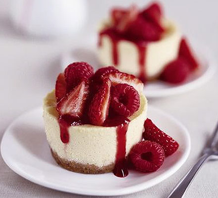
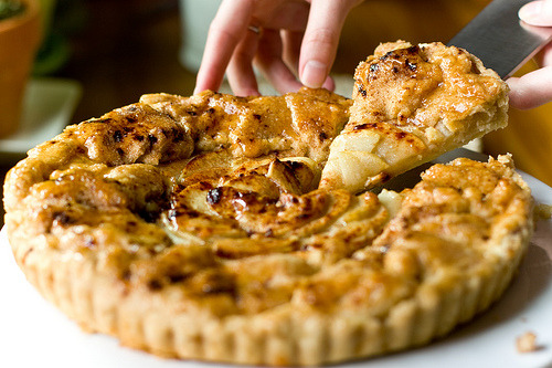
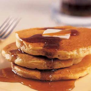
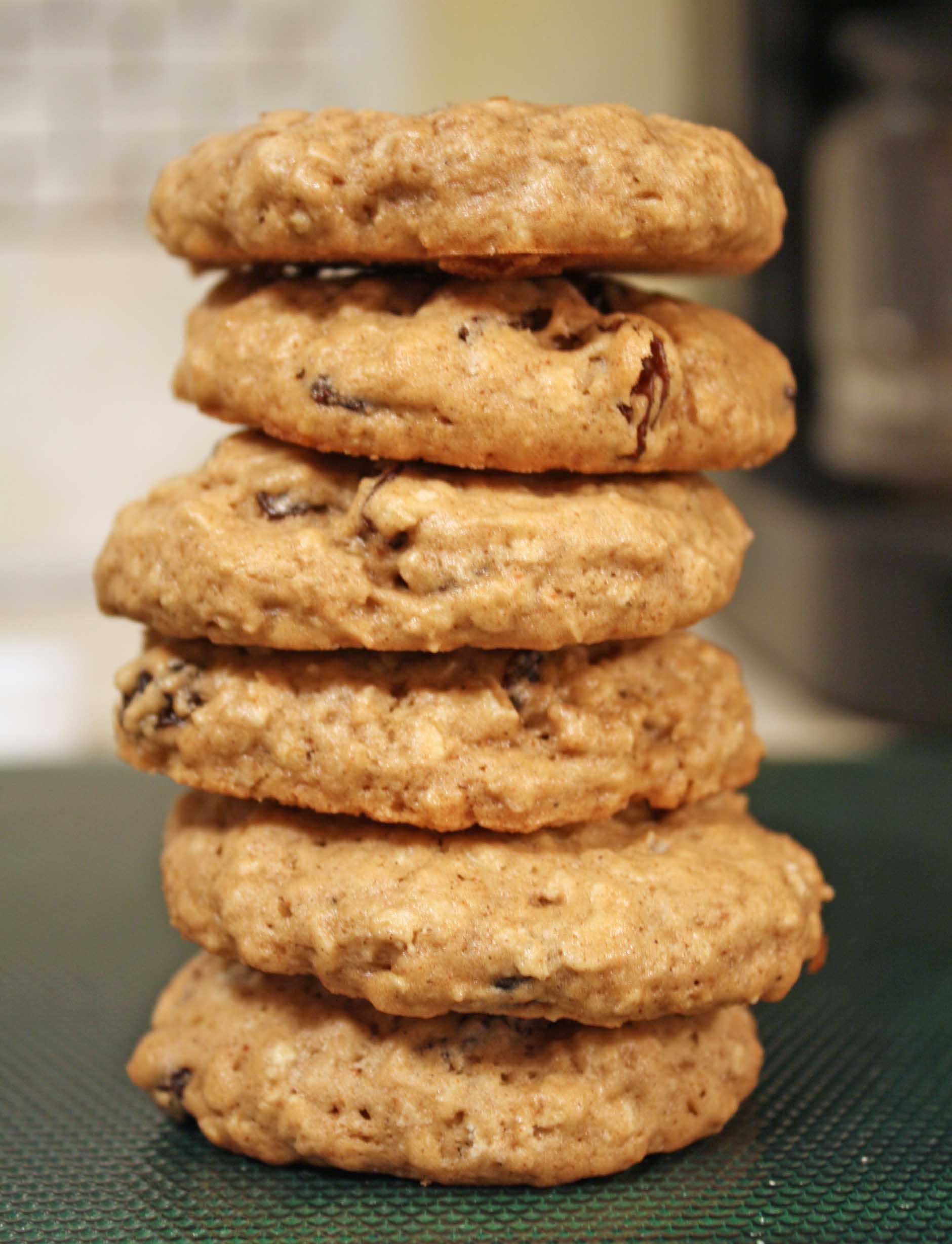
-how to cope with the lack of sleep- food and drink for every emergency situation and make you feel good- food and drink to perk you up- living a healthy lifestyle-

WHAT DO YOU NEED TO COMMUNICATE? (...be clear and specific)

-i will communicate simply and visually tips on how to live healthily with the demands of the course- how to best live with these stresses and lack of sleep in a sensible and suitable manner-

WHY DO THEY NEED TO KNOW? (...the concept of your problem)

-the concept is a guide to what sort of food and drink they should be consuming in their hour of need- what foods, in the long run, will become their new best friend and which you should avoid at all costs- 

WHAT WILL THEY RESPOND TO? (...will they see/watch/buy/wear it etc...?)

-i will produce a series of visual responses to the brief- a paper crafts animation, a photographed instillation, and a series of posters (which, hopefully could also be reproduced as books and other forms of print-based media...)-

WHERE DO THEY GO? (...how will they access/receive/discover etc...the resolution?)

-through a variety of sources- USB stick welcome pack animation, posters handed out on the first day, leaflets in SU/around the canteen-

****

Generally, I felt quite happy with my ideas, but of course, they could do with a lot of tweeking and alteration- along with a new point of view as a critique. Fortunately, we then went on to swap briefs with a partner, mine being Luis, and gave each other both written and verbal feedback which really helped me to define what was working, and what could be improved upon...

FEEDBACK FOR 'HOW TO ORGANISE YOUR WORKING LIFE WHILST AT UNIVERSITY'
FEEDBACK FOR 'HOW TO COPE WITH THE LACK OF SLEEP'

*is it possible to have a healthy lifestyle when you have to live with such issues?
something i know you have had to deal with perhaps more than others and is also massively relevant to what most students experience, aka you have a great knowledge about.

FEEDBACK FOR 'HOW TO ORGANISE YOUR WORKING LIFE WHILST AT UNI'

* both solid briefs. this one in particular is very you, clear concise and organised.

I felt that Luis was far more enthusiastic about the 'how to organise...' brief, particularly as this would benefit his life, admittedly not being very organised and structured with his work.  Whereas I like this idea, I just feel a little more enthusiastic about the "sleep food remedies" as it is something i have personally experienced, and after talking to members of the group, has seemed to effect most people at one time or another. 
Inspired by a conversation with Chloe saying "Get over tiredness by downing a pint of coffee!" the food idea came about, almost like a lunchpack of survival for the day, with a playful and humorous twist...

"A desginer diet"...a title both fitting to our work practice and the sense that it is a very fashionable a la mode "designer" diet. I feel I could have a lot more research and ground work for this brief- sourcing information about food shops in the local proximety to uni, the tasties sandwiches, the healthiest smoothies, etc...I could make it really personal to the course, and find out what other group members say helps them through the day. 

I'm now pretty sure this is the brief I will take forward- lots of experimentation over the weekend to be done!

Speaking from Experience: Concept Development.


Working in small groups (mine being alongside Beth and Chloe) we discussed our ideas that we had generated for the brief since Tuesday's briefing with Fred. It was a really great oppurtunity to hear one another's ideas and how we were viewing and approaching the brief so far, and fun to hear about the topics and concepts raised.

Most importantly, It felt really good to have someone listening to your ideas who would respond honestly- what they felt would work, and what wouldn't work quite so well, as well as talking about our experiences as newbie first years- and remembering how we felt at that time to achieve the most from the brief.

We then went on to break down our concept problems, and how we could possibly tackle them... the 5 I chose were:

-how to cope with the lack of sleep
-organising your time and juggling briefs
-missing home, friends and family
-controlling your budgeting/spending efficently
-not knowing anyone-how to make new friends

and this was how I divided them and broke them down into finer detail...

1. how to cope with the lack of sleep

* make a pixilation animation about how to prioritise sleeping patterns and overcoming tiredness.
* make infographic poster about foods with highest sugar count- keeping you buzzing!
* make booklet about effective remedies and how to sleep well.
* screen/digital print onto bedsheet/duvet cover about effective ways to get to sleep.
* make a photographic poster series- "the decent into stress"- from a healthy portrait to a tired, exhausted image. complete with info/advice text.

2. organising your time and juggling briefs

* make an online/interactive timetable guide: an hour-by-hour management guide.
* make a "mind map" poster- cross-section poster of the brain divided sections with important priorities and points you MUST remember.
* time lapse animation about the fast pace of uni and how to keep up with it (sound bite voice over)
* make a poster series about how to de-stress (with multiple briefs) and most most effectively.
* make animation about work "piling up" (busy desk- literally filling up) with voice-over about how to reduce the workload.
3. missing home, friends and family

*make a papercraft animation about how to keep in touch- snail mail, phone, email, etc- make the items out of paper and animate.
* animation- kinetic type spoken as a phone conversation- with people from the course's view of what moving away from home felt like.
* hand written/drawn animation about how to write home and keep in regular contact- voice over as pen writes on the page.
* write a poem about how to be independent and take care of yourself- create a voice over to animated hand-drawn type.
* video about what people from the course have found most difficult about moving away from home- link in the "eBay ad" out of context language link style.

4. controlling your spending/budgeting effectively

* infographics chart design posters about how to make your savings grow at uni.
* papercraft animation about savings "don't let your money go up in smoke!"
* infographics map guide with highlights of the most affordable places to shop in leeds: divided into categories: clothes, food, music, design materials, etc.
* booklet with highlighted guide to the building societies and banks in leeds- where you can save £, info about ISAs etc.
* poster series about how to save money on your food shop- buying when deals are on, TINS!, market etc.

5. not knowing anyone- making friends

* pixilation animation about first day etiquette and body language- how to avoid coming across as a raving looney.
* write and record sound bites of limericks- people's views on one another and how to avoid alienation.
* illustrative booklet guidde to positive and negative body langauge.
* concertina booklet about easing into the course and gaining confidence with your peers.
*  pamphlet stitch book- great "one liner" quotes and ways to introduce yourself.

Type and Grid Lesson Preperation.


Important info and things to prepare for our next two Tuesday sessions with Lorenzo in type and grid lessons...
FOR TUES 3RD MAY

-Bring both a high-end and "low-end" style of magazine (one of each)

Choose a theme which features in both- wedding dresses, cake making, motor sports, etc.

-ALSO go online and find pictures from the theme I have chosen (around 20 in total)

FOR TUES 10TH MAY
-Bring in all InDesign brief work done so far- thumbnails, both hand drawn and digitally rendered.

Wednesday 27 April 2011

Speaking from experience: Limericks.


I decided to have a quick go at writing some poetry to potentially take forward for the 'speaking from experience' project- perhaps recording as sound bites and developing into a video or animation. With a moment of inspiraiton, I decided to write quick odes to tutors Fred and Amber...

If there’s one thing to know about fred-
Don’t arrive late or you will dread
The guilt and the grief,
For missing the brief-
With the certain threat to go,
Unless you buy him a packet of haribo.

Although it was a very quick two-minute piece it wasn't quite right, and I felt that it needed the structure of the traditional AABBA structure to make the rhymic beat "bounce" more (as limericks have a tendancy to be boppy, and roll off the tongue)...though getting that bit in about haribo was obviously essential...

If there’s one thing to know about amber-
She’s a sucker for many a terrier,
Poodles, Collies and Setter-
No animal is better,
But her favourite’s the golden retriever.

No proof that Amber's favourite pooch is a golden retriver- but heck, for the sake of a two-minute limerick, I hope I shall be forgiven if I am wrong! I think with the rhymic structure this one worked much better, and although very simple, they were quite fun to put together. 

Perhaps, If I were to continue with this for my brief I could get people to write down their experiences on a certain theme (people from the course, that is) then transform them into limericks for a video on animation piece...fun experiment!

Speaking from Experience: My Own Embroidery Work.


A couple of examples of my embroidery work when I was focusing on textiles and surface pattern work whilst at college (oddly enough, there wasn't a graphic design module for our pre-FMP or FMP projects- boo!). If I were to re-create an embriodery style now, I would like to have a go at creating something far more deocrative and image-based, my main interest at oppossed to type. 

Unlike most people, however, I really don't mind the amount of time it takes (I found the bottom jumper took around fifteen hours to handstitch- eep!) as I think I am quite naturally patient and very determined to "get the job done". 

A possible root to go down, and a decorative style with a lot of various aesthetic outcomes.

Opposites Brief: IMPRESS WITH CRESS!


(Cressed to Impress: Day III)
 
 In yesterday's briefing with Fred, we reassessed the OUGD103 module aims and percentages for each project and task. With the 'Opposites' brief and 'Communication is a Virus' brief making up 66.6% of the module mark I started to feel pretty worried. Whilst I don't think either brief that I executed was awful, I don't feel very happy with them either- recieving mixed reviews on both and a conclusion that I didn't really answer the brief.
Whilst between blog posts this afternoon, I looked at the cress growing on my windowsill- a personal project to see how cress would grow in templated forms- and then it struck me (not literally...)...cress>living thing>living thing has to be born, live, and then die, perhaps I could manipulate my own personal project into one suited for this brief? Creating stencils to grow my seeds and photograph them in their states of change?

This could be a really fun and unique way to view my project- and using something a little more creative and abstract than my usual Illustrator brief, which could hopefully bring a little more variety to my work, and, even if I don't suceed with this task, evidence that I really wanted to amend my outcomes, and make it as successful as I possibly could.

PLAN OF ACTION:
-Find suitable typeface for 'birth' 'life' and 'death'- testers.
-BUY MORE CRESS SEEDS!
-Buy planters/suitable boxes to photograph
-Start growing ASAP- only 4.5 weeks left until module hand in! Eeep!

Speaking From Experience: Primary Research- My Own Animations.


Two very, very simple animation samples of what I have created so far for various projects whilst at Uni- the pixilation would be along the same process, but much harder- with 24 frames per second, a half-a minute piece (probably a realistic time for the final piece to be made for deadline) therefore taking 720 frames- twice a full load of images on my Canon EOS 350D! Ha- busy times ahead if I pick this!...