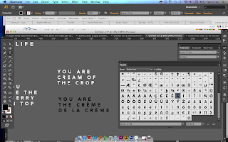
Moving on from the calligraphic, typographic style (as discussed in a previous design post), I decided to work with vector-based type to compliment the existing 'Write About Love' branding design for the YCN/UK Greetings Brief.
I started experimenting with the type used in the brand logo (Avenir) and exploring weights, particularly Heavy, and was really pleased with the bold, modern and clean aesthetic of the design, which I feel would particularly appeal to my retail audience (18-30 year old women with young families/careers with disposable income).
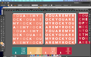
Looking at developing a range of unique and personalised message (trying to avoid overly-romantic cliches) to work to the range of "all types of love" cards (friendship, marital, parental, etc), deciding on the consistent theme of 'You Are...' as the beginning of the message to make it seem more direct and emotive.
Exploring colours, I took to Adobe Kuler (a fantastic resource for colour matching), looking at themes of love, playfulness and "ice cream" to communicate a sweet, playful and romantic feel to the designs, whilst still looking modern and preferably not too feminine, as I want the range to appeal to a wide range of potential recipients.
Through starting to explore use of colour, layout and content, I've started to develop a range of products which I feel will work strongly together in a bold, simple, yet considered way.


No comments:
Post a Comment