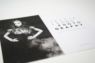
Again, some quick mock ups of the photographic B&W/Greyscale business cards which I pitched to Jessie in regards to ensuring that the visual brand is bold, consistent and represents her striking photographic portfolio, specialising in fashion photography.
Personally, I'm really pleased with the outcome, and think that the business cards, in relation to the coloured cards, are far more consistent and could be introduced throughout both print and digital collateral- creating a 'hover' colour/greyscale on the website, for example, and introducing colour within the magazine portfolio with B&W on the covers, visually conveying the imagination and professionalism, balanced through the use of colour.


this is just beautiful business card you have shared..i might need something like this when use it for the design of plastic business cards..thanks you share it with us.
ReplyDelete