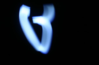
Inspired, and suggested, from my tutorial with Phil earlier in the week, I decided to work on some simple light experiments for potential logo inspiration for the University of Leeds Ballet Society. By simply using the light from my phone and adjusting my DSLR to a low shutter speed, I got some really interesting examples of movement and form- also looking at potentially developing letterforms, as shown in some of the examples below with 'b' and 's' characters formed from the movement in the light.
It was definitely a fun experiment, but I feel as though the society are looking for something far more clean and uniformed, and can be applied to a range of print collateral, so the current design path I'm following is perhaps more appropriate than this abstract one, though this is definitely a method of experimentation and design development I'll look to in future projects, as it was really enjoyable to try something a little different.


No comments:
Post a Comment