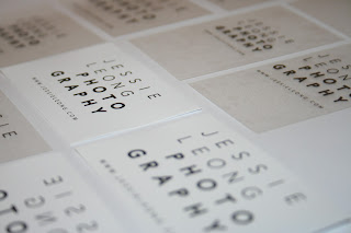
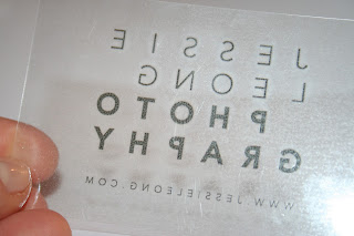
A good morning experimenting with various printed outcomes for the branded business card for the Jessie Leong Photography live client brief.
I printed onto both transparent and white sticker paper, in both landscape and portrait orientations on the traditional 85mm x 55mm size stock to ensure that the business cards are as flexible and accessible to distribute as possible.
The concept for the aesthetic of the brand worked on by both Jessie and myself, was to develop a clean, contemporary type- driven logo design that would reflect the brand identity of bold, focused, contemporary fashion and portraiture photography. To emulate the use of film within her work, I decided to experiment with acetate for a two-sided, reflected type design (as you would get with a film negative image), but also experimented with a solid white background as the design would be seen on digital/screen based design, possibly on letterheads, etc. Both designs seemed to work well, and I'm really looking forward to hopefully getting the opportunity to meet up with Jessie later on in the week to discuss feedback and content for the progression of the designs throughout the project.


These are beautiful cards you have shared..thanks for sharing as i need these design for plastic business cards
ReplyDeleteThis variety of plastic cards commonly known as clear cards are most attractive and captivating among other types....
ReplyDelete