Friday, 30 November 2012

Design Practice III//Jessie Leong Photography Watermarked Images.


Finally got round to completing the watermarking and uploading of images for the Jessie Leong Photography Facebook Page.
Feeling really good as all of Jessie's work is finally starting to come together, creating the entire package of both formal and informal brand outcomes which I feel will really successfully promote her design practice if used well, and hopefully will lead her onto even more design opportunities, commissions and experiences as a result of promoting her work in such a way.


Design Practice III//The Perks of Jessie Leong.


One of the major perks of working on a photographer's branding is that they'll ask you to model for a photoshoot, just because.

Just going to leave these here...


Design Practice III//Jessie Leong Magazine/Portfolio Order.


Really excited to have received an email through this morning from Tina at DPS Printers (aka my new best friend) saying that having been put to the front of the print queue, the portfolios were already printed, bound and now in the post- with a free copy, just because.

A really fantastic company, with great prices, communication and service- I think I've found myself a working relationship for life.

Design Practice II//Jessie Leong Photography Custom CSS.


Starting to make developments for the customisation of the CSS and template layout for Jessie Leong's website, looking at using the Elena Kulkovia existing template and editing it to the specific existing branding and design used for Jessie's work.

We decided to use Cargo as an easy and economical way of Jessie to keep up to date and upload her work with ease (after I teach her the ropes of the site) as well as having another platform to network and communicate with others.

Working on replicating the bold black type on white design with a photography-heavy (of course) layout and content I hope to have the designs completed by Sunday to have resolved Jessie's project, just waiting for the delivery of her portfolio and to finalise the watermarking of images to upload to her social networking media.


Design Practice III//Jessie Leong Photography Envelopes & Sample Pack.


Today I took a trip down to digital print to print out both sizes of the proposed branded envelopes and the sample pack put together yesterday evening for the Jessie Leong Photography product outcomes and brand deliverables. 

I was really happy with the print of the envelopes on a brilliant white bulky newsprint envelopes, but had a real challenge with the sample packs printing onto the white card, with the weave of the paper exposing a great deal of white through the black print. Although the design works well, the stock just isn't appropriate, despite being positively strong and sturdy. Instead, we're going to compromise with printing, again, on a bulky newsprint for a much thinner paper wallet which will still, hopefully, do the same job, but avoid the aforementioned problems- planned to print in my next booked session a week today in digital print.


Design Practice III//Jessie Leong Sample Pack Postcard Prints.


Yesterday, much to my delight, the sample pack postcard prints for the Jessie Leong Photography branding brief arrived, helping to expand the product outcome range, as well as being a step closer to finalising the project brief (with just the Cargo development and uploading of watermarked photos to her online/social networking presence to go!).

I was really pleased with the colour quality produced, and was amazed (particularly with the purple smoke Becky Connolly fashion shoot) how vibrant and rich the images were with the gloss laminate finish of the cards. I'm looking forward to showing Jessie the prints later on it the day, and, as ever, I'm sure she will be just as excited and enthusiastic as I am.


Thursday, 29 November 2012

Design Practice III//Updated Design Board Template.


The redesign of my submission boards, this time using the typeface Avenir in both Light and Heavy weights, which has been a consistent feature through my design briefs for this module, particularly in the Jessie Leong Photography branding brief.

As I feel a personal rebrand will soon be underway, and as I've tired from over-using Helvetica a little too much, Avenir feels like a really clean, geometric type which is well suited for my hopes and plans for the future of my design portfolio.

Hopefully with the balance of photographic imagery (still yet to come!) the images/boards will look really clean, professional and considered.

Now to do the work to be featured on the boards...

Design Practice III//Notes from 261112 Briefing.


Notes from today's briefing with programme administrator and course leader, Fred Bates.

//

NOTES

Year Book Briefing

* Progress crits- Wednesday and Thursday morning (sign up).
* Cross off name for photography workshop.
* GF Smith coming in for industry talk, week on Friday. Joe Gilmore this Friday.

Final Crit Next Week

* Should be seeing boards and all work to submit for the brief.
* Make sure all blogs are up to date and detailed accordingly.
* Bring in all work to date.
* Assessment briefing, 1PM, Monday.

TYPOGATEAUX 141212

BAGD YEARBOOK 2013

* 5th Annual BAGD yearbook.
* DESIGN TEAM: Sophie Wilson, Claudia Griffin, Kirsty Cave, Kirsty Alderson.

* See eStudio postines (at a later date).

PRODUCTION

* Portfolio
* PDF
* Limited Edition Flyer/16pg (economic)

NATIONAL PUBLICITY
(When will I, will I be famous?)

FINAL MAJOR PROJECT 
Considerations

INITIAL PITCH

* Summary and understanding of the programme- reflect the diversity of work produced.

CONCEPTS

* Creative outcomes which reflects ourselves individual, as a design team, and as a degree group.

MARKETING TOOL

* Catalogue version (£3,500 budget, approx)
* Goes out to employees, industry, VIPs, etc
* Downloadable PDF from website

MUST BE APPEALING TO INDUSTRY AND PROFESSIONALS

* Practically conveys a sense of design and professionalism.
* Corporate marketing consideration.
* What makes this course year unique? How do we communicate this- innovative, current.
* How is the content delivered?
* Flooded image photographs, interactive, innovative, interesting content- BE ENGAGING.

IDEAS

* BA (Hons) Graphic Design: The Class of 2013.
* "All for one and one for all".
* Caffeine.
* "Work Hard, Play Hard" (Hard working, innovative, creative).
* "No Rest for the Wicked"

* Have a visual concept/message.
* Student interview with DPS of work?

REQUIREMENTS/IDEAS CONTINUED...

* 210mm x 210mm
* Square format
* £2,500- £3,500 budget (approx)
* Approx 500 copies (around £4 per unit)
* What are we getting out of it by going to print? Consider concepts.
* Embossed greyboard? Colourful, relating to work/play?

WORK HARD/
PLAY HARD
* With complimentary tea/coffee sample...?

STAY SHARP

SUBMISSION

* Short pitch (5 minutes)
* PDF boards
* Submit mock up formats if appropriate?
* See past publications for page numbers, but NOT style
* Cover and spine must be titled

DIVIDE INTO SECTIONS?

* Type
* Image
* Editorial
* Print
* Digital

Etc...

Type
v. The .....

* Write about the caffeine choice average/quotes of the chosen discipline.

DELIVERABLES

* See eStudio brief
* BAGD yearbook continues on to the End of Year Show, New Blood, etc.
* 3 x A2 proposal boards
* Mock ups of deliverables
* Cover design, fonts, colour ways, visual concepts, etc- 4 spreads (different), etc.
* How will we represent members of the course?
* Submit by 9th Jan (Wednesday, 2PM).
* Fashion, Fine Art and Inter. Dis (All definitely want printed publications, other courses may want PDFs).

Design Practice III//University of Leeds Ballet Society Hoodie Mock Up.


touchline.co.uk

A mock up design of the hoodies being ordered for the University of Leeds (Leeds University Union) Ballet Society, with a white embroidered logo design onto purple fabric, with white zip and piping.

The hoodie shown in the image is taken directly from the site, Touchline, who are producing the hoodies, and after initially considering a grey heather design, I think the purple will intact work really well, and be a really strong brand colour to use throughout the designs.

Reasonably gender neutral, working with their existing online presence colour scheme, and emoting traditional colour associations with ballet (in terms of monarchy, royalty and aristocracy which purple is traditionally reserved for- such as in the Royal Ballet logo).

Having bartered the delivery date down from the 11th to 7th December, I'm really looking forward to seeing the designs and create something really quite unique and different for my personal and professional design portfolio.

Design Practice III//University of Leeds Ballet Society Hoodie Order.


Sent through on Tuesday, the invoice for the order of the University of Leeds Ballet Society hoodies through Suffolk-based embroidery company, Touchline.

Although the order was a little smaller (around 1/3 the size) than originally discussed and intended, Jamie at Touchline was still really great and helped us out with a free delivery and no additional art work costs (usually £30), as well as (putting up with me...) bartering down the delivery date from the 11th to the 7th, so, hopefully, I should have time to photograph and print the designs on boards for my module submission, as well as being able to submit the hoodie itself as a working proof for this point.

Really looking forward to seeing the textile prints coming through, as something completely new for me in regards to my portfolio and experience with design printing.

Working with live briefs has really opened me up to new experiences in my professional development, and now feel much more confident when it comes to talking to printers and discussing my wants and needs for project deliverables. So happy to have been able to learn something new, and, hopefully, continue to do this through my FMP work too.

Design Practice III//LCA Prospectus Concept Pitch.


Much to my delight, a couple of days ago we received an email from LCA Marketing Manager, Chloe Ackroyd, informing us that the deadline for the prospectus pitch has been extended to the 11th January, which would give me a great opportunity to work on developing my initial concept and designs over the Christmas break, something that I felt wouldn't necessarily be achievable within this module considering all of the other substantial and additional briefs I would be working on.

Along with writing my finalised draft for my dissertation, it's going to undoubtedly be a very busy "break"!

Design Practice III//YCN & UK Greetings Print Outcomes.


The finalised results of my YCN/UK Greetings brief, with a product range including x4 designs (in various colours) with greetings cards, envelopes, gift wrap, gift tags and x2 sizes of bags (small and medium).

Considering the (very!) quick turn around of the designs, I'm happy with what I've achieved in a short space of time, and feel that as a product range the designs will look really effective together, and, hopefully, product shots will be achieved over the beginning of next week after being printed and constructed on Monday on a range of specialist papers- particularly looking at achieved a high-end, satin/gloss finish to the designs that would be well suited in a retail environment.


Design Practice III//YCN & UK Greetings Design Developments II.


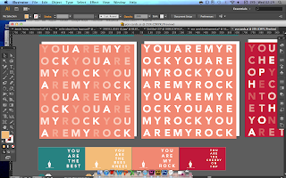
Happy with a style I've been working towards so far for the UK Greetings/YCN 2013 brief, I started working on more design outcomes, particularly looking at gift bags and wraps to work consistently with the card retail range in a bold and minimal design style that will, hopefully, look really effective when photographed as a group range with a focus on bold colours and typography.

Using existing bags I purchased from Paperchase earlier in the month, I went on to create nets of the gift bags (in a small, square format, and a larger, rectangular bag) to be printed in digital print in my next print slot on Monday.

Over the weekend I'll source and purhcase appropriate satin stock to print, along with tissue paper (for photographic purposes!) and silk/reinforced ribbon to be used as handles for each of the bags.

Really looking forward to seeing the outcomes of the bags, and feel quite positive about my future design developments in regards to my packaging design, which, in the past, has been an infamous nemesis.


Design Practice III//YCN & UK Greetings Design Development.


Moving on from the calligraphic, typographic style (as discussed in a previous design post), I decided to work with vector-based type to compliment the existing 'Write About Love' branding design for the YCN/UK Greetings Brief.

I started experimenting with the type used in the brand logo (Avenir) and exploring weights, particularly Heavy, and was really pleased with the bold, modern and clean aesthetic of the design, which I feel would particularly appeal to my retail audience (18-30 year old women with young families/careers with disposable income).

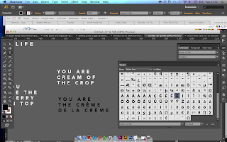
Looking at developing a range of unique and personalised message (trying to avoid overly-romantic cliches) to work to the range of "all types of love" cards (friendship, marital, parental, etc), deciding on the consistent theme of 'You Are...' as the beginning of the message to make it seem more direct and emotive.

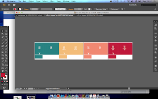
Exploring colours, I took to Adobe Kuler (a fantastic resource for colour matching), looking at themes of love, playfulness and "ice cream" to communicate a sweet, playful and romantic feel to the designs, whilst still looking modern and preferably not too feminine, as I want the range to appeal to a wide range of potential recipients.

Through starting to explore use of colour, layout and content, I've started to develop a range of products which I feel will work strongly together in a bold, simple, yet considered way.