
(Important Notes, Hint, and Tips from the afternoon module...)
-Learning about the make-up of type: components, weights and size, style.
-the definition of the 'x-height' is the height of the lowercase letter, as defined by the 'x'.
-optically, the capital 'o' will always look a lot smaller because of the curve at both the top and baseline- despite infact being the same cap height (capital uppercase)/point size.
-The two most commonly used typestyles are:
Roman
Italic
Technicals: Points, Pica's (a pica is ALWAYS 12 pt), Linefeed, Interline, Spacing, Leading.
-On a leading block, there may, for example, be a 10 pt type size, with a 4pt spacing beneath for print legibility purposes. This would be referred to as "10 on 14 pt"... and written as "10/14pt".
-The total is 14 as 14pt between topline to baseline: 10 + 4= 14 pt.
-The term 'leading' literally derives from 'a piece of lead', the more spacing you want to have between the lines of text, the more lead that you would add.
-Pica, which measured 4.21mm, was divided into 12 equal parts called 'points', which makes the size of a point approximately 0.35mm.
-Pica is a constant, ALWAYS 12pt.
-Some fonts have the same point size, but a different x height- this impacts the visual size optically, often fooling us to think that the font may be smaller in point size by comparison.
-Ligatures: Designed to make two letters more readable in print and publication with the use of spacing (quite traditional in style, not commonly seen in modern publication).
USING TYPE
-Readability is key!! CAPITALS are much harder to read than lowercase letters, as lowercase have a more varied character form, more recognisable and distinctive- we read the shapes of words- not the words themseleves.
-Typefaces and fonts can also be changed to add character and personality with simple selection.
-The type used on motorway font road signs is consitent for recognising words and shapes with ease.
KERNING is the space between two letters (e.g. 1 958...1958)
TRACKING is the spacing between numerous letters (e.g. world...w o r l d...)
REVERSING OUT is reversing the colour out of a background- with white on black (with delicate fonts),tracking out is important to control the bleeding of the ink.
-Font spacing (and leading) is important for legibility- but everyone will have a personal preference. In a selection including: 8/7, 8/8, 8/9, 8/10, 8/12, my personal favourite was 8/10- this was clear and legible without looking irregular.
-8/7 is a MINUS LEADING- which means that the text is excessively cramped and over-lapped.
-SET SOLID- the term for when there is no leading- e.g. 8/8, 9/9/, 10/10.
----
When using type, consider...
-Appropriatness
-Impact
-Meaning
-Unfamiliar words set in ornate typefaces can be confusing.
----
Tones:
-Half-tones can change the hierarchy, and what you decide to read first.
-SCALE, FONTS, COLOUR, and TONE will all influence the reader.
----
Layout:
-Application: bible, cook books, manual, novel, script, magazine- manual's folio: page number.
-Grids
-Conventions, Paras, Columns, Justified, Line Length, Range Left (Alignment), Range Right.
THE GRID IS YOUR FRIEND.
Hint: In newspapers, such as the guardian, you will often find lines that sit in between the gutter between grid margins.

We then went on to discover where grids would lie in newspaper publications. Luckily, Kirsty and I had a G2 supliment (as part of The Guardian) and was very legible and clear, therefore, resonably easily interpretated.
However, we certainly made a few mistakes, and when lining up the pages to see the extra layers of the grid concealed within other pages, that our measurements weren't entirely accurate.
How we had measured our grid (on both pages) was applying the range left grid line to the right also (despite the text not being range right aligned), therefore, when I go on to measure a grid for myself (in my next task) I will measure from the gutter line in the paper, giving me a far more accurate, and paralell grid lining.

I felt a lot more confident when marking out this page, with focus on deciding where the gutters would lie on the grid without more obvious features such as photographic images or justified text boxes as a guide.
Here, I drew the lines from the range left bodies of type, and measured the width to the guided lines on the newspaper (which, in the Guardian, fall in the middle of the gutter)- and then adding the line to the right opposite (with a 2mm distance between the lines on either side).
Using a rather clever piece of kit (as presented to us by Lorenzo), I used a measuring guide to determine the point size of particular sections of the text on the page (with the guide ranging from 6pt-14pt on scale).
The records are as followed:
'Hadley Freeman' journalist's name header...14 1/2pt (over 3 picas [3x12pt] leading- unsure as to the pt size without a large scale!)
"1. We will all stop thinking..." (sub header) 7pt/9pt.
"I could discuss how..." (bulk text) 7pt/8pt.
It was really interesting to see the difference in the leading between the different sections of text on one sheet of the paper alone- it is definately clear to me now how effective the hierarchical methods of displaying type can be- the most important headers (of the articles) not only being in a bright red colour, but also with a wider leading and tracking to ease readability.

Going on to develop and manipulate my own grid and page layouts from exisiting publications, I pulled out the magazines from my bedroom shelf, being my favourite quarterly, 'Oh Comely'.


Despite finding some really interesting layouts and well-considered grid styles, I found that the minimalist style of the magazine would be a little too narrow to experiment with, so looked a little further afield, and found this page in the Boots health and beauty magazine...

With an interesting mix of type, photographic images and a reasonable quantity of text, I look forward to experimenting and manipulating it's layout for the last excercise in experimenting with grid and type...

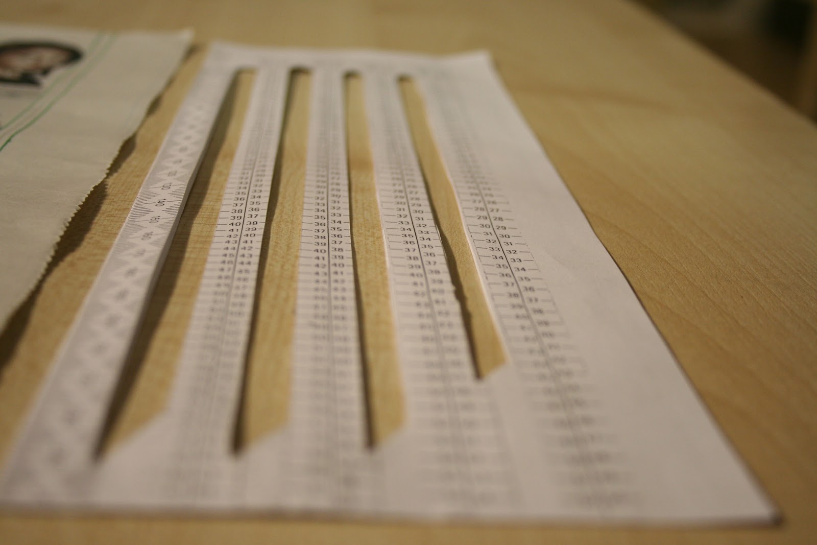
Firstly, to design my grid, I measured the DPS (double page spread) of the magazine, and divided the paper into two- showing the margin fold between the two pages. I then created a simple and structured grid to develop my designs onto- with 2.5mm gutters, 5mm inner margin, and 7.5mm outer margin (as we learnt that newspapers and magazines use a later outer margin for phsycological reasons- as it makes the page appear larger), with each page measuring 200mm x 265mm.
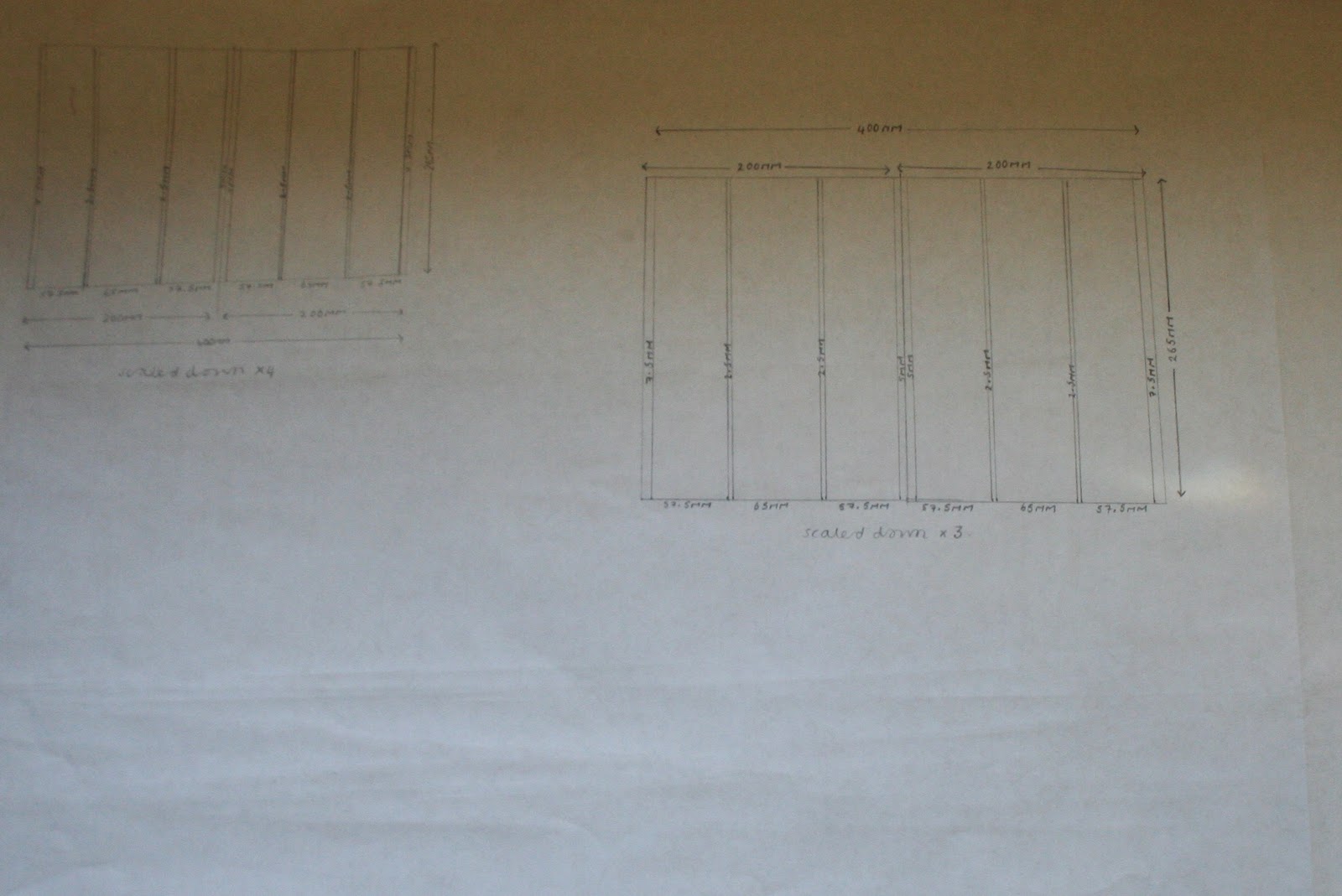
I then scaled down the page to create various designs on a manageable scale- the top left-hand corner scaled down x4, and the other x3.

I then created nine small thumbnail designs- in all of them there were elements that I liked, but nothing was quite right, so I went on to develop three more (of the x3 downscale size, compared to these downscaled x4)...

I much preferred these styles in a minimalist, bold and graphic style compared to the original magazine article which I felt was a little cluttered and busy.
After our visual language introduction, showcasing our work within groups and discussing the key elements in our designs, I went onto create a final sketch-up, complete with a slightly more sophisticated grid layout, to generate a design which I hope to go on to re-produce digitially in the 'In Design' software programme...


The final design included specific information (for my final design instructions), including the point sizes of my text, the fonts in which I will use (Engravers Gothic BT and Amazon BT), the gutters, margins, page folios and leading point size.
No comments:
Post a Comment