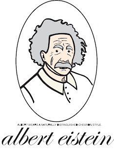
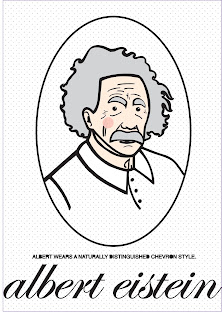
Applying colour to my black and white illustrations (once scanned in)...
After experimenting with several fonts I always found myself coming back to helvetica- very readable with subtle sophistication in the curvature in links and necks.
I filled in the counters for an edgier, modern look.

Combining the modern style type with classical- counter-filled uppercase helvetica with century schoolbook below.
Here, I experimented with different patterns and textures for the background- before successfully grouping the illustrative image away from the background... (a learning curve!)
..Again...I faced the same issues when attempting to apply a purple background to the circle. During these experiments, it was a little confusing, being reasonably new to the Adobe Illustrator software, but I gained vital experience, and worked my way around the problem without too much trouble...
Reversing out my image... I wasn't too found of this style- a bit too dark and with little detail.
A different background pattern this time, a higher density of dots causing the greyscale affect to be much darker- with reversed out white type this was very difficult to read, but it black the image, as a whole, was far too dull.
After a lot of experimentation with design, patterns, background, colours, etc- I have decided upon this design (above) to apply to all of my one hundred illustrative images. A decorative style designed to pose as a wallpapered-wall with a picture frame hanging on it, with the moustache-adorning celebrity in the centre, almost acting as a "shrine" to the moustache (and it's owner!).
The tones will also hopefully apply to both sexes- but particularly the men of whom I aspire to market this product to, young, "trendy", men who love to experiment with fashion and design.


No comments:
Post a Comment