
Showing posts with label Book Works. Show all posts
Showing posts with label Book Works. Show all posts
Monday, 19 March 2012
Image//Book Works//Uh-Oh.
Just done some calculations, and I won't be able to afford to be able to afford to print out the three books that I failed to print for the Book Fair submission (boo hoo). At around £19 each (the cost of a colour cartridge) that would mean a food shopping bill for a month. Ouch. Sorry Amber, hope this doesn't affect my grade!

Friday, 9 March 2012
Image//Book Works//Final resolution PDFs.
I also got to experiment more with book binding (having made this perfect bind style for the first time) and editorial work- two areas of improvement that needed seeing to, and I would still like to work with, and progress with as effectively as possible.
The PDF above shows the full content of the book in digital format- now printed and ready to be sold at the Leeds International Contemporary Artist's book fair on the 9th/10th March (I will be popping along and taking pictures!).
Image//Book Works//Final design.

The finalised printed book- above, probably my favourite DPS within the book (for it's minimalism and simplicity, and the balance of type/editorial design as well as Infographic-style image), along with, below, the series of page spreads throughout the book.
Unfortunately, due to the (ridiculous) print costs of the publication, I was only able to print two of the five books required from the module deliverables and to be sold at the print fair. I hope, time permitting, to also have the other three books printed for the module hand in on Monday 23rd April- which I can then go to sell on in my Etsy store (my friend, Mitty, has already bagsied one) and hopefully make a little of my money back- not a very professional way of working in terms of retail cost, but my own perfectionism is to blame! (Next time, I'll outsource my print, and plan ahead!)

Image//Book Works//Mock-up book.
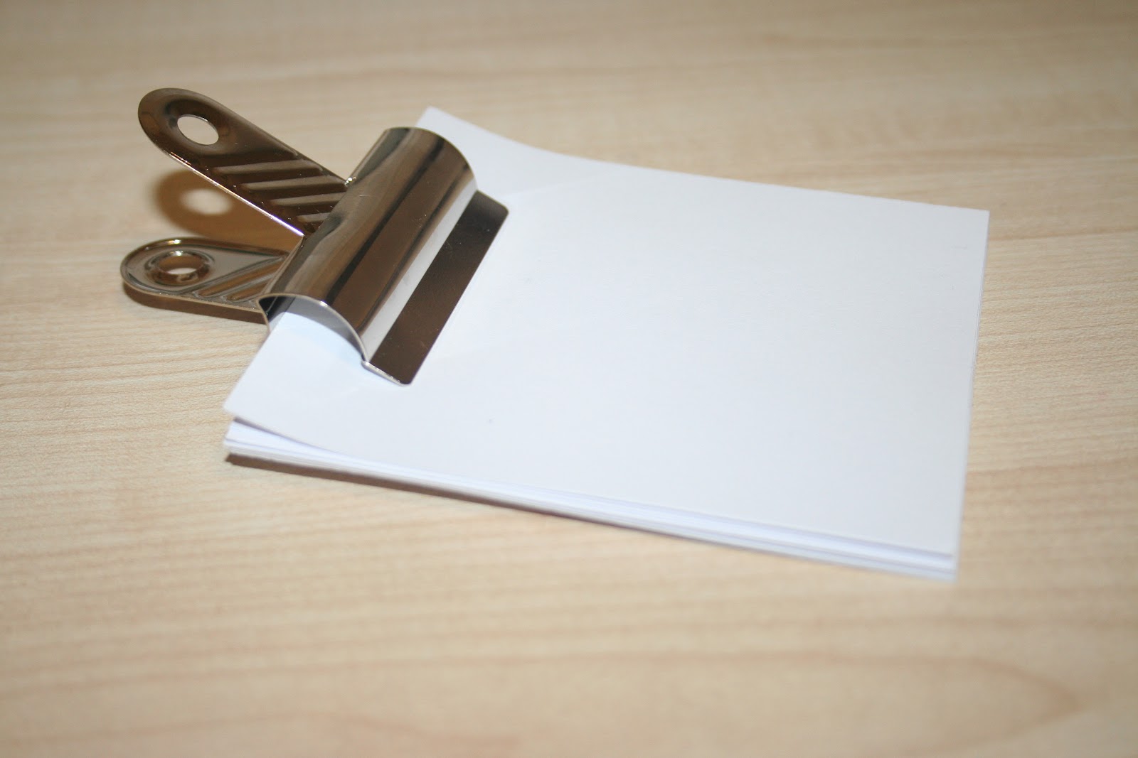
Before printing and trimming the individual pages of my final resolution book/publication design, I wanted to ensure that everything would go to plan (especially considering I have never made a perfect bind book before...). Inspired by a video tutorial seen on Youtube (blogged previously on my Design Context blog), I followed the instructions of trimming, clipping, acid free PVA glueing the spin, clamping, and then covering with the cover (in the same method) and pressing to achieve the bind design.
In this mock-up example, I designed the book at half the scale of my resolved outcome, but with the same bright-white bulky newsprint stock (which I will print my final design onto) to ensure that the same gsm and thickness would be consistent and bind in the same fashion.
Although it took a couple of attempts and re-glueing of the spine on the first attempt, I was very pleased with the final resolution, and feel happy to go on to use this binding method for my printed design outcomes- surely progressing as they are made for a crisper, more considering visual outcome as practice makes perfect!


Image//Book Works//Design amendments.

Having difficulties with my printed designs in terms of colour matching, I have decided to print my books from home. The quality from the digital print room was uncharacteristically poor, stripey, and the yellow was far more of an olive/puce colour than the sunshine, bright yellow that I had used (and checked was print-available in the CMYK gamut).
Unfortunately, I had not taken the considerations of the flooded yellow into my designs when I presumed that I would be printing from Uni, and, consequently, this has really pushed my costings up.
Initial cost calculations:
£3.36 per book (stock + print)
x 5 = £16.80
5 x £5 (RRP) = £25, therefore, making £8.20 profit.
HOWEVER, with the density of flooded colour, each book took AN ENTIRE CARTRIDGE to print, each cartridge costing me £23. There is no way I can justify selling the book, in my opinion, above £5, so, for now, I'll just have to take the hit. Ouch.
As a result, I have only been able to print x2 books for the book fair (as money is tight), and hope to get the other three books printed for the module hand-in.
Due to this printing change, I have also made a few ammendments to the design, to ensure at the late stage of printing (two days before project hand in) I could get all the pages printed- making pages 2, 3, 4, and the final page, 29, white with yellow text (where necessary) to save on print costs.
Well, this has been a lesson. If nothing else.
Image//Book Works//Pre-print final designs.

My finalised print designs, the book spread layout (above), each page measured at 149mm x 149mm, along with the free Lance Armstrong/bicycle print (reverse) poster, which folds down into quarters to measure 149mm x 149mm (printed on A3, to be trimmed) to slip into the back of the book (with the yellow jersey/Lance Armstrong page). With a session booked in the digital print room at Uni to ensure that costs can be kept low and the print (particularly colour) can be kept as consistent as possible.


Image//Book Works//Initial Designs II.

Taking some time away from my designs (always good to come back with fresh ideas) I continued making changes and edits for the content of my publication design. The first edit was changing the tint colour wheel from graduations of 10% (100-10%) to graduations of 5, so that the design looked far smoother and more fluid. A small change, but, to me, a big difference.


Beginning to look closer into my choice of type from the experimentations I had in generating my initial designs, I returned to experimenting with various fonts, weights and colours used. 'Cabin Font' was a good alternative, but not as rounded and contemporary- looking as florencesans (see my previous blog post for more details), which I decided to return to- and disregard my other options.


Practising adjusting the ascenders and descenders from the original typeface design, I felt that it looked far more effective, crisp, and clean (see the comparisons of the 't's' in the image directly above), however, as previously mentioned, this was, unfortunately, going to be far too time-consuming, and, unfortunately, just not a viable option at this time. Therefore, I decided to return to an old favourite (it catches me every time, no matter how hard I try to run from it...) Futura- geometric, structured, lots of varying family members. Just a great, reliable, well-rounded typeface, and perfect for this project. Should have started using it sooner! (See new cover design, image directly below).


Working on drawing my map designs- certainly the longest task within my designs (I have found myself drawing maps for lots of projects... I think I may be a closet cartographer)- I have always found geography interesting, and the infographic style that I can achieve from the varying shapes and dimensions of the countries. However, I will triple back up my files this time...so that I don't have to draw them...again (too much of a good thing?).


Developing icon designs to show the varying symbolism, meanings and messages of yellow around the world- energy, commerce, strength, royalty, hospitality, peace, religion, illness, love, mourning, loyalty, wisdom, fun, happiness, caution and summer. Again, iconography is something I really want to work more with and work upon (inspired by some truly fantastic icon designers out there) and to improve.


My finalised world map (drawn over a period of three days)- reversed out on yellow flooded print. I tried yellow on white also, but found this style was far more suited, and worked well with capturing the detail of the icons most effectively.


Applying my designs to an editorial layout and grid structure in InDesign took a little bit of experimentation- seeing where the content was most suited, how consistent I wanted my page layouts to be, and so on. As my publication was reasonably heavily text-based, I wanted to keep the layout quite conservative and balanced with my text, whilst still trying out a new stye (for me), which I felt worked well, and still looked fairly minimal and suited to the vector-based infographic style of the illustration(s).


One of my final design choices- to add the addition of a free poster into the back of the book, perhaps as more of an incentive to purchase a copy (?!). I used a quote from Lance Armstrong (my favourite of the quotes sourced and published about yellow, which can be found on my Design Context blog) which I felt was motivational, and worked well alongside the 'yellow jersey' text page. Again, keeping it simple with pictogram-style illustration, and this time the addition of the typeface 'Adam Gory Inline' which I felt worked well with the visual links to tires with the outside line as tubing, and the roundness of the type. A few changes and additions need to be made- but definitely on my way to a finalised design!
Image//Book Works//Initial design process.

After completing my research, and generating some simple design drawings to fulfil my expected content, I went on to start generating some designs for my 'Book Works' final publication outcome, knowing that I wanted to keep my designs simple, clean, vectored, and informative.
I began working with circles and colour wheels, inspired by the Dulux Colour designs on my Design Context blog, and by colour wheels and tints in general- a way to propose "infinite colour" and the variations of tints and shades side-by-side.


The various different names and shades of the colour yellow (shown in image at the top of the page)- all in one colour wheel- a dramatic example of the varying colours.


As well as with my circular colour wheel design, I went on to explore squares, and other ways that gradients/tints could be applied. However, I feel that the bold, block colours were far more effective and high-impact, in the infographic style that I was particularly looking to achieve, and decided that it should be stuck with.

Applying this to the dimensions of my cover design- once again, working with the minimalistic, clean approach- also beginning to look at how type can be applied to my design- working with a bold, uppercase and slightly "clinical" looking sans serif typeface. As well as being appropriate to the design, I seem to find myself having less and less time for serif typefaces (at college I used nothing but- the times they are a-changin').

As part of my research, I had also considered looking into the meaning and symbolism of blonde hair (which I, myself, naturally have), which is often described as being "yellow" (in colour). However, the actual swatch colours I produced from images online couldn't be much further away. Although the intention and meaning is there, visually, the colours were not at all consistent with my intentions for the tones and shades to use throughout the book, and therefore decided to ditch this subject matter (perhaps a project for the future?).


Starting to consider type a lot more, and look at how effectively this can be used throughout my publication design. Initially, I thought Gotham would be a great choice- a great variety of weights and styles in the family to utilise, geometric, clean, minimal- just right. However, as a commercial font, I really couldn't justify spending $80 on a single family member (when I'm rich I could... but not when I'm eating Morrison's value beans for tea), so I searched online for a good alternative. In a design ~chat~, I was recommended florencesans (which I was able to download from dafont) which was a great alternative in uppercase- but in lowercase the ascenders and descenders were frustratingly elongated- something I could amend by creating outlines and editing to meet the consistent baseline, but it would be quite time-consuming. Definitely something worth considering. However, really happy with the type in uppercase (as can be seen in my final cover design- image at the bottom of the post), but something I certainly need to consider for the entirety of the book design.


Subscribe to:
Posts (Atom)