Taking some time away from my designs (always good to come back with fresh ideas) I continued making changes and edits for the content of my publication design. The first edit was changing the tint colour wheel from graduations of 10% (100-10%) to graduations of 5, so that the design looked far smoother and more fluid. A small change, but, to me, a big difference.
Beginning to look closer into my choice of type from the experimentations I had in generating my initial designs, I returned to experimenting with various fonts, weights and colours used. 'Cabin Font' was a good alternative, but not as rounded and contemporary- looking as florencesans (see my previous blog post for more details), which I decided to return to- and disregard my other options.
Practising adjusting the ascenders and descenders from the original typeface design, I felt that it looked far more effective, crisp, and clean (see the comparisons of the 't's' in the image directly above), however, as previously mentioned, this was, unfortunately, going to be far too time-consuming, and, unfortunately, just not a viable option at this time. Therefore, I decided to return to an old favourite (it catches me every time, no matter how hard I try to run from it...) Futura- geometric, structured, lots of varying family members. Just a great, reliable, well-rounded typeface, and perfect for this project. Should have started using it sooner! (See new cover design, image directly below).
Working on drawing my map designs- certainly the longest task within my designs (I have found myself drawing maps for lots of projects... I think I may be a closet cartographer)- I have always found geography interesting, and the infographic style that I can achieve from the varying shapes and dimensions of the countries. However, I will triple back up my files this time...so that I don't have to draw them...again (too much of a good thing?).
Developing icon designs to show the varying symbolism, meanings and messages of yellow around the world- energy, commerce, strength, royalty, hospitality, peace, religion, illness, love, mourning, loyalty, wisdom, fun, happiness, caution and summer. Again, iconography is something I really want to work more with and work upon (inspired by some truly fantastic icon designers out there) and to improve.
My finalised world map (drawn over a period of three days)- reversed out on yellow flooded print. I tried yellow on white also, but found this style was far more suited, and worked well with capturing the detail of the icons most effectively.
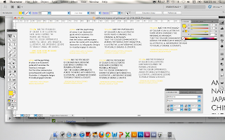
Applying my designs to an editorial layout and grid structure in InDesign took a little bit of experimentation- seeing where the content was most suited, how consistent I wanted my page layouts to be, and so on. As my publication was reasonably heavily text-based, I wanted to keep the layout quite conservative and balanced with my text, whilst still trying out a new stye (for me), which I felt worked well, and still looked fairly minimal and suited to the vector-based infographic style of the illustration(s).
One of my final design choices- to add the addition of a free poster into the back of the book, perhaps as more of an incentive to purchase a copy (?!). I used a quote from Lance Armstrong (my favourite of the quotes sourced and published about yellow, which can be found on my Design Context blog) which I felt was motivational, and worked well alongside the 'yellow jersey' text page. Again, keeping it simple with pictogram-style illustration, and this time the addition of the typeface 'Adam Gory Inline' which I felt worked well with the visual links to tires with the outside line as tubing, and the roundness of the type. A few changes and additions need to be made- but definitely on my way to a finalised design!


No comments:
Post a Comment