Showing posts with label Concepts. Show all posts

Monday, 12 March 2012

Image//6 Week FMP//Concept Development.


Having been assigned the new brief for Image, our six week "FMP", I decided to try and be as proactive as possible over the weekend in terms of developing ideas and concepts that could be put towards the deign development and idea generation ready for Thursday's image session, and to be able to put to the group for feedback and response to my current idea(s).


I started off by brainstorming each of the individual "subjects" for our design outcomes that we have had throughout image so far: Editorial, Type as Image, 2D/3D/2D, Scale/Frame/Format, and also the latest project Book Works. As our FMP 6 week project has to be loosely based around one of the past projects, to then expand upon, I felt that this would be a good place to start- and I wrote down all of my personal pros and cons for each of the projects, and what I feel I could get out of them.


After this stage, I went on to write about what I personally enjoy, or what I feel would be beneficial for me to work on whilst I still have the opportunity to develop and strengthen my portfolio, in terms of design, and how I could incorporate this into a project, with subjects and methods of delivery including illustrative type, illustration, colour, and so on. Again, I wrote a list of pros and cons to distinguish the right direction to follow.


I then went on to combine these two concept developments to generate some potential design subjects that I could focus on. Whilst I'm a student, and have the luxury of being able to dictate and choose my own projects, I wanted to look towards subjects that I knew I would really engage well with, and knew that the loss of interest throughout the six weeks would be entirely minimal. The two that I found myself getting particularly interested in/by were education (for children) and film... of which I then again went on to generate (far more solid) design concept ideas from...


Following this, I went on to develop three concepts- two following a filmic direction, and one more focused at education and children's literature. The design concept that I have decided to follow (as highlighted in the image above) is as follows...

-A HISTORY OF THE OSCARS AWARD CEREMONY-

Celebrating and documenting the history of the film and cinema awards in an illustrative guide for the contemporary film fan (target market, 18-30 year olds) in a collectable printed media pack including the printed guide, along with other printed merchandise such as posters, stickers, and so on.

Developing my concept and design ideas asap!

Monday, 13 February 2012

Image//Book Works//Concept Development.


Before completing my finalised rationale for the 'Book Works' brief, I looked at various concepts and outcomes that I could produce for potential concept for the brief (under the categories of SHAPE, TYPEFACE, COLOUR, and SOUND). 


These notes were taken in the session as a generate brainstorm exercise- looking at where my ideas could potentially lead- before deciding on my final 'YELLOW' outcome (as highlighted in bold below).


COLOUR


* Yellow- The psychology of colour- photographic study/infographics.
* One colour plus stock illustration.


TYPEFACE


* Laser cut typefaces- wood.
* Futura- The mother of all typefaces.
* Type as image- food for thought.
* Type as image food, photography.


SHAPE


* Spirographs.
* Bauhaus.
* Geometry.
* Diamond.
* Triangle.
* Dodecahedron.
* Infographics shapes.
* Mazes & Labyrinths.


***


I have decided to stick to infographic design, perhaps with a little photography here and there, but I didn't want it to look to cliche, or like a print manual/colour chart- no bananas, please!
For my "yellow" research, I will be looking at these particularly areas to build on my design development:


TO DO


* Psychology of colour.
* Existing colours.
* Yellow in different cultures.
* Bookbinding & bookmaking techniques.
* Printers (to produce books).
* Create infographics.
* Publication, layout & packaging research.
* Yellow animals research.
* Yellow fashion research.
* "Blondes" research.

Thursday, 26 January 2012

Image//Scale/Frame/Format//Concept Development.


Brainstorming and developing concepts from today's given brief: Scale/Frame/Format which looks at how we can visually communicate a selected object in a simple, legible, clear way (up to a distance of 20ft away- as we would find in eye tests in an Opticians- the source of inspiration for this design outcome). My randomly selected object was 'socks'- which I will go on to research and develop through both primary and secondary sources. 
From this brainstorm I looked at different "sock factors" including material of socks, possible patterns, designers (such as Hackett and Paul Smith), as well as the different types of sock.
Looking at existing eye chart designs, I have decided that the concept I want to develop is based on the length/style of socks. Working in the way of the traditional eye chart test (with the large, single letter at the top- and the row of small letterforms at the bottom), I will have the longest sock- an over knee graduating down through a knee high, gentleman's sock, ankle sock, trainer sock, and babies socks, etc- looking at the shape, scale, pattern and fashion design elements to help distinguish one style from another in a crisp, pictogram style- hoping to create a vector design ready for screenprinting (either monochrome or red and white- still undecided) to create a faded- washed out (washed sock!) outcome- design developments can be found on Design Practice, whereas research and concept development shall be built up on my Design Context blog.


Monday, 5 December 2011

Design Production for Digital//Silent Movie//Storyboard Sequence Task.


My final five boards from last week's Silent Movie Storyboarding task- using my two words 'stretch' and 'float' to create five possible outcomes for each of the (minimum of) five design final outcomes.

Although I see potential in a few of the designs, overall, I wish that I had been more creative and precise within my designs for the five key frames of the sequence. Before further, digital development, I would like to go on to expand my ideas more creatively, and going on, once again, to take the strongest ideas from these design worksheets, and push them further still- oh, and get some more reliable pens (ones that don't run out half way through colouring...).

Thursday, 10 November 2011

Design Production for Print//Finalised product outcome ideas.


After yesterday's feedback crit session I've become a bit more rational, and considered the amount of time I have left for this module to create design outcomes. Bearing in mind what feedback I had "quality not quantity" I have reduced my design outcomes list to ten developments- four of which will be solely photoshopped (which will save time in the long run)- and I aim to achieve this full range to promote, persuade and inform people about the films of Wes Anderson, and the Film Festival itself.

MY FINAL OUTCOMES LIST INCLUDES:

P= PRINT
PS= PHOTOSHOP
* Mailshot//Invites [P]
* 6 Sheet Bus Shell Advertising [PS]
* 4 Sheet Train Station Advertising [P & PS]
* Pull out map [P]
* Stationary map [PS]
* Promotional billboards [PS]
* Mailshot booklet [P]
* Exterior signage//Wayfinding [PS]
* Programme x7 (One for each film?) [P]
* Presentational programme [P]

Design Production for Print//LOGO.


Just when you think I couldn't change my logo any more... I go and do it again. (The bottom image shows my logo in context- looks quite good- using varying % of tints in my design to see which shades and tints are most suited to my subject matter- multiples of 10).
Thinking alot about the overall aesthetic of my project from the last couple of days, I don't think that the banners communicated the liveliness and fun of the festival that I hope to promote. Returning to an old logo design and re-tweaking, I have returned to the star burst shape, which is bold, eye-catching and simple- also, reminding me of a camera flash. I need to force myself to stop changing my logo ideas.

Sunday, 6 November 2011

Design Production for Print//Design Drawings.


Images of the design boards that I have been working on in the past day- with a bit of RSI I called it a halt, perhaps a little prematurely on some aspects on my design sheets- though, overall, I'm quite happy with the developments I've made- and it's certainly opened me up to new ideas- and lots more design outcomes which I now feel happy to go on and pursue- and am definitely excited about starting more digital work and design developments. Deifnitely a little more technical than I intended- but for me, I find this is the best way to process my ideas and just get them down on the page. In the later stages of design and product development I will draw more detailed three-dimensional drawings and add colour (my current Copic pens felt a little too dense for the paper? Need to look into this).


Getting my ideas down- from my mind down to the paper- as you can see, lots and lots of design paths which I found were available to me- really, it's just a matter of distinguishing which paths are worth pursuing, and how I design and develop each one.


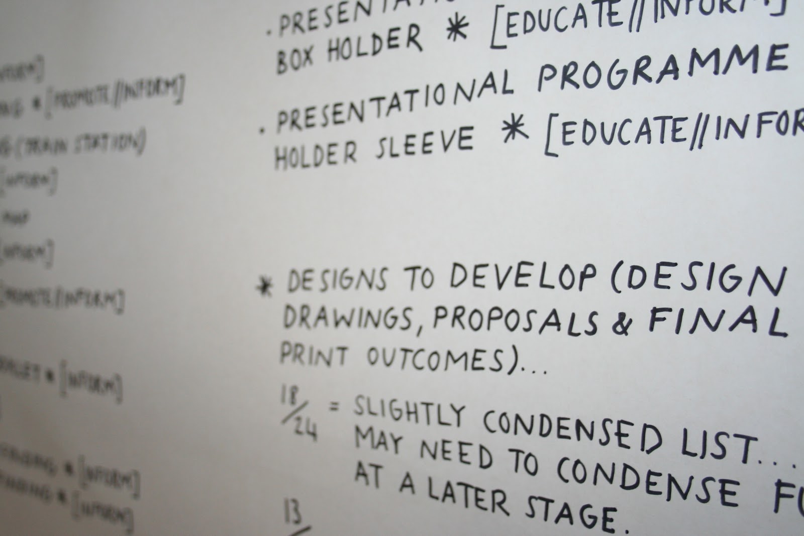
Condensing my list to eighteen design outcomes, as opposed to my original twenty-four... still a heck of a lot to do, but really it's just a matter of keeping organised- and I know I can produce it, and be proud to add the project to my portfolio of work- in both a personal and professional environment.


The images above show the progress of my design developments- and after a good few hours working on each sheet, few quite happy with the results, and, as aforementioned, feel happy, and ready, to go onto the next step of my design process (at last!). The design drawings, perhaps still a little "techy" are far more expressive and carefree than my usual work- and, consequently, I managed to get a lot more down on the page- as soon as an idea came, it was down- if a little messy to look at (oh, well!). The design drawings span from mailshot presentation boxes to billboard poster campaigns- and can be seen more closely when zoomed in. As I progress on to digital design, nets of particular design outcomes will be fashioned, as well as sizes and scales being 
more accurately specified.