
Showing posts with label Good Is.... Show all posts
Showing posts with label Good Is.... Show all posts
Monday, 21 November 2011
Good Is//Design Production for Print//What is Good Links.
Good Is//Design Production for Print//Conclusion.
Overall, I am in fact quite disappointed with the work I produced throughout this project.
Although
I know I worked hard, I don't think that this materialised enough in my
work- and not really giving justice to my 'Good Is' subject.I feel that my research has been substantial, and probably the best part of the project- however, I feel that my design outcomes were not half as ambitious as I would have hoped and that my grades will ultimately reflect this.
I've let personal problems get in the way of my work, and have found myself repeatedly panicked and anxious in the past week- I need to stop spending my time worrying and try to channel it into being more pro-active and plough on through the design wall, even when times are challenging.
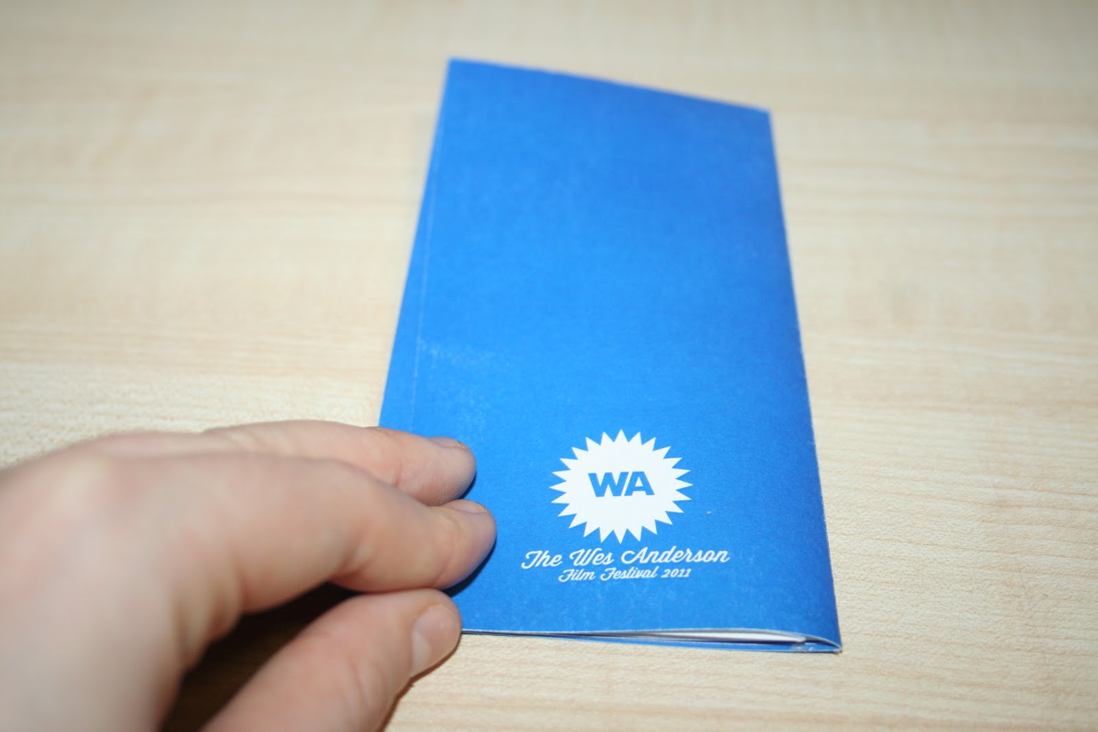
Good Is//Design Production for Print//Hotdog Booklets.


Unable to print the hotdog booklet film companion guides at their original scale at such short notice, compromises, unfortunately, have had to have been made. I originally attempted to scale to fit A3 in the mac suites at Uni- but the texture that the laser print gave to the cartridge stock (and stock, in general) was far too "plastic"- the coating making the designs have a slightly tacky gloss which resulted in weave and
colour damage when folded- not at all ideal.


Compromising yet again, I printed the designs from my inkjet printer at home- now tiny in comparison to their original scale (now shrunk to fit A4)- not an ideal situation whatsoever, but merely an example of my layouts, format and colours, if nothing else. In my final mailshot delivery box I have added the unfinished 'Fantastic Mr. Fox' booklet to represent scale- along with the 6 x smaller hotdog booklets for text and image reference. Again, apologies- wish I could amend this and thought about it/designed it sooner- I solemnly swear I never
want to fall behind on a module ever again.


Again- a little dissapointed with the outcomes, but okay considering their quick turn around time (I would have impressed myself greatly this time last year...). The colours and patterns would work, but would certainly need more consideration and attention for professional production for print.
All in all, I really wish I'd just added more variation to my mailshot box- or make it more of a "show stopping" conversation piece with interesting use of net design/print finishes- feel a little underwhelmed considering how much time I have spent over the project. Hopefully the research and content will help me through.
Good Is//Design Production for Print//Reward Scheme Card.
hopefully giving more incentive to return.


Playing around with typefaces in the family of Futura/Wisdom Script I have used throughout my designs- Light Italic worked the best (Futura) as opposed to Bold- looked slightly edgier and more modern than it's bold counterpart- given the opportunity, I would have liked to use this weight more in my design outcomes- I think it suits my concept and visual outcome- looking contemporary whilst still remaining true to it's
Wes Anderson origins with Futura.


I decided to print the icon images chosen from my repeat pattern prints which I think summarised and best represented each of the six individual films to be shown at the Festival. Printing in greyscale to define when a film has been seen at The Picture House- with a coloured (it's assigned spot colour) sticker over the top of the icon- see image below.
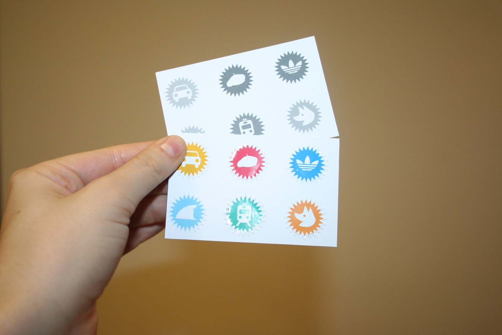


(l-r) Icons for: 'Bottle Rocket', 'Rushmore', 'The Royal Tenenbaums', 'The Life Aquatic with Steve Zissou', 'The Darjeeling Limited' and 'Fantastic Mr. Fox'
Again, I really wish I'd thought of this (simple) idea sooner- I could have incorporated it into my project long ago to make it more of a fun, sort of souvenir- based event- acting as more of a persuasive design outcome than I currently have. Still, I have included it into my mailshot pack, as it fits in with my design content, though, ideally, I wish it had a little more background and context.
Living and learning.
Good Is//Design Production for Print//Debossing.


Throughout my weeks of experimenting with print formats and finishes, I've found that many of the more visually eye-catching methods such as spot varnishes and foils don't suit either the stock, or the subject matter for my project- the indie cool Art House Film Festival (set at The Hyde Park Picture House) would neither be fitting for reflecting the subtle and sophisticated films themselves, or the budget of the Picture House, in realistic terms. Already spending money on individual spot colours- some of the more elaborate finishes may be too costly.
Having experimented with emboss and debossing briefly, ideally, in professional print production a mould for the deboss (the finish I have eventually chosen to act as a "stamp" for logos throughout the printed media) would be made and act as a press to create the pattern relief in the stock (a very crude example above- I cut the shape for the back of the mailshot box in greyboard)- however, due to time constraints, I have unfortunately not been able to take this further. Therefore, again, very crudely, I have created a deboss effect with my embossing tools- and, given more time, would apply this to all the logos used in the mailshot printed media for a touch of the aforementioned subtle sophistication that is represented in Wes' films.


Good Is//Design Production for Print//PDF > CD uploads.

All necessary design files saved as a PDF and uploaded onto a CD ready for hand in.
Ideally, I would have liked to create an appropriate CD cover to go with my work- but time is really against me, so sadly it'll have to wait until a future project.
Design Production for Print//Presentation boards.


Presentation boards won't save because of lack of memory- so I can't upload to Issuu.
When printed (into panels of four as I couldn't print at Uni) they don't match up properly.
Everything that could go wrong in this project has gone wrong. Wish I could close my eyes and make it go away.


Dodgy crops and alignment rife throughout the boards- argh.


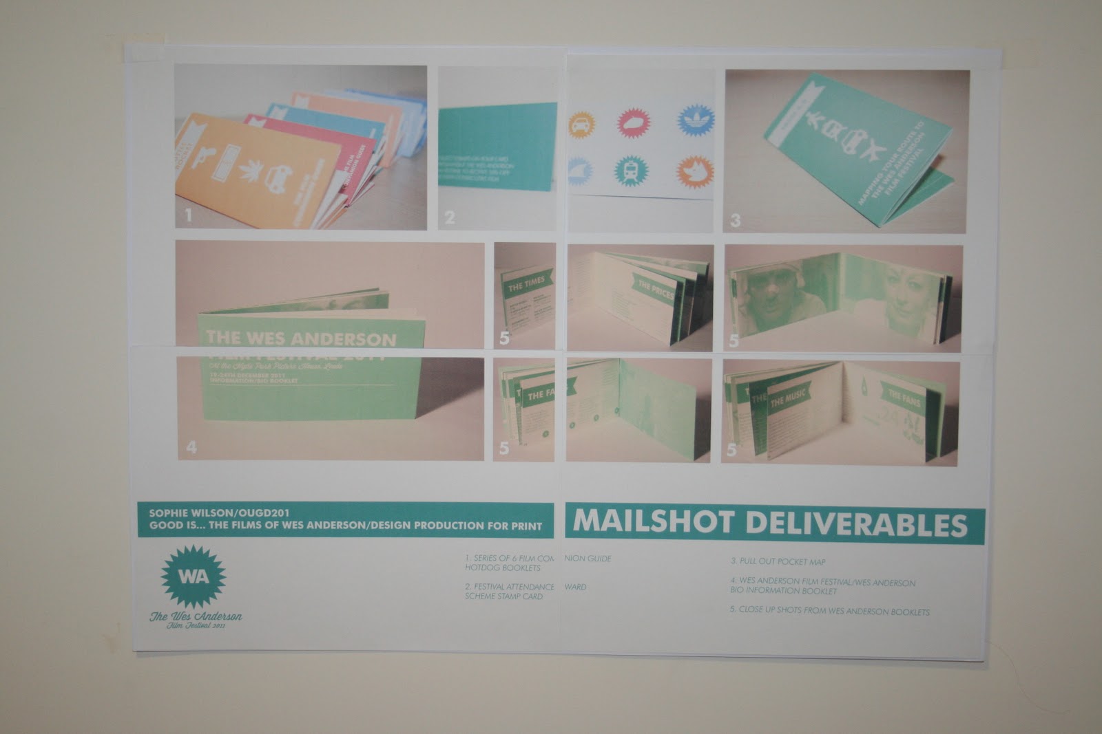


Being very aware that the final presentation boards are a truly essential part of this module and project (in terms of marks and grades) I hope that my stupid mistakes haven't affected the outcome too much- many of the images are legible, along with text, but with difficulties with aligning artboards and borderless printing (at 2am in the morning...) and with such tight time constraints (as well as financial) I'll have to, unfortunately, take the hit.
Subscribe to:
Posts (Atom)