Showing posts with label Type as Image. Show all posts

Thursday, 26 January 2012

Image//Type as Image//Session feedback.


Today's feedback session was really great- another good opportunity to work with the small group from last week's session to discuss the development of our work- the strengths, weakness, and so on. The notes below are taken from direct comments and points from members of the group:

- Research papercraft designer Owen Gildersleeve (created Lacto Free Milk advert).
- Stick laser cut down with spray mount? (Had curled a little due to rolling).
- Brass rubbing- could try various other methods of delivery and outcomes- flocking, s/printing, etc.
- Strong concepts, work well- clear and visually communicative.
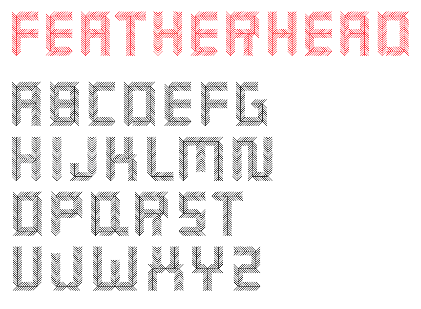
- Look at possibly developing typeface out of real feathers- lots of various shades, textures and patterns that could form the typeface.

Again, really helpful points and great feedback and constructive criticisms from the group- and I sold my 'birds' A1 poster to a fellow classmate, hurray!

Image//Type as Image//Final designs.


The final results of my type as image brief outcomes for the week- again, quite happy with the designs- the feather type being my favourite as it has certainly had the most work and originality applied to it. I've enjoyed experimenting with the methods of production and surprisingly with the design element (never classing myself as a "type person" before)- and hope to explore with typography a lot more in the future.

Wednesday, 25 January 2012

Image//Type as Image//I wish I could.


Design developments for my final A1 type as image "I wish I could" quote design in which I experimented with developing the Chopin Script typeface to create a calligraphic, script style- inspired by the covers of fairytale books, where, of course, wishes are a prominent feature (and often come true).
Styling my hand-rendering type (shown in a previous post photographically) up into vector form, I experimented with colour- thinking that gold on black would work quite well to emulate the "fairytale" gold leaf style. Originally, I planned for something far more ornate- in the image below, starting to apply leaves/ivy, though I felt this might get a bit too illustrative- and wanted to work solely with type to really get out of my illustration comfort zone- and I'm happy I stuck by that decision. The image at the bottom of the post shows my final stage ready to be laser cut (the method of delivery I have chosen for this design- black overlaying gold) for Thursday's image hand in and feedback session.


Image//Type as Image//Final outcomes.


The collective set of photographic images showing the final designs for the 'type as image' project brief as close-up shots (will try and get full-scale shots with good lighting/a helpful assistant tomorrow morning). All in all, I'm quite happy with the results- and compared to last week, I spent a great deal more time developing my designs and exploring various outcomes. The least favourite of the designs in definitely the 'Brass Rubbing' poster- originally intended for screenprint, but unfortunately running out of time (considering the balance of other Uni modules) and the textures look a little too dark and messy- though still something new for me, and still a learning curve all the same. Although the '...Birds' feather typeface design is my favourite (suits my ornate yet minimalist taste, and is the most effective in terms of visual communication), I am really pleased that I got to experiment with laser cutting- I'm really happy with the finish and crisp cut it has produced (would probably have made the hairlines slightly thicker- 0.5 as opposed to 0.25?) and will certainly be using (and abusing) it more in the future, and hopefully within this image module.

* NOTE- Tried silver as well as gold for the laser cut design- but I think the gold works better in hindsight! That'll be the one submitted as my final design.

Tuesday, 24 January 2012

Image//Type as Image//Brass Rubbing.


A short post documenting the development of my 'Brass Rubbing' A1 type as image design- the progress I made in designing the final outcome, what I feel I could improve, etc.

I started out by trying to combine separate typefaces- one of which would visually communicate the bold, robust (metal) brass, whilst another would be softer and relaxed- a script/italic typeface- though I found this wasn't working as well as I'd hoped- few sat together well on screen.
Finally I decided on using Futura Condensed Extrabold for the two words (free distort transforming the 'rubbing' to give it more visual impact and emphasis)- communicating the density and weight of the brass of the quote. I went on to use gold and black- not only to represent the metal through the yellow-gold colour, but the black to add the look of tarnish- as if the brass has been rubbed too much, or too vigorously- and adding texture and a linear black-gold gradient to add the final "rubbed" texture.

Ideally, I was originally intending to screenprint this design, however, I unfortunately won't have enough time in balance with the other modules currently going on- a shame, but definitely something worth considering for future designs- and hopefully I will achieve a similar aesthetic from having applied my texture layers.

Something quite different for me, still not too sure if I like the design or not- though I think it is communicative and clear to a degree- now I just need to work on perfecting a style of design that suits me, my way of working, and, if possible, to start developing a certain niche style or characteristic to my work that will help boost both my confidence and my portfolio in regards to my design practice.

THE FINAL DESIGN OUTCOME CAN BE SEEN AT THE TOP OF THE BLOG POST/PAGE.


Image//Type as Image//Birds//Design.


This evening I worked upon finishing one of my three designs for the type as image brief within the image module- creating an illustrative type design for the pulled quote 'It has nothing to do with the number of birds', from last week's given 'This column will change your life' article from The Guardian.
Again, following on from blog posts yesterday- I went on to develop something quite different to what I had originally intended- and am really pleased with the change of heart as a consequence- designing my own typeface based around the existing Old Road Signs Font typeface I was previously set you use- and still found appropriate in this instance.
With downloaded vector feathers as my starting point, I went on to create quite a crude design (last night, image above) to get the rough idea of what visual outcome I wanted to achieve before editing the illustrative details and lettering today- experimenting with colour and composition until I created a design I was happy with (the last image of the post)- a left-aligned type with soft black on white (too high contrast doesn't really add to the soft, organic lines of the feathers)- whilst still hopefully looking well produced and crisp.
Again, something really different for me- by no means perfect, but a great experiment with exploring type- two more images left to go!


Image//Type as Image//Birds//Ammendments.


A change in direction for my type as image work- after starting to sketch out a few of the bird illustrations, I came to realise that the style was going to be far too ornate- and much more like illustration with type thrown in for good measure.
Worried about the final outcome, I decided for a change in direction. One of my original ideas was to create a typeface based on the anatomical features of birds- though felt that eyes/beaks, etc might be a little sinister looking- and not effectively communicative- until I thought perhaps of using feathers- the texture could create a really interesting shape and illustrative style whilst still firmly remaining in the ~realms of type~. The image above is a quick design I experimented with- having downloaded free vector feathers online, which I will go on to create my own for a smoother, crisper line and a more suited geometry of type. 
Below, some image examples of existing feather typefaces (images sourced from various Google Images links) to inspire my own design- love the tactile nature of the photographed feathers- so soft and organic looking.

(*Note from image above- perhaps try hand-rendering the typeface, once printed and designed, with black fineliner onto brown parcel paper- gives quite a good, natural, earthy look- might be difficult to source paper this large- need to do some info!)


Monday, 23 January 2012

Image//Type as Image//Laser cutting induction.


This morning I was lucky enough to (finally!) get a laser cutting induction (having told myself constantly in first year that I should get one...)- luckily getting a place after one of the original signed-on students didn't show, which was a great opportunity for me. 
For one of my type as image designs, I wanted to create an intricate paper-cut design, however, I felt that both my skill and time were certainly limited to achieve such a piece- and that laser cutting would be a much better option.
In the hour and a half workshop, I learnt a great deal about the variety of outcomes that can be achieved- as well as how to programme the cutter itself- creating my own little 'TEST' test piece of acrylic (which can be seen in the photograph directly above). I've got a session booked up for Wednesday- giving me time to finish the design before Thursday's project hand in- exciting times (For more details and information- see notes below, along with blue information pack given at the induction).
 

Image//Type as Image//Flocking.


I went down to the print room this morning to inquire about the possibility of sourcing gold flocking for my 'Brass Rubbing' type as image design- no such luck! This would have been my preferred print finish, but now I'll have to look at other possibilities as unfortunately I won't be able to source the material from any other place in time- potentially a project to return to in the future, however?

Sunday, 22 January 2012

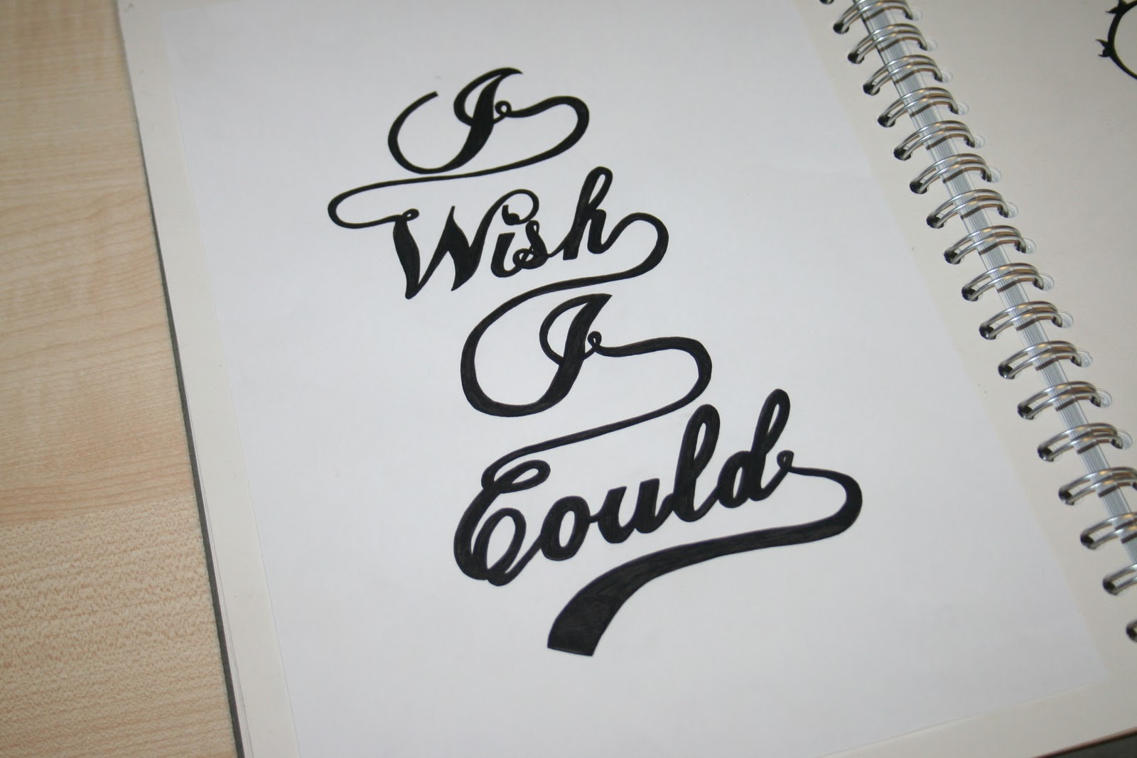
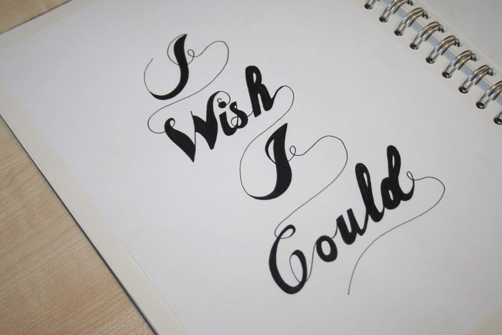
Image//Type as Image//'I wish I could' hand-rendered type.


Today I began experimenting with hand-rendered different variations of the original Chopin Script Medium typeface to develop for my own type as image design with the pulled article quote 'I wish I could'. I chose the typeface to evoke a sense of magic and the visual communication of a style of fairy tales- where my inspiration for the design has been drawn (see my Design Context blog for more visual examples).
The images pictured below (top- bottom) show my progression through my designs in terms of strokes, weight of line, etc. Although I deterred from my initial idea of creating a Sleeping-Beauty like ivy and rose cut-out design, (see image example below- but would have to be developed further), it is definitely something I would like to try and come back to when applying digitally to see how affective this higher-impact visual would have in vector format.