


A change in direction for my type as image work- after starting to sketch out a few of the bird illustrations, I came to realise that the style was going to be far too ornate- and much more like illustration with type thrown in for good measure.
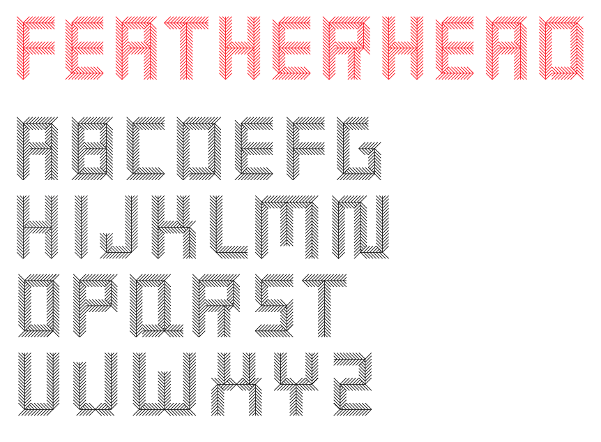
Worried about the final outcome, I decided for a change in direction. One of my original ideas was to create a typeface based on the anatomical features of birds- though felt that eyes/beaks, etc might be a little sinister looking- and not effectively communicative- until I thought perhaps of using feathers- the texture could create a really interesting shape and illustrative style whilst still firmly remaining in the ~realms of type~. The image above is a quick design I experimented with- having downloaded free vector feathers online, which I will go on to create my own for a smoother, crisper line and a more suited geometry of type. Below, some image examples of existing feather typefaces (images sourced from various Google Images links) to inspire my own design- love the tactile nature of the photographed feathers- so soft and organic looking.
(*Note from image above- perhaps try hand-rendering the typeface, once printed and designed, with black fineliner onto brown parcel paper- gives quite a good, natural, earthy look- might be difficult to source paper this large- need to do some info!)


No comments:
Post a Comment