

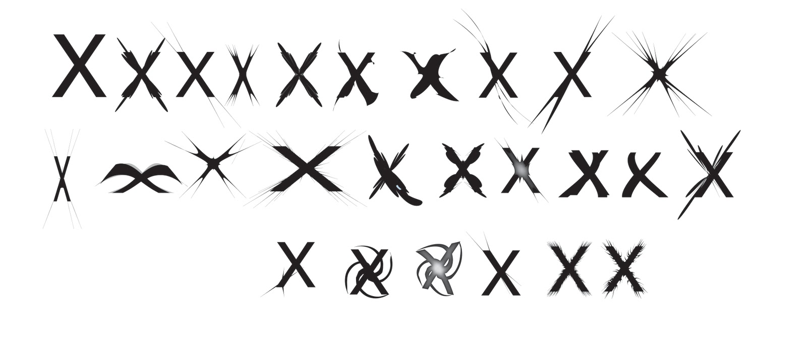
(l-r)
1. standard c24 m5 y2 k0 helvetica.
2. bloat tool 133% bloat.
3. pucker tool 138% bloat.
4. soft blue plain helvetica, lowercase c24 m5 y2 k0.
5. puckered -37%.
6. stylaised inner glow, 68% opacity, 1.76mm blur from centre then bloated 86%- starburst effect.
7. roughen 30% horizontal, 10% vertical.
8. 30% horizontal, 10% vertical roughen.
9. left stem extended streched and puckered -86% then twisted 23%.
10. pucker -140%, tweaked 5% horizontally and vertically.
11. transformed to 140 degrees horizontal, twisted 23 degrees, puckered -85%
12. closed bottom, -122% puckered.
13. shell upper warp, 86%, 53%, 24%/
14. shell upper warp, 40%, puckered -94%
15. roughen 2%, -69% pucker.
16. 69% lower arc warp, 80% bloat.
17. 80% bloat on top half, 92% bloat on bottom half.
blob brush tool x4 in the centre, inner glow of 68%, -45% pucker tool.
18. arc lower warp, 63%.
19. x upside-down, arc lower warp 63%
20. x with 200% puckered shadow background, built up from 1 stem and apex.
21. -200% puckered, corner of bottom left stem.
22. 180 degree twist.
23. 180 degree twist with wave warp. -3% bend, 22% horizontal distortion, -22% vertical distortion, 84% central inner glow.
24. pucker -150% from top left corner, 84% opacity colour dodge, inner glow.
25. roughen 5%, smooth 100/in detail, pucker -18%.
26. roughen 8% detail 59/in, smooth -18% pucker.
Considering the lack of experience I have using illustrator, I am quite pleased with the result I have achieved in my final design 'wingvetica' (or so i have dubbed it!).
Before I print on my A1 design sheet, ready for module submission day on monday 22nd november, I will re-organise my order for a more styalised flow and structure and arrange the composition of my designs.
Just another experimentation- seeing my designs once again in black and white really makes me appreciate the addition of colour- I think the blue tone really enhances it so much, and the black and white gradient glow looks quite crude and unprofessional, the blue is a definate improvement!
No comments:
Post a Comment