
- tint: introducing more white, brighter.
- shade: darker, introducing more black.
- if you lower the satuation, the chromatic value (bright hue) is being dulled/made paler.
Colour Part III: Colour and Contrast.
- Colours are made up from wavelengths, variant in dimensions.
- Additive and Subtractive define luminence.
- Additive: RGB mixes to white (in secondary colours).
- Subtractive: CMYK mixes to black (in secondary colours).
Seven Contrasts
- Contrast of Tone.
- Contrast of Hue.
- Contrast of Saturation.
- Contrast of Extension.
- Contrast of Temperature.
- Complementary Contrast.
- Simultaneous Contrast.
We only percieve colour by differenciating comparisons.
Contrast of Tone:
Formed by the juxtaposition of light and dark values.
You can't percieve a tonal contrast.
By changing colour or tones, we can make things more or less easy to read- an aesthetic hierarchy- (e.g. used in comic books) along with weight of line to attract attention in a visual order.
Contrast of Hue:
Formed by the juxtaposing of different hues. The greater the distance between hues on a colour wheel, the greater the contrast.
Contrast of Saturation:
Formed by the juxtaposing of light and dark values and their relative saturations- deferinciating colour by it's saturation- defining the "bluest blue" etc.
Contrast of Extension:
Formed by assiging proportional field sizes in relation.
How much of something we can see by how we read it- spacial.
How we divide space and colour in composition defines how much/less of the colour we can see from points of contrast.
Complimentary colours exaggerate one another.
Contrast of Temperature:
Formed by juxtaposing hues that can be "warm" or "cold".
When flat colours are placed side-by-side, they give an illusion of a gradient transition between the tints and shades.
Complementary Contrast:
Juxtaposing complementary colours from a colour wheel or perceptual opposities (as far away as they can be on the colour wheel).
Different colours respond differently with complementary values.
Simultaneous Contrast:
Formed when boundaries between colours perceptually vibrate.
When colours are upon a neutral background, they perceptually try to "push out" their complimentary colours in the vibrating lines.
Task: Start visually investigating colour contrasts (complimentaries)- put colours together, see how they are affected. What happens visually? Look at how colour effects colour- both through primary and secondary sources.


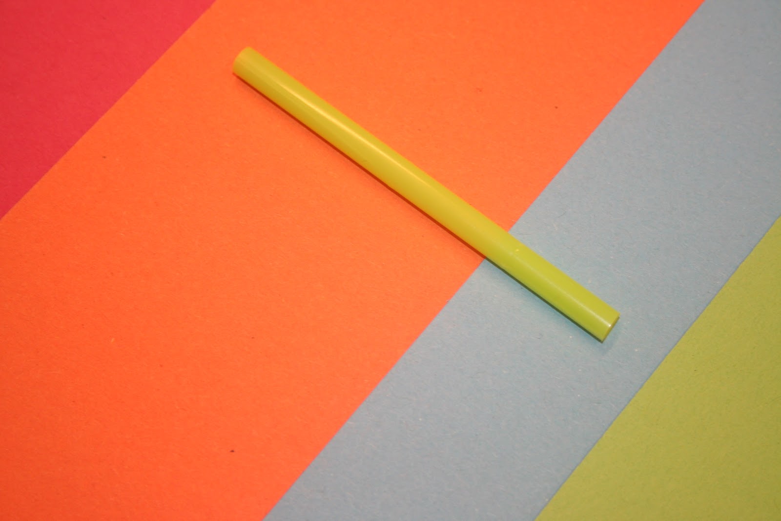

Above, just a few examples of colour contrast, as my colour theory group mixed with the contrasting colour group: green. It was really interesting to see the visual reaction created by all the different tones and saturations of our colours- some tones and shades working more in harmony with one another, and some less.
I am really looking forward to exploring colour theory and learning more about the subject, as I know it will undoubtedly benefit my practice, and make me even more inquisitive about design around me.
No comments:
Post a Comment