
Today, along with classmates Beth, Baljeet and Lisa, (after I went to book the photography mezzanine last week) spent our "free" afternoon session by compiling a collection of photographs to support our Photography Workshop Brief, and were really pleased with the results of the professional photographic equiptment along with the ease and support of the session, helped along by one another. We used collective items and experimented with many different colours and methods, as well as focusing on our own colours schemes, mine being...
RED

Setting up the studio light- unfortunately, all of the lights with continuous illumination's bulbs were broken, so we had to use a tungsten light. However, as we were using DSLR cameras we were lucky that adjusting the white balance setting was relatively easy- to the tungsten mode, allowing to restore the balance and neutralising the glowing warmth.
Also, it was important to consider just how hot these lights were- it was very lucky that we had decided to go down as a group, as we could then take it in turns to hold the coloured gels (transparencies) as sticking them over the lens would easily have melted them.


Quick experimentations with the light mode- creating fun lighting trails. However cliched this method may be, there will never be a time when throwing your camera around on a low shutter speed isn't fun.


A few tester shots of the vibrant and beautiful tulips Lisa bought along to photograph- working on my manual focus technique (lately, I've been trying to veer away from depending on auto fous to push my photographic experimental and abstract methods).


We began experimenting using the lights and manipulating the shadow by altering the position of the lighting- certain angles providing longer or wider shadows, moving the light forward to increase the intensity of lighting, and distancing it for a dimmer, softer light.
We also began experimenting with singular coloured gel transparencies- and had a really interesting effect and blend on the colours of the petals.


...And then combining and overlapping two coloured gels (magenta and yellow) for contrasting colours- they really worked wonderfully with the violet tulip- the softeness of the gel really making the colour of the petals pop.

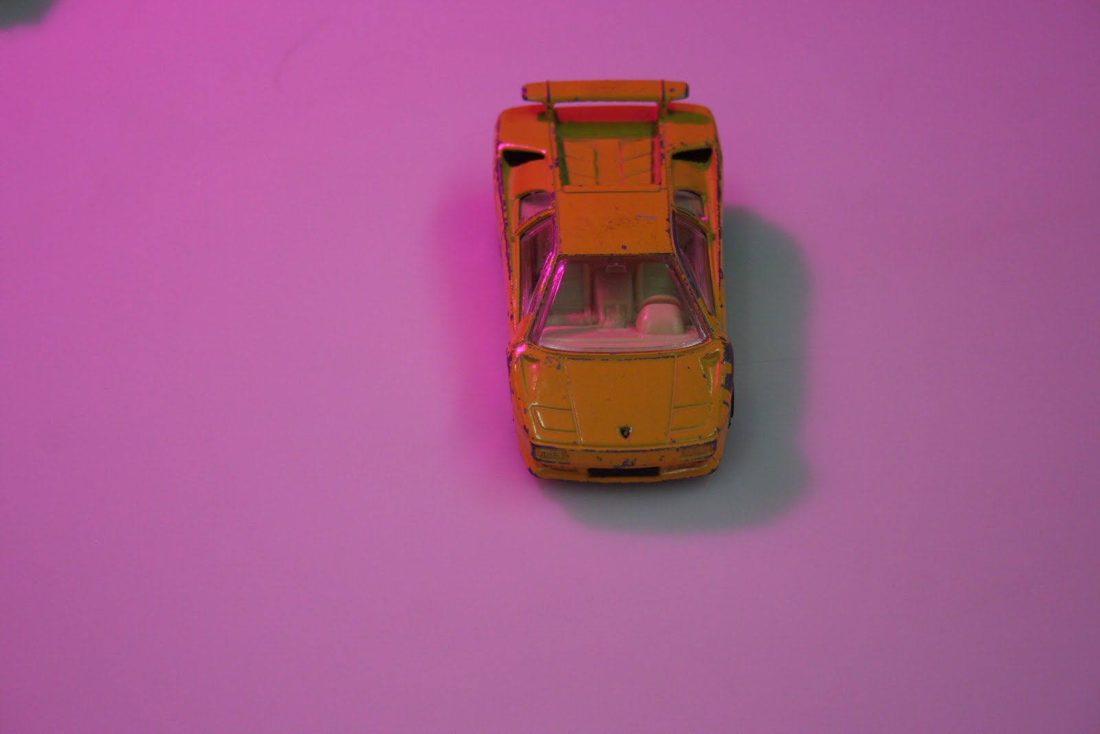
We had a really interesting reaction using the purple gels over the lights- causing all the shadows to appear green. The four of us were really fascinated by this reaction, and were curious as to whether it was the optical effect from blending the colours? Or how the white reflected the purple transparency, combined with the grey tones of the shadow?
Definately one to query course leader Fred, aka, the master of colour, about!

Another great colour combo- in photography, I have been a real fan of white-on-white for sometime- loving the washed out and eerie look it often creates, but this yellow-on-yellow has really fired up my imagination- the brightness is delightful and gloriously vibrant- I will definately apply more bright-on-bright combinations within my designs as soon as possible (watch this space!).

Begin to experiment with my colour- red and more composed set-up of images. Originally using my red camera necklass, I embelleshed the set with a few items I happened to have lingering in my bag (...If I'm honest, they never leave my side...).


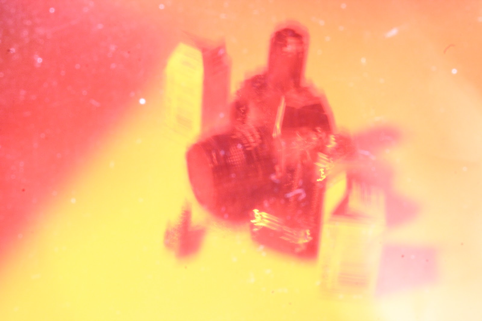
Beginning to get a bit more experimental, I used manual focus and a low shutter speed (100 and 200 ISO) to created blurred, light-leak effects.
I really loved these experimental, random effects and it would be really easy to create a flowing series by repeating similar movements and shakes of the camera when capturing an image, however, I think that the colour isn't as clearly represented as it should be- perhaps a little too yellow and orange- not as bold as I would like (perhaps double layering a red gel could emphasise this?)


Taking pictures through the coloured gels- I loved the textured this picked up from the film- small, grainy lines which almost looked as if they were produced from 35mm in a dark room. Definately a method I will try again. However satisfying it is being able to apply textures and layers digitally through Photoshop- if feels great to know that it can be just as easily done in the manual, traditional sense.


Again, I loved the motion and textures in these images- but perhaps a little too yellow. Really enjoyable to experiment with though- having fun and trying out new things is such a satisfying way to learn.


...Trying out the method with a violet gel too. Photography provides a great chance to experiment with the versatility and effects of colour, cheaply and efficently.


Experimenting by layering three coloured gels in front of the lights to create a gradient-like effect you would achieve in Photoshop. I really loved these images- so bright, colourful and energetic and the range of colours achieved from the blend was great- a really good technique.


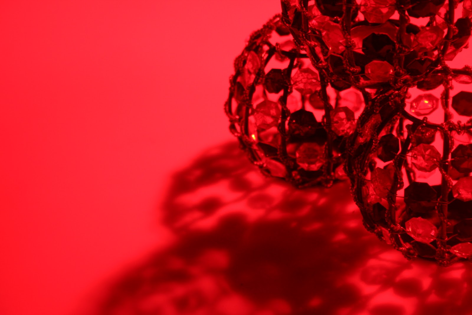
It was when Lisa started to photograph her tealights that I was really inspired- when the red gels were placed over the lights the image was stunning- the shape of the tealights allowed for a lot of range in shadow, and the decorative beads helped to create really interesting shapes. I was also really surprised by how great the contrast was of the shades and tones- almost as if the image was in black and white, with a red overlay.
I will definately use a series of ten of these images (I have many more photographs from the day, but won't upload them all here, for fear of breaking the world wide web...) for my final designs- I feel that the varying styles of composition and boldness of the contrast and shapes is a real new, and striking photographic style for me, and I feel really proud of how these images turned out.
No comments:
Post a Comment