
KERNING is the negative space between letters, and only put in place for singular words, as readability and legibility in type. But how do we keep the consistency?
Visually, we measure the negative space between letter forms to distinguish correct kerning- working from the largest negative space between two letter forms and then applying this to all letter form spacing within the word.
Kerning is only used for singular words, particularly in logos and brands.
Although computers and software systems provide kerning measures for us, perfection can only be achieved manually.
NEVER negatively kern a word.
Kerning changes the tone of voice in the word- practice makes perfect.
Work to amend the other letters comparative to the pair with the widest negative space.
HIERARCHICAL TEXT//TYPE
Learning how we visualise type by it's placement on a page.

Centralising a word will automatically draw us in due to the amount of negative space surrounding it.
If a word is closer to the edge of the page it will draw less attention, and will be less bold.
Factors of hierarchy on a page include:
SIZE//POSITION//WEIGHT

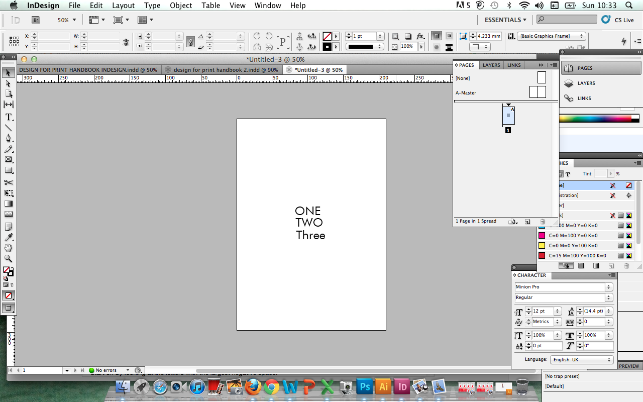
Despite LOOKING at the upside down 'four' first, we still read 'one, two, three, four'- our eyes are lazy and conditioned to read in a traditionally hierarchical way- though get confused by the confused shape and letter form of the 'four'.

In this scenario, with the 'four' at a 90 degree angle, and obstructing the negative space surrounding what would otherwise be the hierarchical 'one', we first read 'two', as the letter forms are far less confused and readable.
We first look at the four, due to the laziness of hierarchy reading (as aforementioned), but it is not read first.
In this scenario, we read 'one, three, two' as the 'one' is at the top, it is naturally (to our lazy eyes) hierarchical, whereas the three draws our attention as it introduces both upper and lowercase (notably lowercase here is effective) in a title case. Lowercase is naturally easier to read as we can distinguish the letter forms more readily (as they have stronger visual characteristics than uppercase) and read the SHAPE as opposed to the letter (hence why it is used on road signs, motorways, etc).
HOW DO YOU BREAK A SENTENCE
INTO TWO LINES?//
USED FOR:
HEADINGS
Newspaper, magazine, editorial article.
You ALWAYS break a sentence where the natural pause is.
Consider type as SPOKEN not read.
***
EXERCISE I:
KERNING OUT FIRST AND SECOND NAME (INDIVIDUALLY)
Start off by looking at the letters with the largest negative space.
FIRST NAME: San Serif UPPERCASE
SURNAME: Serif UPPERCASE


Firstly, I went on to practice the exercise of kerning with my first name, 'Sophie'. At this stage, I am unsure whether typefaces make a significant impact upon the ease of kerning, or the letter form combinations in particular, but I found this sans serif typeface much easier to work with.
Luckily for me, the largest negative spacings, and most consistent were found at the end of my name in the 'HIE' section, with the 'S' and the 'O' the only areas which I felt needed attention. I increased the spacing by 10, and felt this gave a more balanced, kerned outcome.


I then went on to kern my surname, and I found this far more challenging- the serif typeface perhaps giving the illusion of far less negative space than there perhaps was, resulting in far more edits and alterations in manually kerning and spacing the letter forms.
However, I am quite happy with the results and look forward to seeing how well I have executed the exercise- I definitely want/need to do some more practicing!
EXPERIMENT WITH COMPOSITION AND LAYOUT OF A PROVERB/SONG LYRIC
(6/7 words)
Be creative with the layout- not a standard, conventional hierarchy and test how effective this is in it's ability to be read easily and fluidly as it would traditionally be.


I found this exercise quite fun, and it was a really good experiment of understanding and how we read and view type, my quote (which can be found at the bottom of the page) is from Regina Spektor's song, 'Aquarius'. To achieve hierarchical, yet deconstructed type layout I explored the use of weight (bold/regular), point size and italicising for emphasis, as well as rotation of words- hopefully to showcase an experimental, yet readable design. Before our next type session, I will test this out on a fellow GD-er to see how effective my experimental layout has been.
This has definitely inspired me to be more experimental with my type layouts, and has given me great inspiration for projects I am working on at Uni, my Issuu brief, as well as my main 'Design Production for Print' Wes Anderson brief- both of which can be found on my Design Practice blog.
Take our chosen proverb/sentence and effectively separate it into two lines of text.

One of my favourite quotes (Ben Franklin), 'Love thy neighbour yet don't pull down your hedge', which I always found quite entertaining.
Personally, I think that proverbs are perhaps a little too simple for this exercise- as we are regarding the type as spoken, proverbs are so commonly spoken and known it makes it quite simple. So, I decided to experiment with a few song lyrics to, to try and challenge myself a little more:

This line, 'the drops they slip right through my fingers' from Regina Spektor's 'Aquarius', is one of my favourite songs- and remaining quite ambiguous in the sentence I have chosen will give me a good chance to experiment with the layout, composition and hierarchy to see how effective my methods and pratice has been (this is the phrase I have chosen for my experiments in hierarchy, see above).
No comments:
Post a Comment