


In the past developments of this project (such as the one-week packaging brief) I have flirted with creating logos, though I felt at that time, the one chosen was far too irrelevant to my now final concept, and on my part was far too vague. Creating a new logo now to encapsulate the idea of the Wes Anderson film festival gave me chance to try something new and not be too "attached" to past designs.
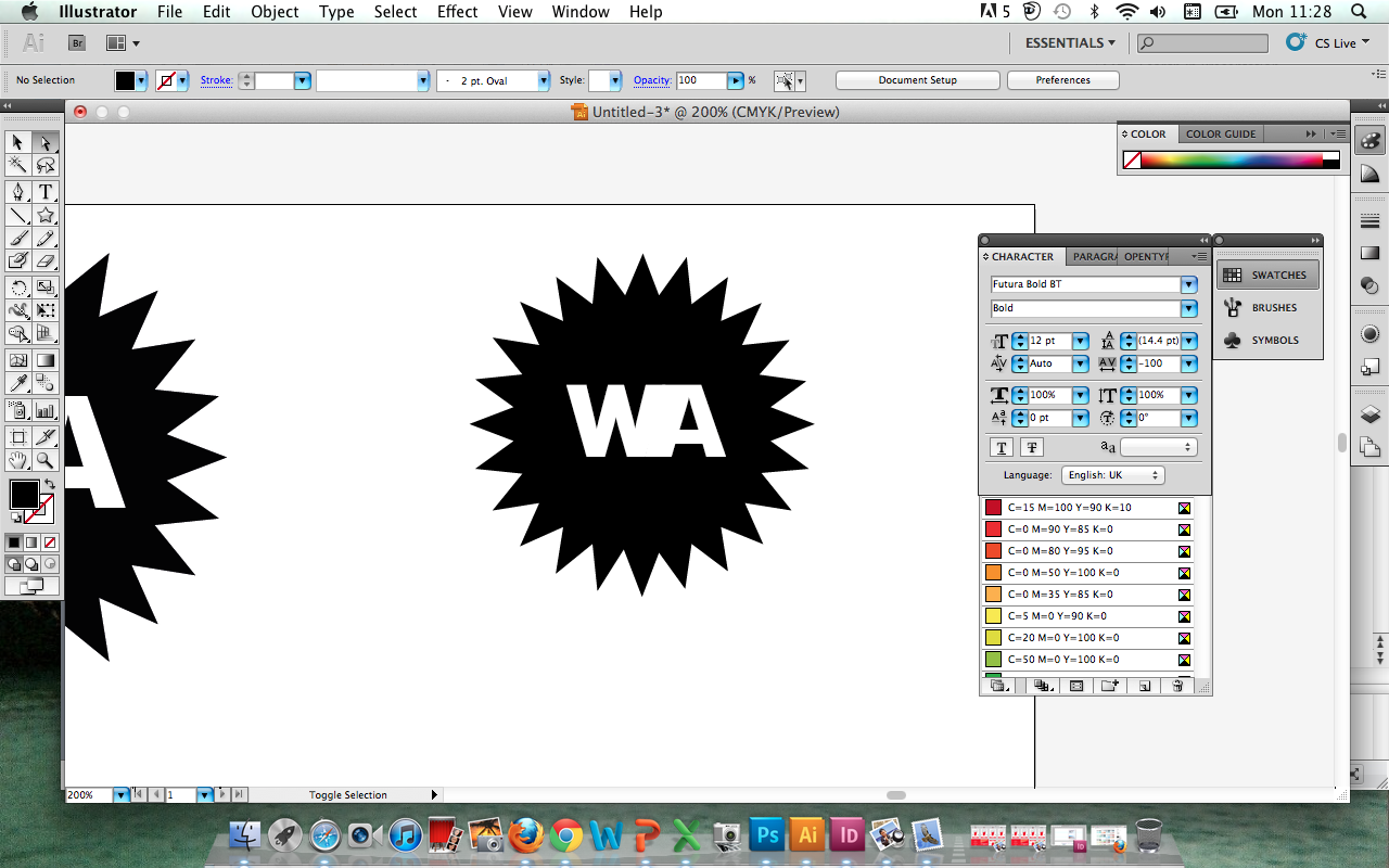
Inspired by a quick "two minute" logo created for my initial "What Is Good?" presentation for the start of the second year, I replicated this design- a simple use of a star burst vector to represent the flash of a camera (film) as well as visually communicating something requiring special focus or attention- the shape often found in shops or printed media as "special deals", "prizes", etc. The reversed out white 'WA', of course, standing for Wes Anderson. Although it worked to an extent, it certainly required more information to work as a stand-alone logo.


Through this project, I have found it both a blessing and a curse that Wes Anderson is so recognised for his use of the typeface Futura (particularly bold). Despite the potential to experiment with other typefaces, I feel that Futura is a fundamental link to Wes Anderson and any other typeface seems alien to the visual communication of his films.
Here, I've experimented with several typefaces from the Futura family- Condensed, Medium, Book, Bold- also creating outlines to join the two letterforms together (though this negative kern doesn't work at all- far too messy).


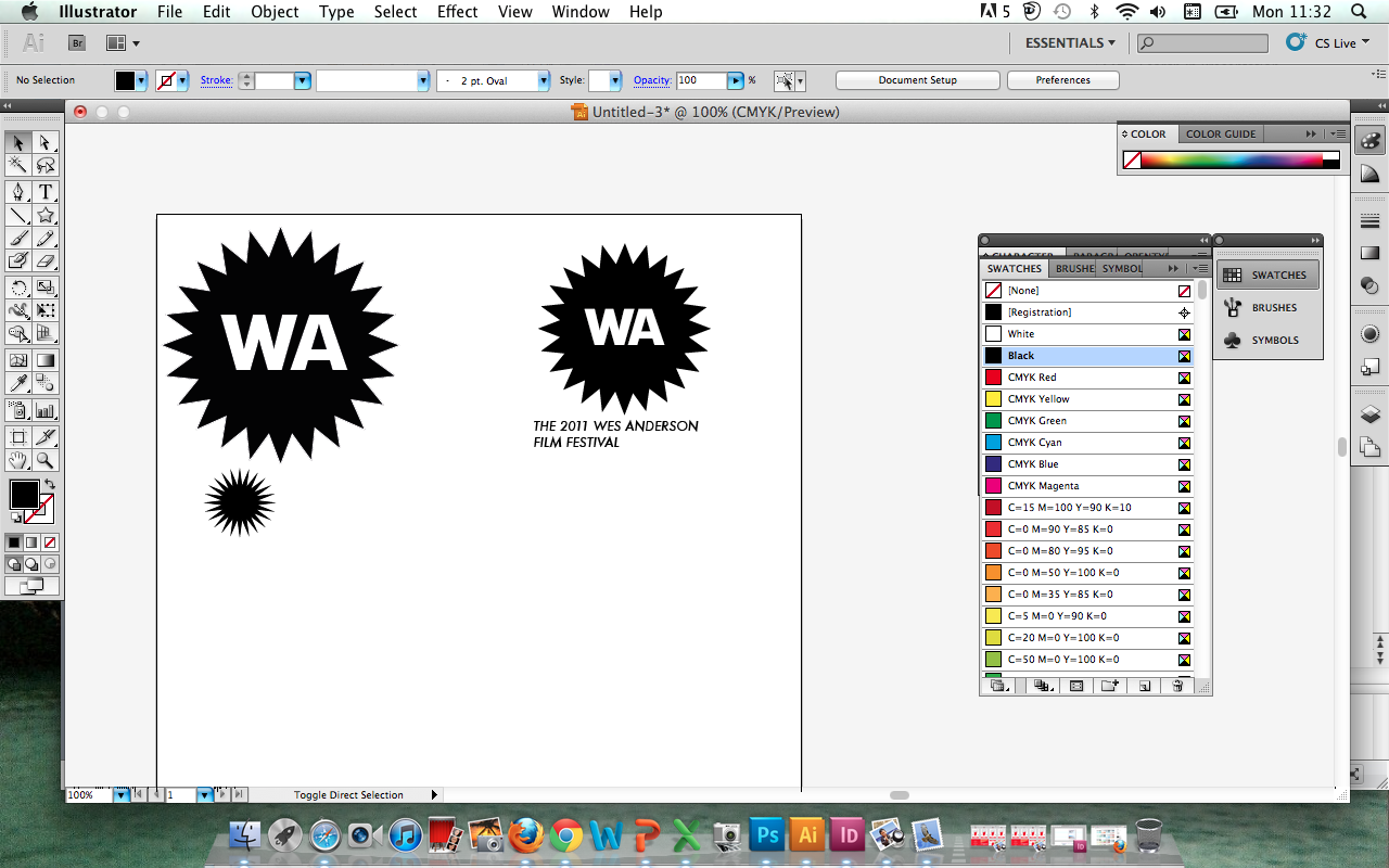

As aforementioned, the logo certainly needed something extra- an element or section of type to make it more understood- here I used the (temporary) text "The 2011 Wes Anderson Film Festival"- experimenting again with different typefaces (italicised working most effectively) and alignment- central working best with the logo image.


Finding the logo a little flat and boring, I began to experiment with other typefaces such as Century Schoolbook (as can be seen in the screenshots above) and shapes- such as reversed out star bursts, circles and banners. I felt that the italicised Century Schoolbook worked well with the logo, and gave a more prestigious visual (communicating the style, class, or importance of the event) but looked a little contrasting to the high-impact burst- and not appropriate for communicating Wes' films, as Futura does so naturally.


I started to experiment more with the banner design, as I felt this was well suited to the event- evoking an award-like feel, and a contemporary and well-recognised design style.
Again, I used the blue as I felt this represented Wes' films most effectively.
Unfortunately, I was unable to download the Adobe Kuler swatches (unrecognised files- will try and again tomorrow!) so for the meanwhile just used the colour picker to represent colours from CMYK, though would, ordinarily use PANTONE spot colours (they will be colour matched when my designs are more finalised/decided upon...).
Using a negative kern for the 'W' and 'A', along with creating outlines and adjusting the anchor points for a more parallel stroke line, and the italicised Futura medium, as used previously in my packaging design experiments.
I felt this worked well as a logo for a promotional campaign- quite unusual and decorative enough without being overpowering... I went to apply these to a basic duotone image created of Wes Anderson yesterday in Photoshop.


Applying these to my designs, I was quite happy with the result, and felt it worked well on the Duotone image, creating quite a bold and cinematic image (working particularly well in the left-hand corner). I think this image of Wes works particularly well, though will explore with my own primary source photography in the next couple of days- with objects represented in the films (such as particular books, objects, costumes, etc) as well as pictures of the Hyde Park Picture House (where the film festival itself would be held).
I decided upon the name 'Needle In The Hay' for the Film Festival as this both represents the unique quality of both Wes and his films, but also reflects upon one of the most iconic moments in his film 'The Royal Tenenbaums'- a moment of isolation and the "outsider" that is (in Wes' opinion) so attracted to his films...
I decided upon the name 'Needle In The Hay' for the Film Festival as this both represents the unique quality of both Wes and his films, but also reflects upon one of the most iconic moments in his film 'The Royal Tenenbaums'- a moment of isolation and the "outsider" that is (in Wes' opinion) so attracted to his films...
No comments:
Post a Comment