

Starting to work on the development for my net packaging to incorporate my Wes Anderson logo, as seen posted previously on my Design Practice blog. Given the original net sheets, I scanned them in and then traced (due to poor quality scanning) the sheets in to create the nets for:
- Letter Envelope
- Pocket Folder
- Locking Fold Folder
- Bottle Carrier
I then made up examples of the nets to see what they would look like when produced, as the images below show.


The bottle carrier is certainly the most complex of the nets to form- I will check when in Uni on Monday about it's construction to ensure that I get the shape right post-print.


Nicely creased here... need to take more care of my work...
Of
course, scale is an important factor- and of course, these items will
need re-sizing at a later print stage (which I will ammend during
practice prints, mock-ups etc). These are my initial designs for each
net:
I then went on to develop designs for my envelope, as I had most inspiration for this design from the past few days, and felt this, consequently, would be the easiest to approach.
LETTER ENVELOPE

My complete range of designs- covering a total of thirty-five artboards (again, more than I had originally anticipated- but a great sign that my ideas are naturally developing). From my original logo designs, I had quickly established that I wanted to work with red/blue/white- as I felt these were more visually communicative, and representative of my nautical theme.
At this stage, I am using only process colours. Due to the digital printing methods I will be utilising (for short print run, cost effectiveness, ease, etc) any spot colours would automatically be converted to CMYK, and, therefore, be useless.
At this stage, I am using only process colours. Due to the digital printing methods I will be utilising (for short print run, cost effectiveness, ease, etc) any spot colours would automatically be converted to CMYK, and, therefore, be useless.


I quickly found that the "French" navy (Jean-Paul Gaultier... and I always associate it with France- it's a favourite in Sarkozy's wardrobe, apparently) to be best suited- creating a real nautical, maritime design with the stripes giving a distinctive, yet simple design.
I decided to create an inside print for my envelope (see image below, right) which was a continuation of the navy blue with a polka dot-like pattern on the inside flaps- still unsure as to whether or not I should print this pattern on either or both of the other two folded sides on the inside print- I will perform a test print and evaluate which style works best.


The evolution of my envelope designs (l-r, top row-bottom row). The interior/inside print for the envelope (polka dot print) needs to be sorted- the flaps at the back of the envelope make it look slightly untidy, but this is a small ammendment- other than that, quite happy with the design. Simple, visually communicative.


After later inspiration (see text content below, as well as ticket permit edits) I decided to create printed media to act as an interior for my envelopes- printed invitations which showcase a still of musician and actor Seu Jorge from the film with a bold, consistent, and informative design.
POCKET FOLDER


Designing the pocket folder was a far deal quicker now I had a distinct style. I decided to keep a consistent branding and print throughout my designs to maintain the colour and stock choice for a far more professional and considered outcome.
I created the 83x83mm pocket folder first (as given on the net print) and kept the logo- to ensure the design be kept as simple and bold as possible. However, I felt the net was a little too small, and felt it would work far better at an A4 scale for documentations, as it's purpose would usually fit. To fit the net at this scale, it would need to be printed at A1 (see image directly above). I will continue to experiment at a larger scale A3 (when back at Uni with larger printers!) to finalise my decision at this later stage. Also having altered the position of the logo to the top of the net fold page.
Another consideration is to mimic the die cut of the envelope by cutting the blue wave area out of the logo- a creative way to see both the patterned inside, and also to have a "quick-view" as to the documents inside.


The evolution of my printed pocket folders (l-r, top row-bottom row). The polka dot cover will be the interior printed side for the DVD/pocket cover.

After a brainwave- I decided to utilise the square formatting of the pocket-fold to create a DVD cover- something that too would be more appropriate for my design content and "good" theme. Fitting to the nautical theme, I decided to brand the design as 'The life Aquatic with Steve Zissou collectors edition DVD' in the Wes Anderson collection. With 125 x 125mm measurements, the design will need to be printed on A3, though I have created an A4- scaled mock up (see below) for a rough idea of the design. Again, I will experiment with die-cut- like cutting (in the center, perhaps when the circle of the DVD would lie?) when printing at this scale is accessible
(Leading increased on the bottom picture- more readable and legible design- and a change of type, after a print test the stroke colour bled and was unreadable in parts- the italicised version, though still different, is much more print-friendly).
With a new concept for my packaging branding (see information below in 'locking fold folder'), I have decided to transform the pocket folder DVD cover into a CD cover (therefore, still maintaining the same dimensions) as a complimentary 'The Life Aquatic with Steve Zissou OST CD' gift on attendance to the film screening.

A simple, traced design of a CD, into which I shall overlay my chosen image. I decided to incorporate an image from the film to diversify my branding, and to ensure a strong visual outcome.


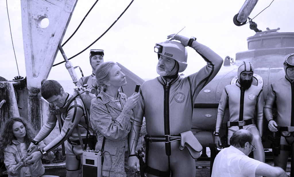

After sourcing my chosen image online (musically relative- where Steve Zissou (of the title) talks about how they pipe music into their deep-sea helmets), I reverted the original copy to black and white and added an adjustment layer with my navy spot colour for a duotone- like effect, before impossing this onto the CD trace. The image directly above with the three CD designs shows various scales, the image in the third artboard, top left hand corner being the true 125 x 125mm scale which I shall print as a mock-up print design.
LOCKING FOLD FOLDER

After a short time away from my designs, I decided that I wanted to have a little more focus with my branding and identity. Therefore, I have decided to promote my items with a "film festival" concept- each item suited for a particular necessity (the image above shows the screening pass wallet):
* An envelope containing a ticket to the film screening of 'The Life Aquatic'...
* A pocket folder CD case (containing a CD with the 'Life Aquatic OST', a complimentary gift on arrival)
* A screening pass which allows you to gain access to the film screening.
* A bottle carrier containing a bottle of 'Zissouade'- fresh water from the Ping Island oceans (a complimentary gift on arrival).
I am really excited about these developments, and hope to gain a more substanial and meaningful body of work from them. Of course, with only two days remaining until Wednesday's workshop, this will undoubtedly be a feat of design, but I'm game.


Re-design of my pocket fold wallet- altering the scale of the packaging to the same dimensions as the envelope net, 75x 125mm- keeping a consistency over the brand range to contain a film screening pass (to be designed and printed asap).


Designs for screening permits- bold, branded consistency- with an image wrap around the logo for a unique and stylised variation of the polka dot identity print. This would look great with a silver foil block finish (as opposed to the white)- definitely something to consider and look into at a later date.


After returning to my designs, I considered my CD design- and certainly wanted to keep more of a consistency with this style, in fear of it looking as if it were an "odd-one-out" (having already attempted a more simplistic vector design but being dissatisfied with the results). Therefore, I experimented a little with a great shot of Bill Murray as Steve Zissou from the film- used bold and consistent type and image on the design to achieve a style I was pleased with- as can be found in the image directly above, right-hand corner artboard (a double-sided design).
BOTTLE CARRIER


STATIONARY AND MERCHANDISE


A few printed sticker designs- a basic stationary item which represents the printed logo- an item for sealing envelopes, packaging, etc. I would really love the develop a rubber stamp of this design, but, of course, time and skill constraints are an important factor. However, it is something I would certainly like to look into for my final outcome for this Design Production for Print project.


Badges created using a quick Photoshop edit- promotion of the event (film screening) incorporating the brand logo as well as manipulated logo designs as a freebie when attending the screening which boasts "I've seen 'The Life Aquatic with Steve Zissou'- a promotional tool as well as a fun giveaway.


The 'I've seen...' designs, to be printed as stickers (measured at 70mm in height and width for a readable design- also a similar size to gloriously nostalgic dentist's stickers- gives an added, playful, child-like charm).

Another quick Photoshop edit- here incorporating the logo onto a t-shirt... perhaps to be worn as a uniform for workers at the event, or another giveaway item (looks a little life-guard-ish though, due to the nautical theme).


Because of the digital process that my designs will be printed in, I have chosen a process colour for my designs to be printed in the four- colour process (CMYK). However, this afternoon I matched up my navy colour to a Pantone swatch (solid uncoated for printing on matte white card), so will create re-designs with this chosen colour (see designs below). Given more time, I would also be interested in creating metallic foil blocking print finishes (where the white/negative space is represented in the image)- and have gone on to digital represent how they would appear in their final designs.
SPOT (PANTONE) COLOURS:
NAVY: 5 39 C
SILVER: Cool Gray 7 C
GOLD: 1495 C (decided to replace with 147 C in edits for a richer colour)


First, I reapplied my Navy blue colour with PANTONE 5 39 C, which gave the images (what appeared to me) a higher ratio of yellow mix, with a slight green tint in an almost grey shade.


I then applied the PANTONE Cool Grey 7 C spot colour over the white, where the silver foil blocking print finish would be applied. I really liked the effect this created- subtle, yet luxurious- the colour combination worked really well, and this is something I would definately like to experiment with more in the future of this project.
(Please excuse the poor edits now visible... pre- print excuses!)


Next, I applied the PANTONE spot metallic colour 147 C to add a metallic foil blocked aesthetic and finish. Despite the more luxurious and sophisticated outcome of this design (as opposed to the plain white initial design) I was dissatisfied with the result- with too many visual connotations of blue and gold springing to mind- the Swedish flag, butter brand packaging, Egyptian headresses, etc (well, they made sense in my head...). Also, I feel the colour is a little too dark and dulls the blue- giving less visual luminosity to the images and designs.
No comments:
Post a Comment