
Starting to put together designs for my "Top Ten" Print Manual of things that are key to know in print. After deciding on my final list of content for the book (see previous posts on the blog) I set about organising my page layout and said content into an orderly and logical format through the pages (from the beginning to the end of the design process as a narrative throughout the handbook).


I
finally resulted in having a 24 page booklet design layout in A5 (practical as a handbook/zine- fits in bags, easy to hold in DPS)- a great
number considering imposition when printing, as it can be made up from
one A1 and one A2 sheet of stock- very economical.


Creating the cover design (to inspire the content design and layout for the entirety of my publication) I created registration marks, reversed out my type for a more unique design, and used the PANTONE spot colour 88 7 U, which, if printed, would reveal a metallic silver print finish.
I used a Baskerville Italic ampersand to represent both the luxury of print and the "and" it represents... that print isn't an after thought, it's an integral part of design not just "design" but "design AND print"- the two are essentially bought together, hand-in-hand.


To get a feel for the book and it's general aesthetic, I first began playing around with different typefaces for the cover design and consistency of type used throughout the guide book. I experimented with different designs and names- deciding that I wanted to use a sans serif, bold typeface to reflect the modern methods and techniques used in printing today, with a confident design.
I decided upon News Gothic MT- varying in uppercase, regular, sentence case and bold for particular parts throughout the design for specific needs (header, sub headers, etc).Creating the cover design (to inspire the content design and layout for the entirety of my publication) I created registration marks, reversed out my type for a more unique design, and used the PANTONE spot colour 88 7 U, which, if printed, would reveal a metallic silver print finish.
I used a Baskerville Italic ampersand to represent both the luxury of print and the "and" it represents... that print isn't an after thought, it's an integral part of design not just "design" but "design AND print"- the two are essentially bought together, hand-in-hand.


I then went on to develop an A5 grid in InDesign to help the structural layout of my book.
Vertical griding (per DPS): 20mm//276mm
Horizontal griding (per DPS): 33.489mm//52.5mm//105mm//157.5mm//193mm


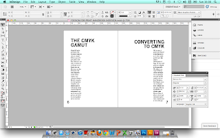
Originally opting for a horizontal format for my body of text(s), I experimented with a more vertical composition, and found that suited the page layout a great deal more- plus, gave more visible space for images, an important necessity for text/visual instructions and comparisons, as well as the aesthetic benefits.

Again, another experimentation- the left hand page body of text left aligned, the right hand page, right aligned in a mirrored effect makes the DPS appear to have a great deal more negative space, and more fitting to a minimal aesthetic- hopefully not making the informative body of text too overwhelming and difficult to read.


In terms of content, I started on the Glossary. Working from definitions found and sourced on my Design Context blog, as well as my own personal knowledge that I have built up from the print seminars and inductions, this would help me to focus on the particular subject areas and content when filling them in at a later date.


Editing small features as I go... from deciding upon the content and body of text, small features have to be altered where necessary- such as point size. Consequently, I decreased the folio (page numbers) so they didn't detract too much away from the body of text itself.


My first completed DPS for manual content- happy with the results so far. Keeping it simple, and hopefully, crisp and considered. To ensure that the best photographic evidence is available in a short time frame (as the module deadline creeps closer...) I have used secondary source imagery with source links for now- and I will replace them with high-quality primary source images if time permits in the near future.


Saving my pages in PDF format, to see the results achieved so far. I'm quite happy with the grid structure- it's taken a lot of tweaks and mathematical equations here and there, but it looks minimal, whilst still considered and rich in content.


Throughout the time I have been filling my manual with necessary content- images and textual reference, quotes, etc, I have still consistently been considering my layout, type and griding structure. The light, low contrast images made me feel that the header type was perhaps too bold, so I experimented with a 50% tint of black, and also tried an italicised weight, and felt this was most appropriate- and kept the publication looking modern, styalised, and interesting.


Originally opting for a horizontal format for my body of text(s), I experimented with a more vertical composition, and found that suited the page layout a great deal more- plus, gave more visible space for images, an important necessity for text/visual instructions and comparisons, as well as the aesthetic benefits.

Again, another experimentation- the left hand page body of text left aligned, the right hand page, right aligned in a mirrored effect makes the DPS appear to have a great deal more negative space, and more fitting to a minimal aesthetic- hopefully not making the informative body of text too overwhelming and difficult to read.


In terms of content, I started on the Glossary. Working from definitions found and sourced on my Design Context blog, as well as my own personal knowledge that I have built up from the print seminars and inductions, this would help me to focus on the particular subject areas and content when filling them in at a later date.


Editing small features as I go... from deciding upon the content and body of text, small features have to be altered where necessary- such as point size. Consequently, I decreased the folio (page numbers) so they didn't detract too much away from the body of text itself.


Although I was reasonably happy with my cover design when first putting it together a couple of days ago, it came to my attention that the only way it would look like a truly "print focused" manual would be if it were professionally printed to reveal the PANTONE spot colour (of the original ampersand) and if any special print finishes such as foil blocking or spot UV varnish were applied. Therefore, I decided to play around with other designs that would be more visually communicative of print for when the publication is posted on my Design Practice blog via Issuu. The design below, which shows the graduated % tones in a horizontal-bar format being my favourite.

My first completed DPS for manual content- happy with the results so far. Keeping it simple, and hopefully, crisp and considered. To ensure that the best photographic evidence is available in a short time frame (as the module deadline creeps closer...) I have used secondary source imagery with source links for now- and I will replace them with high-quality primary source images if time permits in the near future.


Saving my pages in PDF format, to see the results achieved so far. I'm quite happy with the grid structure- it's taken a lot of tweaks and mathematical equations here and there, but it looks minimal, whilst still considered and rich in content.


Throughout the time I have been filling my manual with necessary content- images and textual reference, quotes, etc, I have still consistently been considering my layout, type and griding structure. The light, low contrast images made me feel that the header type was perhaps too bold, so I experimented with a 50% tint of black, and also tried an italicised weight, and felt this was most appropriate- and kept the publication looking modern, styalised, and interesting.


Another consideration was the positioning of the headers- I felt that the ratios of the page and grid were a little bottom-heavy, so I moved the top line up to 16mm for a more balanced design.


Screenshots of my final print manual design. I am pleased with the overall visual result, though I would have liked to have more experimental variation between pages for an increased visual interest.


After continuing to add text and images to my designs, I have my finalised (for now!) design- now
published on Issuu (http://issuu.com/sophieindisguise/docs/printmanual#download).
Considering the time constraints I am reasonably happy with the design I achieved, though I would have liked to have experimented with more versatile layouts and grids as well as a more inventive use of imagery and typography. If time permits, I would like to return to this brief before module hand in to make necessary amendments to enhance the design.
No comments:
Post a Comment