


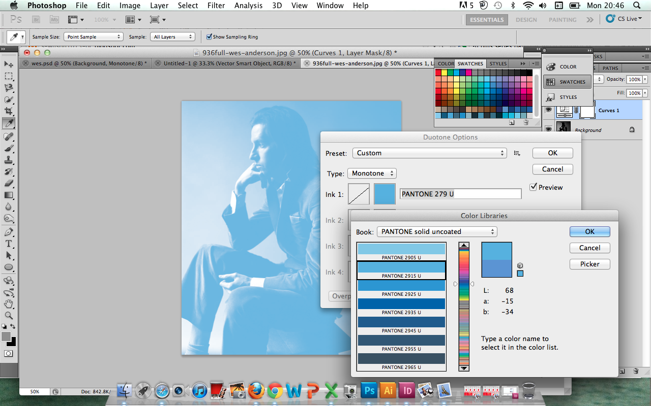


Here, just experimenting with some really basic designs to get "the ball rolling" in terms of design ideas and outcomes. Using the CMYK colour picked Adobe Kuler colours, I translated these into appropriately matched PANTONE colours using the swatch library swatches and colour bridge swatches. Currently considering an organic, contemporary visual, I have used an "uncoated" colour- imagining textured, almost newsprint like light gsm paper to be used in print production.
Again, just a quick experimentation, but I am liking the composition of the right-aligned type- need a consistent size for the show title (will be produced in it's final stages in InDesign)- and feel that the colour works well with the reversed out type- looking forward to expanding these designs further, and, hopefully, creating a consistency among the promotional material range.
No comments:
Post a Comment