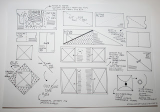
A few simple diagrams and illustrations for potential design and outcome development for my Wes Anderson film festival 'Design Production for Print' project.
Admittedly, the past couple of days have been very challenging- and I feel as if my mind's changed one hundred and one times. These sketches give a little insight into my thought processes, and what I now aspire to create- my concept, style and products.
The sketches below show idea development from yesterday, and my final development sketches will be posted separately (as soon as possible on this Design Practice blog).
Billboard and advertisement ideas- looking at various different methods of folding for invitations and mailshots- perforations playing a big part in my design development- a unique folding and opening mechanism which would add to the anticipation, and the feeling of opening a gift- an invitation
to the festival.
Also looking at rotary blade billboards (as I have started to look at in posts below) and their potential- though I feel that necessary information or design details would get lost in the cut slat grooves, design the potential benefit of multiple-surface images and printed designs.
More concepts for mailshot designs- creating gate fold designs with the aid of perforated flaps- more interactive and engaging- also reminded me of the curtains opening in traditional cinemas, unveiling a grand event- could be a fun play on the visual experience of cinema-going.
The perforation idea also leads on to "spreading the word" creating mailshots with multiple tags so that the recipient can invite friends along too, with necessary information, and increasing audience members.Again... more experimentation with mailshots (getting quite into it...). Keeping the design relatively simple and subtly stylish could allow more playful or inventiveness in terms of my folds and binding methods- simple innovation without being too overly elaborate- communicating a similar style to Wes' films.
Considering the branding of my designs a little more. Yesterday, I had convinced myself to create a photographic set up for my images- in a rostrum style shoot with the objects representative of Wes' films. However, after a frankly traumatic day and evening of indecision and dissatisfaction with the project (along with the struggle to obtain objects and props with a limited cash flow) I decide to focus my ideas elsewhere.
Following the concept "outside the box" I decided upon, I went on to sketch up a few items and logos with a similar theme. However, despite liking a few of my shapes, folds, layouts and concepts it looked more like packaging for a courier company than a film festival. Need to be more subtle and focus on the films- the name is an added flourish, but not a priority.
It's been good to return to hand-rendering designs- a much more natural and fluid way of producing design ideas. However, there is still a great deal more to do- working on many more product items and deliverables (wayfinding, merchandise, etc) so will create design sketches for these products, and post them to the blog as soon as possible. Also need to focus on a particular design style and concept- and don't get carried away. Communication is key. Think about my audience, and what I am proposing first.


No comments:
Post a Comment