
Although my ideas and designs were more focused due to hand-rendering, I still wasn't entirely sure what I was aiming for, and had a good experiment with different designs, creating far more than I had originally anticipated, which really helped me to think more creatively with the design.

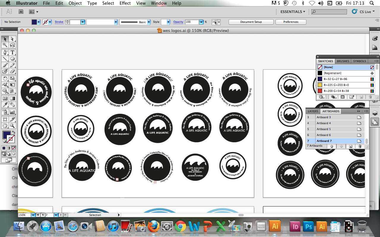


This was the design I finally decided upon- simple, bold and visually communicative- not too dissimilar from my first draft hand-rendered design- and I was pleased with that. The group marking my work told me it was effective, so I knew it just needed a few small "tweaks". I also decided to go down a Wes Anderson/Jacques Costeau route in terms of the logo's purpose- as the nautical theme along was, admittedly, a tenuous link- so I felt that, working with these restrictions, it was the best way to ensure my logo was visually communicative.


Once I was happy with this design, I went on to apply colour- taking inspiration from Wes' nautical film (directly inspired by Costeau- the famous videographer and oceanographer)- particularly the costume of Team Zissou (of 'The Life Aquatic with Steve Zissou'). The blue worked particularly well (ocean/water/nautical) and decided to experiment with a few different swatches in my colour palette. Along with the monochrome design, the two (image above) that I liked best were a cool blue- like the Team Zissou shirt, and a more royal/navy blue, which looks more sophisticated and "nautical". Although I am currently undecided which to call my "final", I will go on in the forthcoming days to experiment with application to my packaging designs, and make my decision then.
No comments:
Post a Comment