

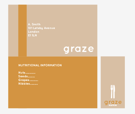
Moving away from the green colour palette I was originally experimenting with, as shown in my previous post, I decided to go with other natural, organic tones- looking to more oranges, yellow, and browns, which I felt still visually communicated the "natural" qualities of the box, perhaps being slightly less typical than the usual green and brown combinations you find in "environmental" brands.

Applying the colours, again, to my very basic, minimal designs, I felt that the mid/burnt orange was well suited to the mid-brown swatch of the kraft card/paper I had previously sourced, and it still maintained the natural, organic look- reminding me of pumpkins, squashes and other autumnal food products- working very simply with the brown stock colour, reversed-out white and the newly selected orange, I believe, works well together, though I am slightly concerned in terms of the visual communication- would this be percieved as as natural and environmental a brand and product as opposed to using green?
Definitely worth researching more into (evidence of which will be found on my Design Context blog) and discussing with Charlie, as well as, if possible, getting feedback from my peers.


No comments:
Post a Comment