
Not content with the colour palette that we were considering too, particularly after negative feedback from our crit session last week, Charlie and I have decided to move away from the jade green palette. However, we were still open to the colour green, particularly because of it's natural and environmental connotations. For a little inspiration, I went around my room photographing all that was green, and, unsurprisingly, finding that the vast majority of the greens/items had links to health and nourishment- such as moisturisers, haircare products, and so on.
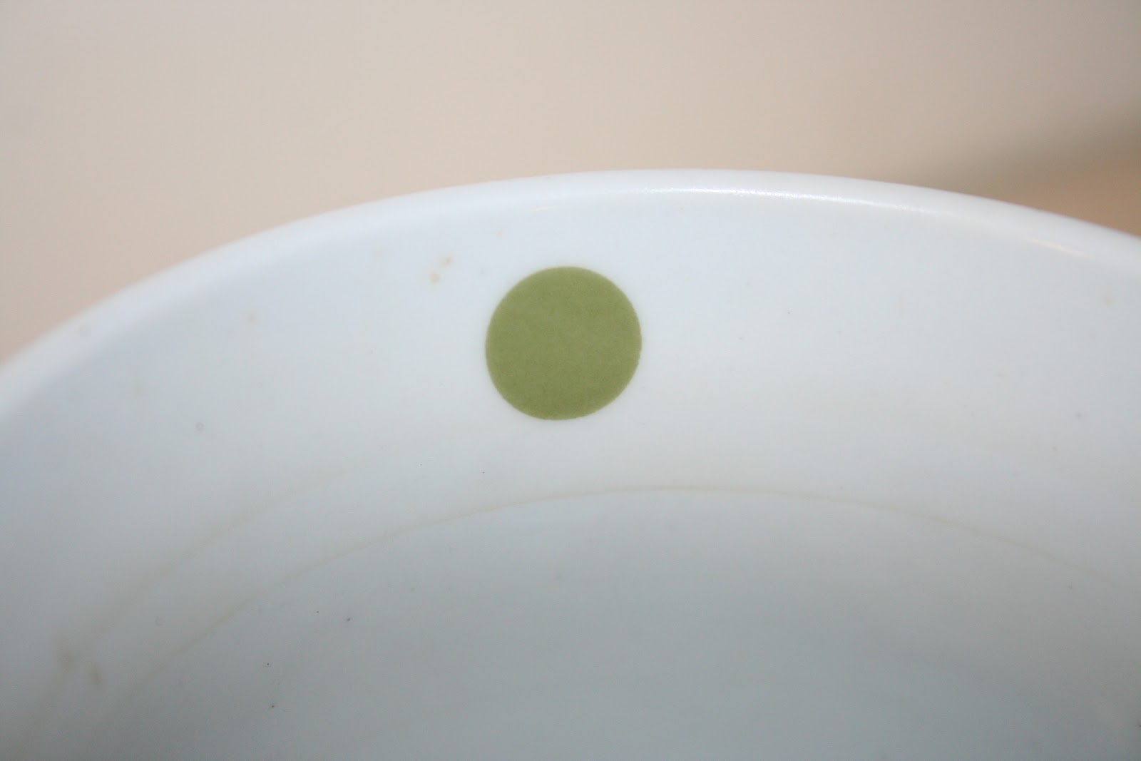


I then went on to make swatches of these selected greens, and went on to choose the ones that I felt most signified nature, environment and vitality before matching them up with a swatch of standardised kraft paper (/card, the material that we are looking to use for printing purposes for our design outcomes).


Although (obviously) an incredibly primitive mock up in terms of design, the swatches that I selected from the original green items/photographs were done so because I felt that they would particularly stand out, or be vibrant against the brown of the packaging, which would ensure that they would be really eye-catching and attention grabbing, whilst still maintaining the more natural and environmental aesthetic. However, after my initial experimentation, the colours don't seem very well suited and the green gets lost easily- more experimentation outside of green is definitely needed, and I'll be sure to discuss the potential problems with Charlie first thing tomorrow when we meet again at Uni.
No comments:
Post a Comment