
After initial experiments applying textures to my character designs, I felt this was a little too much- and the overall aesthetic was a little too messy- so, I decided to experiment with applying it to backgrounds/scenery, and was happy with the result- screengrabs and images explained in more depth below.

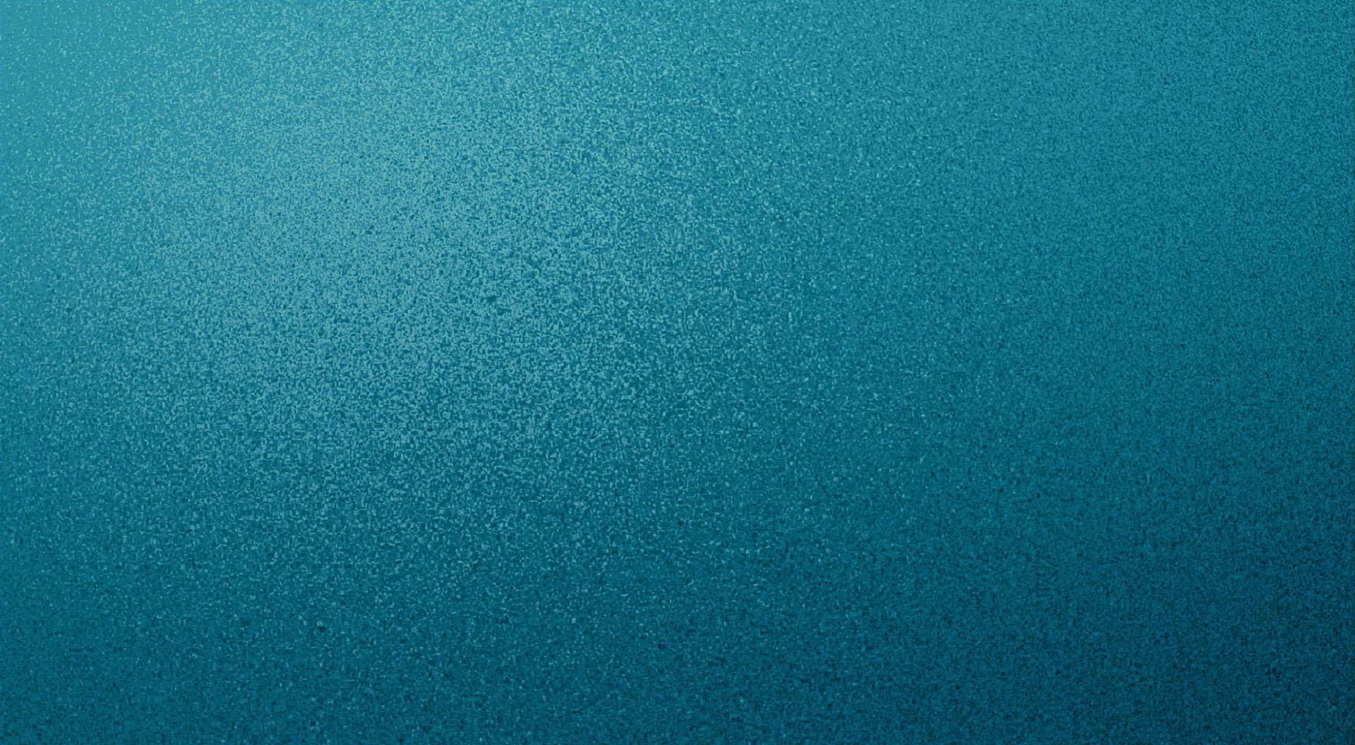
http://simplywallpaper.net/pictures/2010/12/08/aqua-texture-wallpaper.jpg


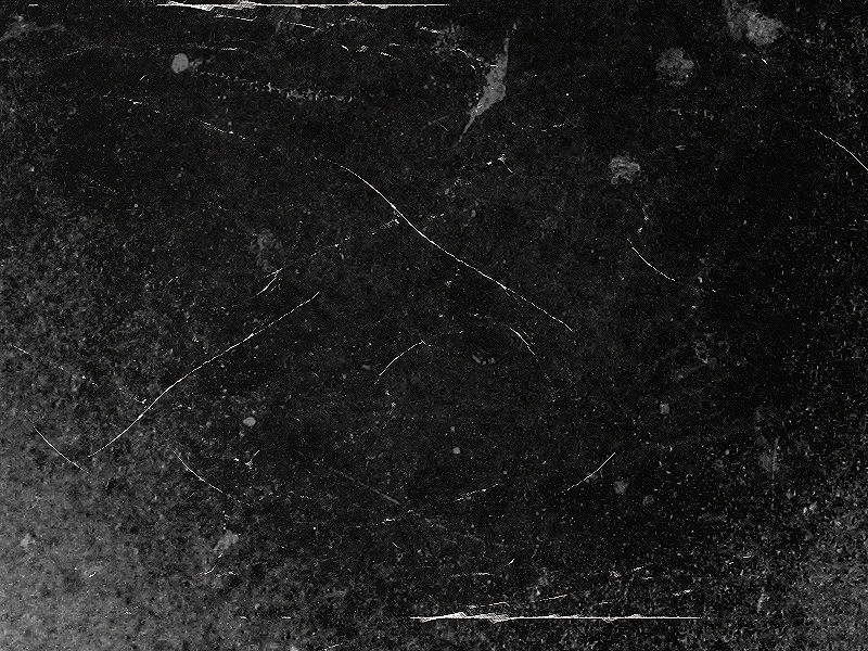
http://fc09.deviantart.net/fs35/f/2008/305/e/9/Scratchy_texture_by_SugarFeathers.png

The range of textures I first started experimenting with in different vector elements within one of my first designs- creating different elements for my first ident proposal- particularly looking at the sea, mountains, ice and sky.


First tried applying the snowflake texture to the mountains- but saw how it could easily get quite confusing and messy- needed to be a little more subtle, and avoid over-laying textures and opacities- afterwards trying the scratch/water textures- each, again, not really hitting the mark- although I liked the fact that the water texture reminded me of snow, it was still a little messy and busy- especially when applying the snowflake texture background to the design which I think worked particularly well- along with a radial gradient to, again, give the image a little more depth- decided to keep the mountains as flat vectors, and focus on the background, in particular, in consideration for applying textures to the additional elements.

This style of wave looked far too messy and cluttered- decided against them, and went for something far more simple and fitting to the geometric style of the vector design.


To finish off the design, complete with what will be the motion pattern of my penguin in the ident, I worked on the waves and sky to get the right mixture of texture and colour palette- trying not to forget about my 5-11 target audience, and introducing the colours at a slightly higher saturation that I may have otherwise used- the final scene resembling that of the design at the bottom of the screen.
To do:
- Create all 4 storyboard idents
- Create storyboard for title sequence
- Draw individual snowflake pattern to animate these as they fall
- Tidy up mountain top peaks
- Finish off other vector illustrations for ident and title sequence
- Start animating!
No comments:
Post a Comment