As part of my design development for my type as image Image module brief, for the concept development of our designs, and design outcomes, each A1 design has to be derived from an original typeface to create our own, unique design.
For my 'It certainly has nothing to do with the number of birds' quote design, I wanted to use a bold, uppercase font with distinctive character and letterform definition, to fill with my illustrative bird design, yet still be for the message and quote to be perfectly readable, legible and visually understood.
After experimenting with several typefaces I felt could potentially work, I decided upon 'Old Road Signs Font', as I felt this was most suited to my concept outcome.
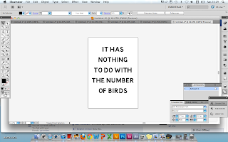
After experimenting with various layouts and compositions (wanting to keep the style relatively simple so that the illustrations will "do the talking"), I felt that a simple centralised text (the screenshot directly above) was the most suited to my design- finishing at the centre of the page, I am considering adding the addition of a single bird illustration beneath the design- don't know if this "infringes" the type as image aspect of the brief? Worth asking about- though I quite like the idea of it looking similar to a 1940's wartime poster in terms of the bold type and simple imagery. Before I print and begin the design, I will definitely experimenting with generating illustrations of birds to ensure that I achieve a style and way of working I am happy with before committing myself to the final design.


No comments:
Post a Comment