
Moving on with the development of my title sequence, I wanted to ensure that I got the design finalised and complete as soon as possible to provide me with any necessary time afterwards to make amendments from given feedback or my own personal critiquing. Again, I found myself in a position where time wasn't in abundance- again, completely my own fault, but at very least this has made me realise just how much time and effort actually goes into designing and finalising the motion graphics designs, and, if I were to embark on such a project again it would give me a full understanding and basis of what to expect.


Continuing from my last developments, I realised that I wanted to ensure a continuity throughout my idents and my title sequence- finally starting to establish a visual outcome I would be happy with (largely based on what has become, I think, my strongest design in Ident #3 'Diet') and running this throughout my series- an example here, changing the background to match the radial gradients throughout- also darkening the vignette snowflake background to make the colour palette more suited and consistent throughout the 60 second design.


Another one of my most significant ideas, around this point was the addition of type- created and displayed in a style inspired by a video I found (an ode to Falmouth, which can be seen on my Design Context blog)- I tried experimenting with one of the techniques we were taught during our After Effects workshop, animating the appearance and position of text- though even this subtle effect felt a little too flashy and distracting from the main image (which is the intended appeal for my target audience)- also tried a "blink" effect with opacity- again, felt too much like a flashy powerpoint presentation than a subtly styled motion graphics effect.


Still keen to use type as a narrative for my images- and to give a little more evidence as to what the 'Top 10' may in fact be (whilst not giving away too much information), I experimented with my existing typeface used throughout my designs- in Italic and Italic Bold. Although I feel the bold case suits the character and target audience of the outcome more effectively, it definitely proves to be more distracting from the image- I wanted something subtle, not overpowering and visually noisy.
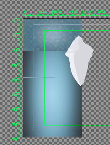
Keeping a consistent grid position- inside the title safe zone to ensure it won't get lost on any monitors/ screens, and remains readable and legible.
I ending up also deciding upon using a mask layer over a directional line as my method of communication for each of the 'top ten' words- kept the style looking informative, clean, but still interactive and of course, with motion, which will help to keep my restless target audience a little more entertained than they could have potentially otherwise been.
After several hours and what feels like a million and one potential screenshot opportunities, I started developing a stronger idea of the visual identity for the title sequence and the outcome that I hoped to achieve. Of course, as aforementioned- time is a major factor, so there is a lot less originality in context with the idents than I would have liked- but at least this way I know that the designs are visually clear, connected and consistent with one another.
Putting the sequences together- here, adding ident #1- colony, to the sequence- still a lot of development needed at this stage, however- but an encouraging sight to see the design becoming more fluid, and the sequences working well along side one another in terms of timing, audio and visual consistency.
A much more complete outcome- here, utilising my audio rhythm to affect the motion and speed of the sequence in terms of mask layers for my text lines, and, of course, the transitions between the separate idents which make up the title sequence as a whole. Reasonably happy with the design- but the Chinstrap and Adelie penguin during the 'species' sequence section aren't entirely straight and aligned with one another- time to get the rulers and grids out!
The final design- again, as previously stated, there are numerous things that I would like to change about the design, or feel that I would certainly change, if time were more of a luxury. However, considering the constraints of time in balance with other responsibilities both in and out of college, I can say that I am reasonably happy with what I have achieved in this module- and feel that despite not necessarily having the outcome I aspired to, I have worked hard to have as an effective and successful design as possible- and I hope this is evidenced enough.
No comments:
Post a Comment