

Searching through some of my old book collection to find examples of Penguin and Puffin books (Puffin, who specialise in children's literature, being the publishing house I am proposing that my 200 Books/200 Schools campaign books are published under) for inspiration in regards to the general layout and design of the content in terms of type, folios and image distribution throughout.


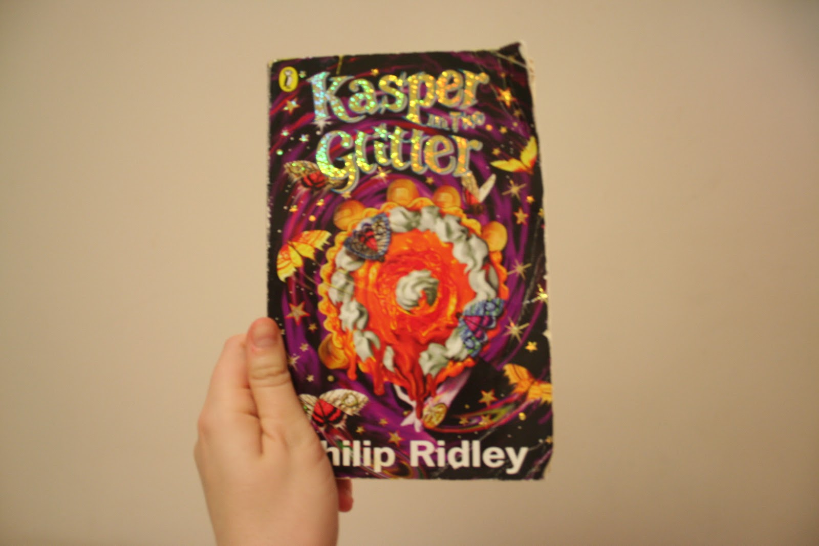
Looking through the two Penguin books in the small pile I gathered together, I was interested to see the distinct differences in that ways that children's and adults literature was formatted and presented. Of course, for an older target audience, these books were far more dense in terms of written content with no imagery aside from the cover designs (which was, again, still minimal). In the copy of 'The Great Gasby', a millenium classics release to celebrate Penguin publication classics, the stock used for print is incredibly lightweight, due to the low cost of the books on their reprint editions to keep costs low for both the company and consumers to attract new readers with their low retail prices (around £2 per book).

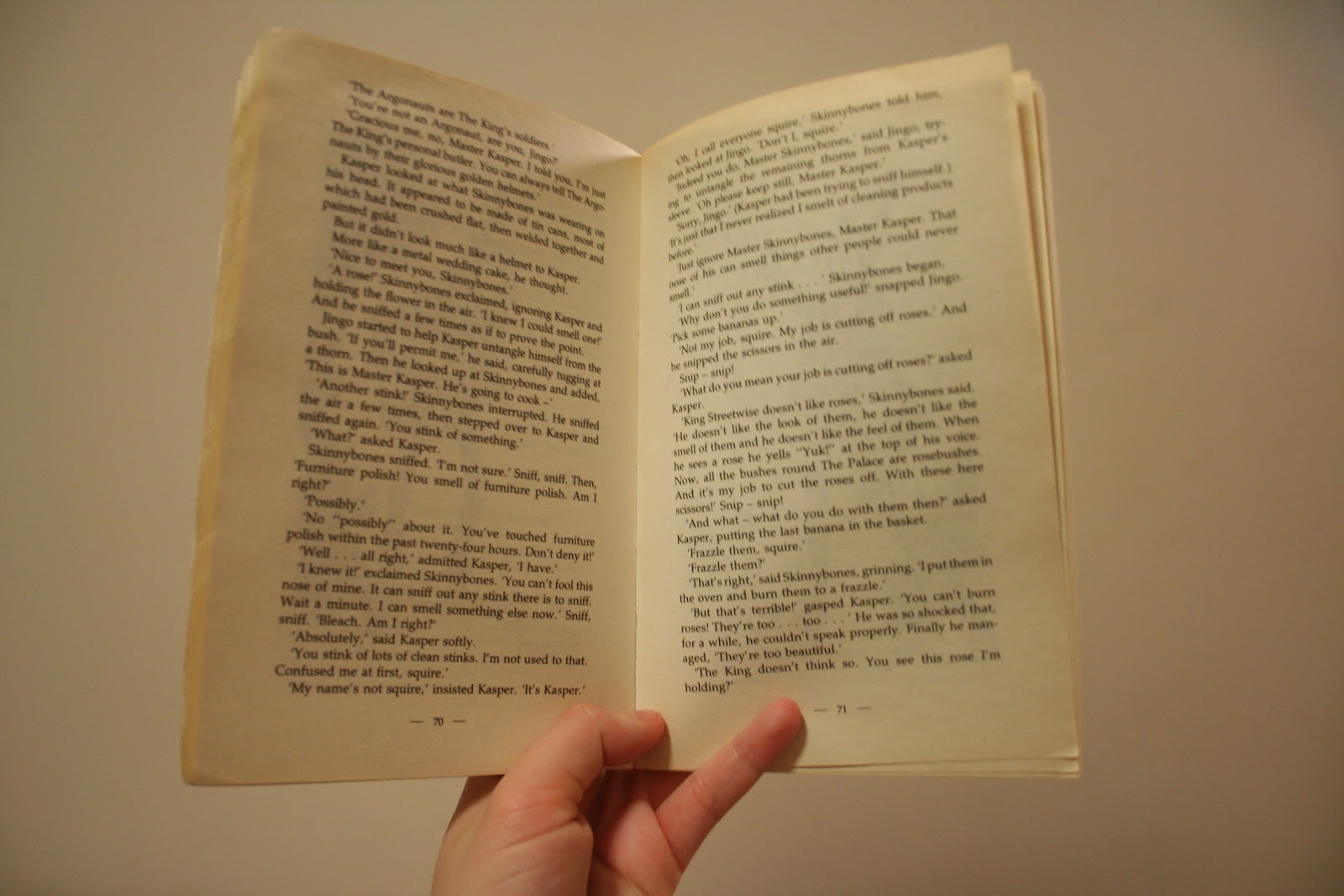


Looking through the children's publications there were clear and distinct differences- largely with the use of illustrative detail and imagery throughout, with "flooded" illustration pages (which I think work really well to narrate the story, as well as for aesthetic detail) as well as illustrations with wrap around text/as "header/footer" images at the top and bottom of the body copy text content.
Interesting to see that the folios remain centralised in both the children's and adult's literature, and something that I will go on to keep consistent, and that I may not have otherwise thought of, or considered that carefully.
For my own publication designs, I will aim to create my illustrative cover design, as well as x1 "flooded" illustration page per fairy tale (Grimms Fairy Tales- 10 throughout the book) as well as at least one more additional illustration per fairy tale to work into the text and add more detail in the overall design outcome(s).


Other interesting points to consider- usually serif typefaces are used throughout fictional literature publications, as in dense blocks of text, the letterforms are much easier to read and distinguish. Is this something I want to maintain? San serif can, sometimes, be used- such as in the example of the Innocent Smoothie business book, as shown above. It would certainly help to break the stories up a little more, as the fairy tales, in themselves do effectively throughout the entire book. Definite need for experimentation and consideration when setting my type in InDesign.
Also- thought about changing the logo for Puffin, or reverting back to a classic style (the style shown on the spine of these books are pre-2003, when the most recent logo was introduced) and for me, the heritage factor and feeling of history and the "classic" nature would be more appropriate. However, the first Puffin logo/Puffin itself was introduced in 1967, and therefore, not really appropriate to showcase the history of the 200 year old Grimms publication, and the age that inspired the 200 Books/200 Schools campaign concept.
No comments:
Post a Comment