


My printed and design progress work ready for the
morning's progress tutorial. Although it was still good to get some work
produced for this crit, I wasn't too pleased with what I had to show in
the crit- all test samples, and very basic design pieces that I really
wanted to spend more time developing (and printing to scale would have
helped too...).
Quite pleased with the colour scheme (the "Wes
Anderson palette") and some of the stocks used to print were very
effective- others not quite so (watercolour paper, for example- not a
crisp enough print, too textured). This also gave me a good opportunity
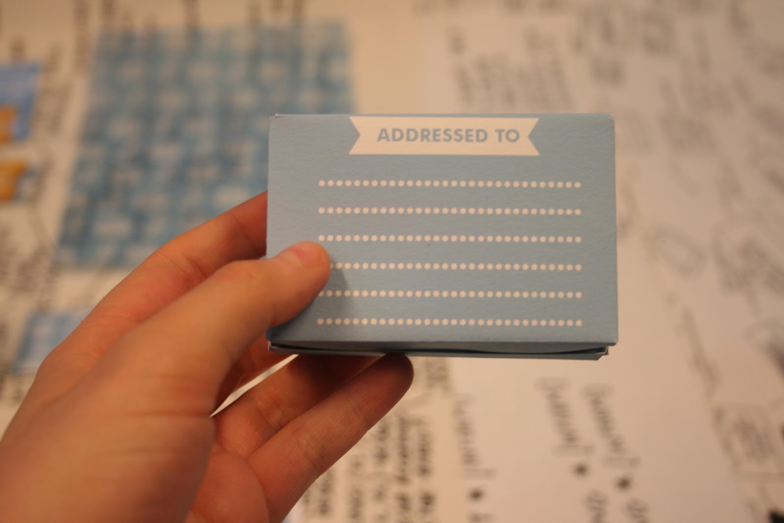
to evaluate the scales and positioning of design on nets etc- for
example, on the mailshot box the quote looks wrong beneath the design
and the back cover address design needs to be moved down to not bleed
off the surface, etc. Pleased with the ticket range, and the perforation
works well- simple yet effective finish.
Also like the trace
pattern outcome, but the pattern needs to be more exciting and a little
less "cloudy"- a light weight acetate would be far more effective and
crisp.[PLEASE EXCUSE the terrible winter morning lighting...]
No comments:
Post a Comment