Today I went down to my allotted print session to organise some test prints for my work designed so far. Still a little unsure about what would work, and what wouldn't work, this presented a good opportunity for me to test and compare pieces away from the computer and to visualise them in print.
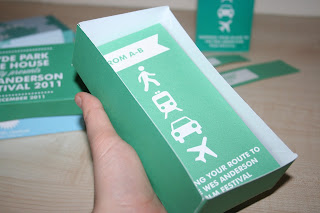
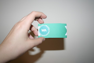
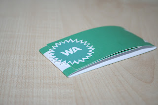
I printed my mailshot box in three different ways- one digitally on cartridge, one by laser on cartridge and one on white card by cartridge. The print and colour difference was really astonishing. Of course, working from a spot colour to CMYK, I was aware that there may be a colour shift. However, when printing digitally, the colour didn't vary too greatly from how it appeared on screen- the green still quite a turquoise-like colour. However, printing by laser produced an almost pea-green, vibrant colour- completely different to the digital outcome- though I felt this was perhaps a little more appropriate colour for definition and the subject matter/Wes colour palette.
A few attention to detail points-
* Need to decrease the point size on the cover of the green box- still peeps through when slip cover is in the centre
* Be careful with folding- stock is too heavy to avoid breaks in weave of paper otherwise (would ideally choose a lighter weight stock- time restrictions mean I may not have time, unfortunately, to do this)
* Ensure that belly binds fit according to paper weight/thickness of fold out map
* Creating a dashed line between 'Cordially' and the dot on the map would make it more interesting and consistent.
The map design- fits well into the box, accurate measure and dimensions- however, need to be careful with my folding to ensure a crisp finish- will move the banner in the illustration slightly over to ensure it doesn't overlap. When in the box, it doesn't look quite so plain- definitely need to consider this and move quickly before Friday.
My poster designs- scaled down x2 from it's original 1.0m x 1.5m 4 sheet train station advertising size to fit onto print on A3 scale- printed two copies- one in cartridge, one in white card. The white card looks more sophisticated and considered, but the texture of the cartridge makes it look edgier and more "art house" with slightly more muted colours. I've decided to go for this option in my design as it feels far more personal and fitting to the brief and the "aura" of The Film Festival and The Hyde Park Picture House- having something which feels high-quality, yet still tailor made.
A range of stickers printed in the varying colours in the swatch palette for the project deliverables and design- originally I intended to have them cut on the vinyl cutter, but the que was long and time was short- will consider their use within the project, and possibly have them cut out again in my final print slot on Friday.


No comments:
Post a Comment