


PRINT FINISHES//FEATURES:
- Range of 6 spot colours throughout the brand/visual identity range
- Embossed slip cover wallet for mailshot presentation box
- Die cut slip cover mailshot wallet & mailshot presentation box
- Folded & cut Map & Hotdog book series
(Although considering perhaps quite a lot more visually grand finishes such as spot varnish and foil blocking, I decided to go for an emboss- a print finish far more subtle and suited to the understated charisma and style of both The Hyde Park Picture House and Wes' films themselves. Although the Festival is, of course, intend to be celebrated, the substance of the films, and their quality can speak for themselves- elaborate finishes may have overwhelmed the understated, minimal designs.)
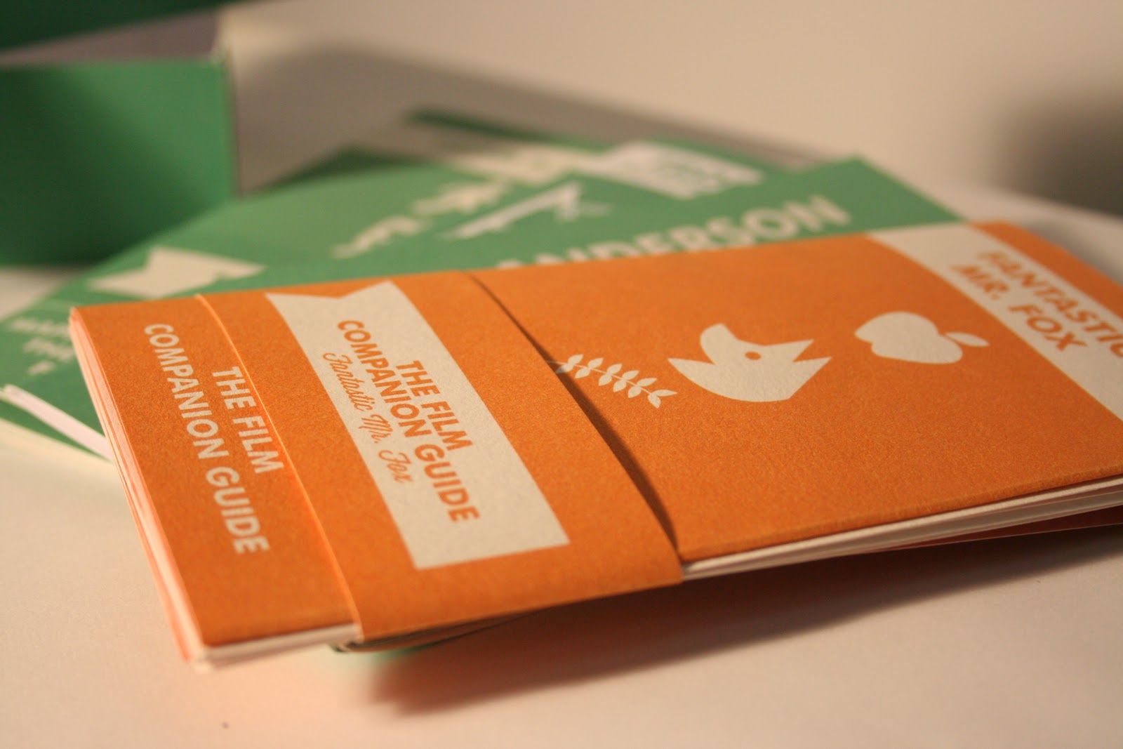
Photographs documenting the final print stages of my 'Good Is...' project, having printed and made up my nets/booklets this afternoon- creating my Fantastic Mr. Fox hotdog booklet today- wanting to portray more information about each film individually (I will finish the rest of the hotdog booklet series over the weekend- and print if I am able to/have time in print).
Overall, I think the stocks worked well- I used a combination of cartridge paper and white card (for reinforcement/structure)- I would have liked to have experimented more with stocks, weights, colours etc, but sadly both time and finances have held me back from doing so.
Aesthetically, I think that the project has been reasonably successful- in comparison to my work last (academic) year, I can certainly see an improvement and a great understanding of theoretical and contemporary graphic design, however, throughout the entire design process of this module I have felt frustrated with my lack of creativity in terms of concept development- feeling very trapped and restricted, and often uninspired- sadly not doing my project the justice I feel it deserves.
(in my books, any way).
Due to time constraints today (print today 3-4, photography at 4.30-7.00) I felt very rushed for time, and sadly this has shown in my final pieces- not well constructed- for example, the saddle stitch is a little wonky in the mailshot booklet- and I accidentally trimmed down a few folios- very frustrating at this late stage, and something I unfortunately no longer have the time to amend. As someone who strives for finish perfection, this is rather irritating, though, of course, would never happen in the professional print environment for which it is intended.
(PS- Poster scaled down to 25%- left border on for aesthetic representation of frame in outdoor advertising, retains A3 scale- and I can see now that the contact card is a bit unnecessary- it won't be part of my
final mailshot box!)
No comments:
Post a Comment