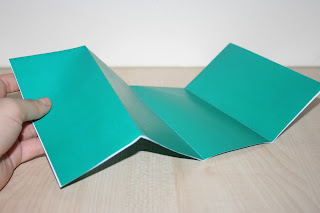
Today I printed a test of my map design to see how it would materialise in print (considering the spot colour to CMYK conversion, scale, folds, and so on). Generally, I was really happy with the design (due to A3 macroom limitations I had to scale the page to fit... but it is just shy of the actual dimensions- will be printed onto an A2 sheet with trim marks in it's final design), and was lucky to recieve lots of great comments and feedback from friends and peers- that the spot colour looked good, the design was well laid out and that the vectors were clear and crisp. Bingo.
A few edits I want to make... when opening the map the plain green looks a little plain- I don't want to make it too busy, so I'll just add a dashed line along the bottom of the panel faces (like the dashed line from the map on the inside of the design), lowering the logo so that the text aligns with the direction headers, as well as increasing the leading between the direction information and the line below).
I think the crisp, ice white works really well here too- make the colour pop- definitely need to do more research into my stock choices, and buy any necessary before Monday- looking for a bright white stock (not too textured, perhaps a slight satin) for my print session.


No comments:
Post a Comment